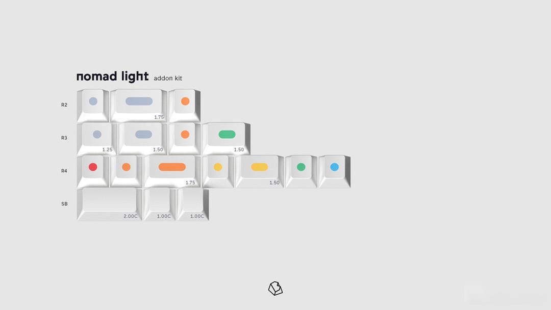
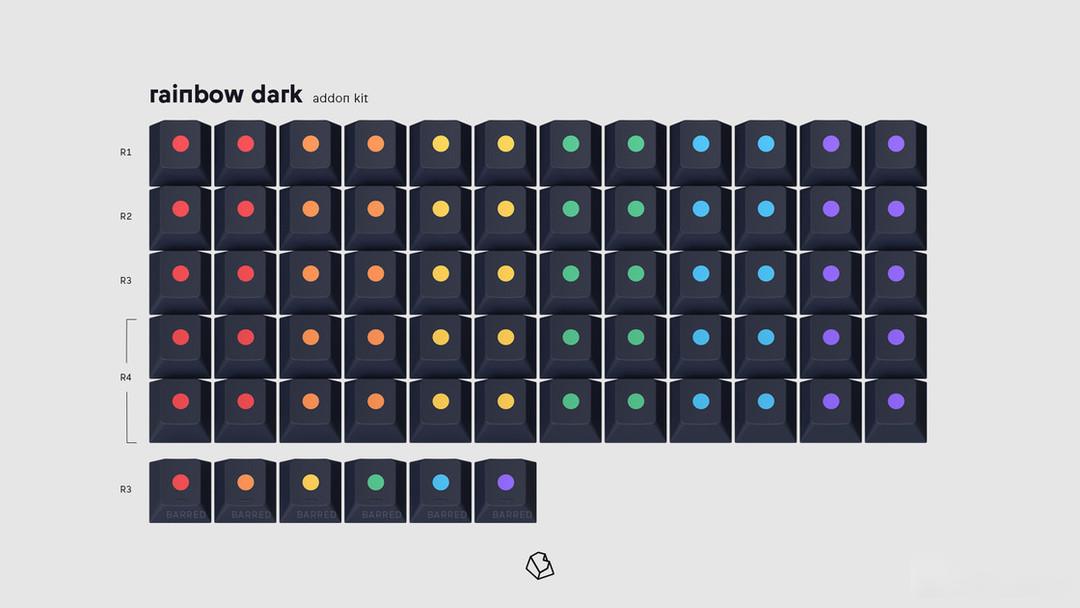
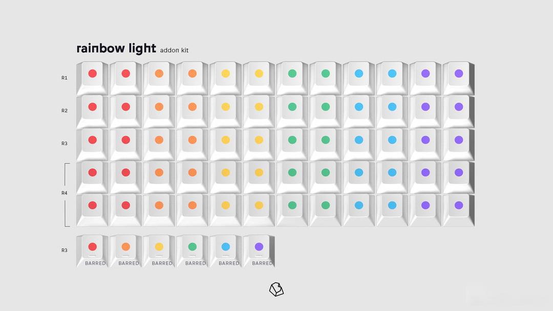
"Customization丨Keyboard" is approaching the end of the year, taking stock of the best design of the year in my mind - keycaps
This article only represents personal opinions, and is used to record and watch some keycaps.
Purely subjective sharing, no rating
Due to the production time difference of the keycaps, there may be many keycaps with a long time span in the 2022 inventory. The shipment, IC, and GB in 2022 will all be included in the inventory. Please refer to the actual product in the end.
names not listed in order
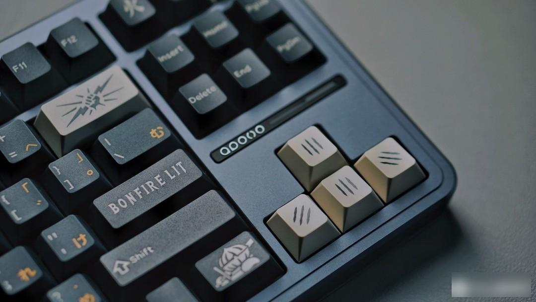
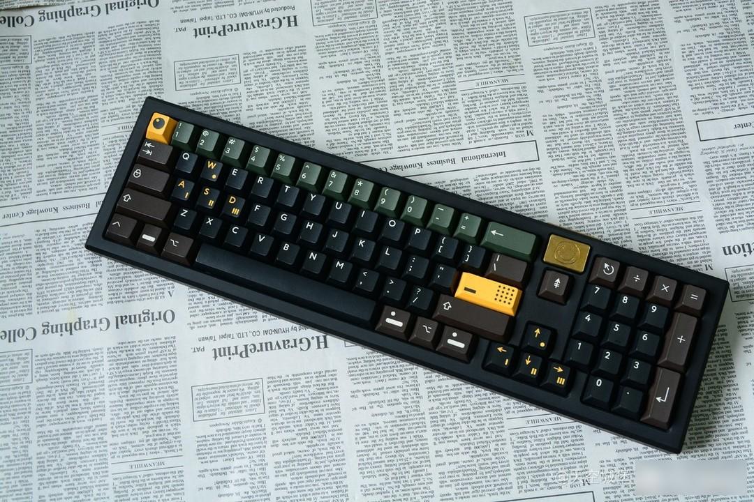
BONFIRE LIT! Fire bearers, get ready to burn yourself to light up the world!
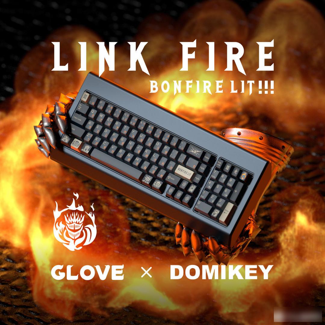
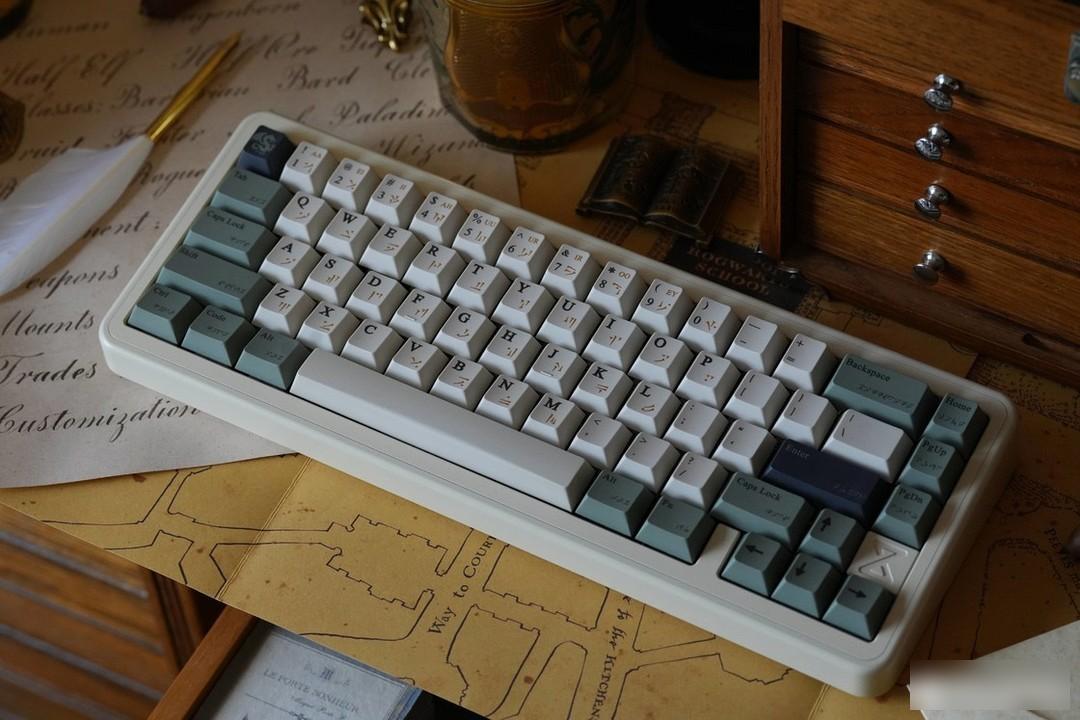
This keycap was opened by the designer "glove" of the glove studio in February this year. It is a highly completed secondary creation keycap, inspired by soul games. Glove Studio is a customization studio that has been active since 2020, mainly engaged in the design and sales of original keycaps.
Burn yourself and use yourself as firewood to continue the light of the world a little bit. What burns is the soul. After being turned into firewood and burned, although the body still exists, the soul will gradually be lost and become a walking dead, a lonely ghost. Although I know that the world will eventually return to darkness irretrievably, I still choose to burn myself to add meaningful light to the world!
Color matching:

Color Card
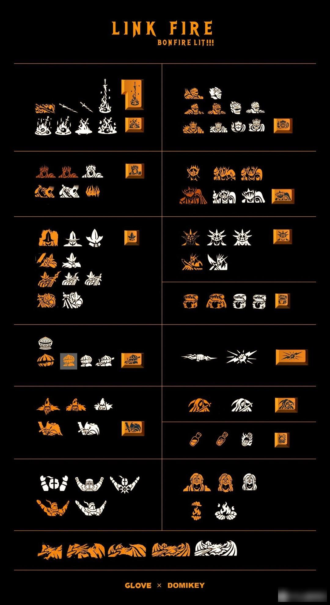
In the past few months, I have gained a deeper understanding of the culture of the game, so I have new thoughts on the color design of this set of keycaps. In fact, the story revolves around the story of passing fire, and Cinder also represents the shimmering ashes after burning. Although the successors in the world will burn themselves, the world will inevitably go dark. The tone of the whole story is desperate and cold. So I added retro gray and white representing ash and bones to the design of the color scheme, and reduced the application of warm orange. In the initial version of the design, I found the dark alpha to be plain looking and not pretty on many keyboards. So I started talking with a few friends and wanted to change the color combination. Later, we will consider the voting results of the multi-version color matching by friends in the group, the color scheme of the following final version and Pele.
The art style of soul games is realistic, but some places will be supplemented with exaggerated design. It is based on Western Europe and integrates the cultural colors of Central Asia, Persia, Japan and many other regions. It is not uncommon to use a variety of visual elements in art works, but it is very difficult to make them unobtrusive, which requires designers to exercise restraint and trade-offs in art style.
The color of the keycaps is mainly navy blue, dark blue is used as the base color of the large keys, and retro gray and white are used as the character color to form a sharp contrast with the dark color, and at the same time skillfully express the elements of bones and ashes. The warm orange color represents the element of "Fire" at the same time. It is also very eye-catching visually, like a flame in the dark. Sky blue as a personality and supplementary color adds a touch of vitality to the whole set of keycaps.
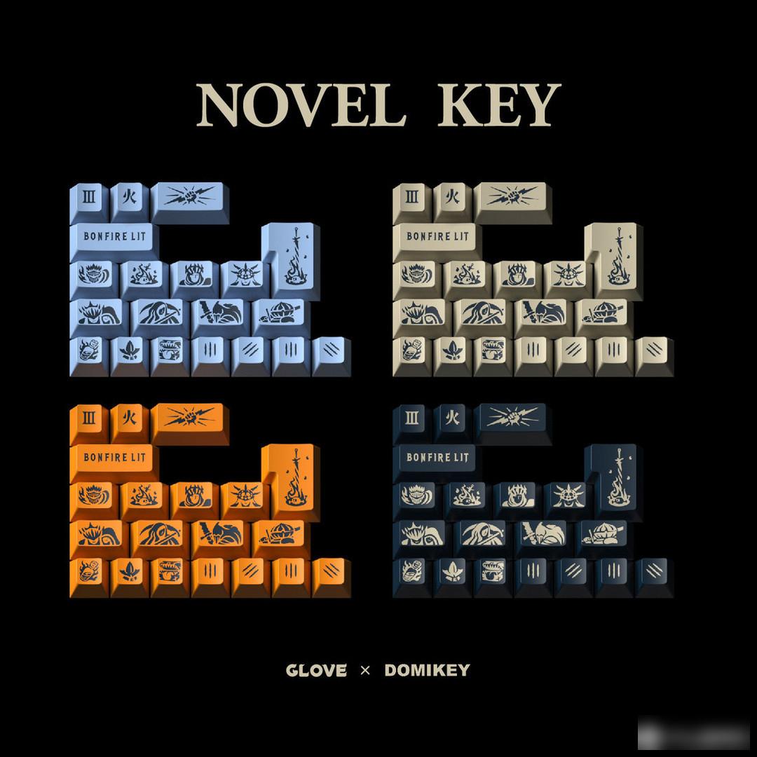
Personality section:
The personalized keycaps have been modified over and over again for several months, and I don’t know how many versions have been updated and iterated. After a series of complications, simplifications and simplifications.
The personalized keycaps designed and drawn according to the content of the game are full of magical colors, and even the treasure box monsters have a sense of intimacy. The two-color molding and mold making make this design even more precious.
Metal keycaps:
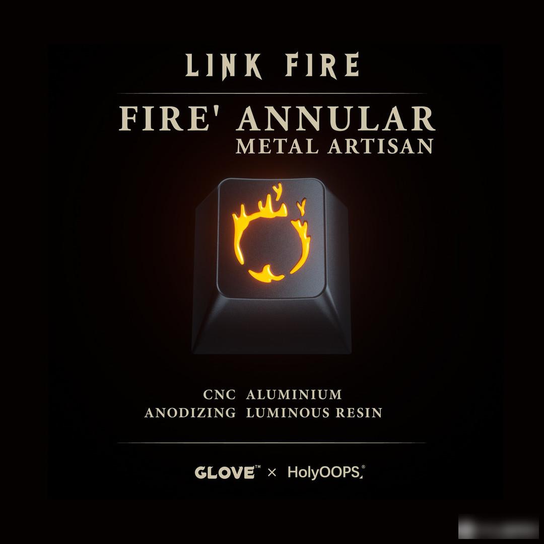

Material: aluminum + resin
Process: CNC + dark blue anode + luminous resin filling
Vendor: HolyOOPS
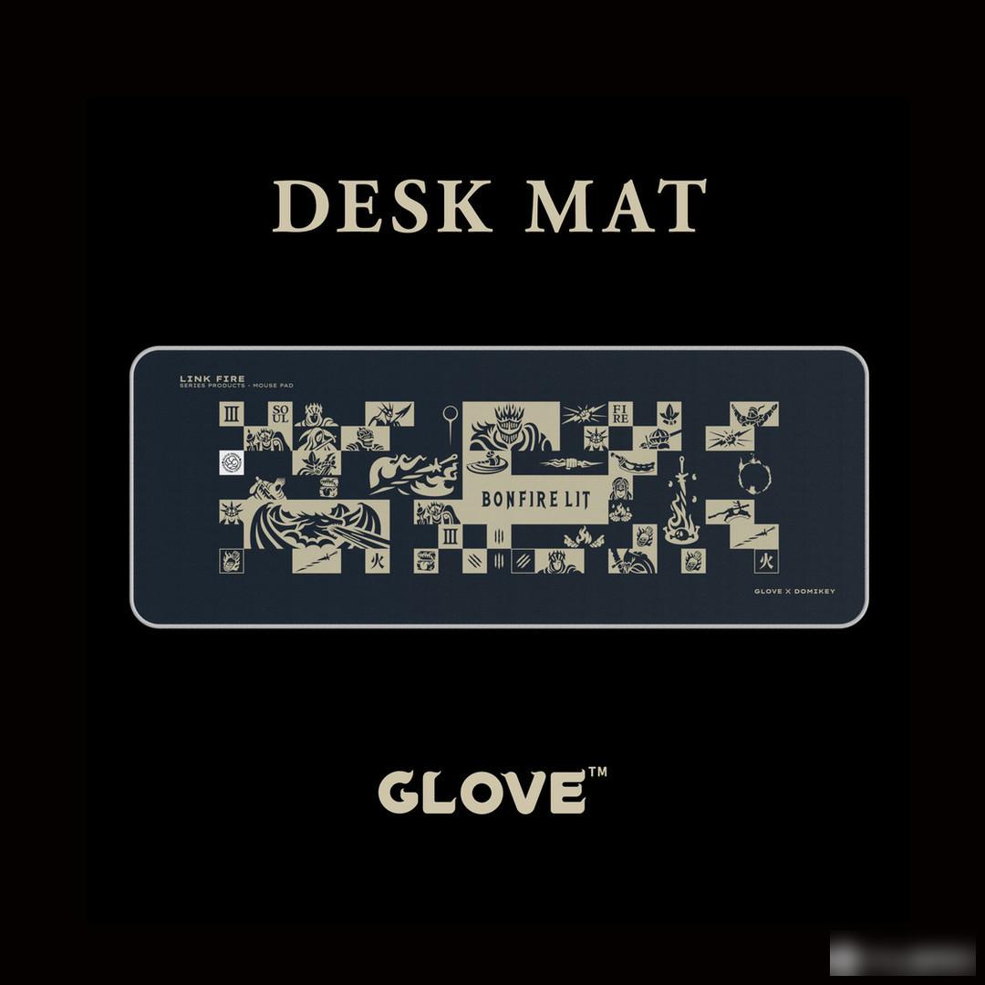
Table mat:
The following are some excellent real shots in the forum
Real shot display:
Photo by Ye Feimu


Keycap information:
Manufacturer: DOMIKEY
Material: ABS
Process: secondary molding (two-color, three-color)
Height: original factory height
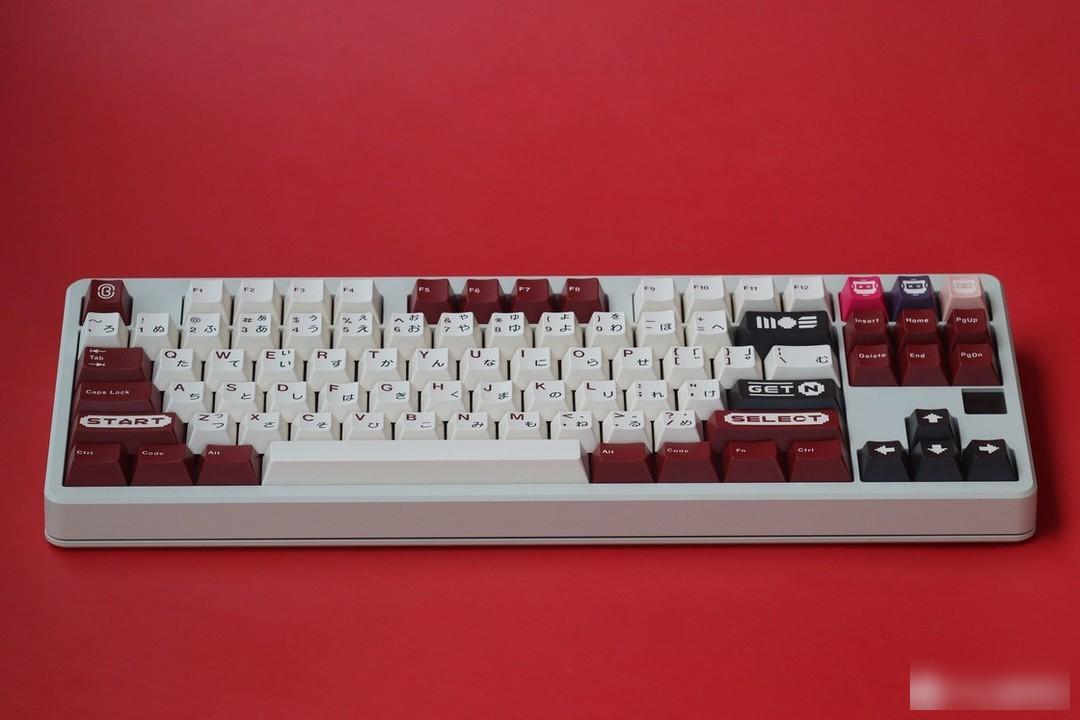
What a generation of people think about every day in class and read while sleeping is the contributor to the popularization of video games, and it is also the incentive for friends to fall in love and kill each other - red and white machines!
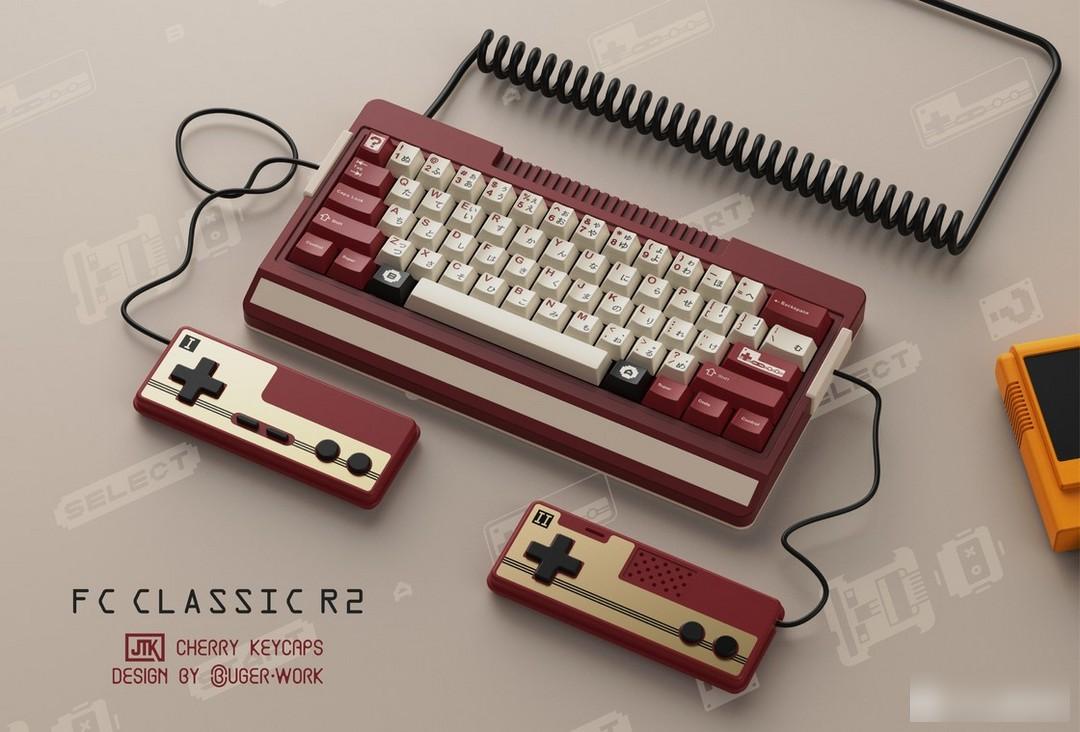
This set of keycaps is designed by the domestic designer BUGER. This designer has profound design skills. He has designed many classic keycaps, such as plastic, landscape, virtual war, Dongfang No. 1, C64 and other keycaps.
BUG is not a loophole, but an unknown possibility. Those who are willing to explore this possibility are BUGER.
This set of keycaps is a very representative buger design style, integrating cross-border product design into the keycaps, Famicom + keycaps, Classic FC keycaps were born. After being well received by the market, in March 2022, Classic FC opened R2.
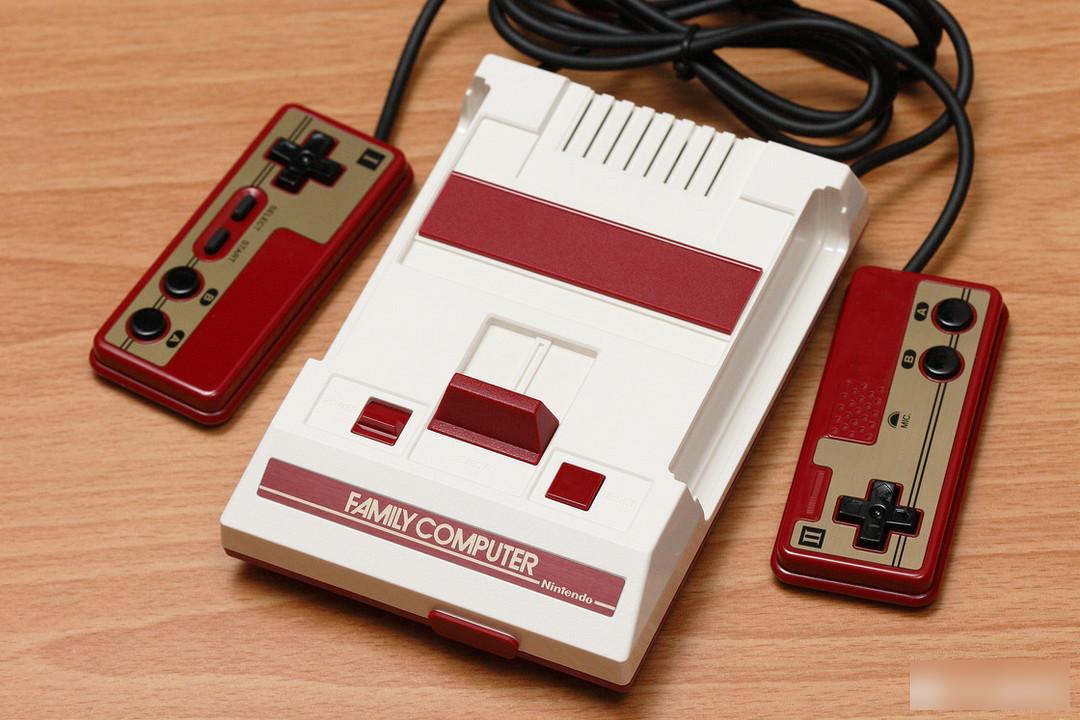
Nintendo_CLV-101
Color matching:
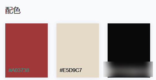
In terms of color matching, in the game circle, there are not many host and peripheral designs related to red and white, but the most famous one is Nintendo's red and white machine. This keycap also uses the classic red and white machine color matching, but in order to be more visually recognizable, the color has been fine-tuned.
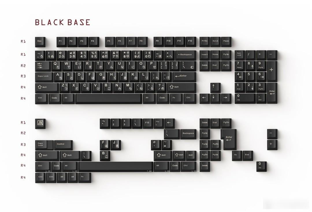
At the same time, the R2 Famicom has added a black-based Kit for players to choose from.
Personality section:
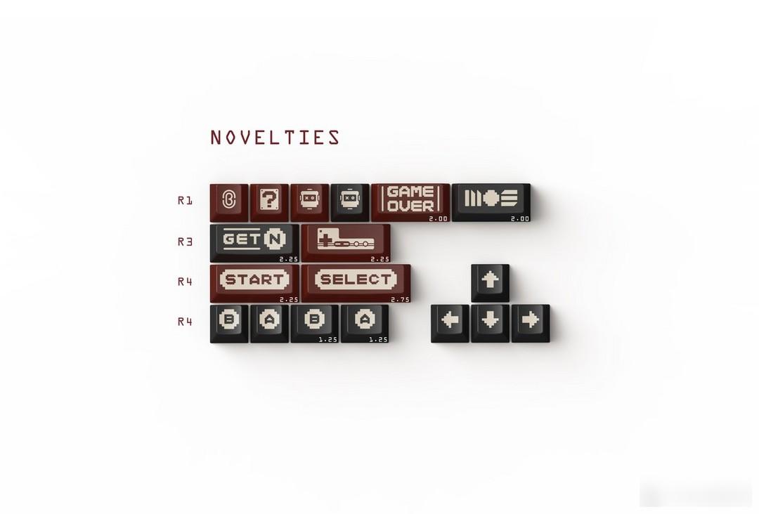
The personality part is composed of function keys on the Famicom and pixel-style game prompt characters, supplemented by buger's studio logo and Famicom. And this little robot-like pattern is a small mascot designed by the designer.
This one is based on the evolution of game cartridges, because of the technical limitations of the two-color keycaps, I have tried my best. The hidden easter egg at the back is also the same pattern, but the color scheme is different, which symbolizes different game cards. Of course, please do not need to correspond one by one, because the color is not so easy to do. I just hope to unlock as many colors as possible and put them in the F area. Rows should be a lot of fun. Because of the anthropomorphic treatment, I wanted to give this thing a name. The first thing I thought of was Luigi, and this "ki" feels very destined. Anyone who knows me knows that I like G, it is pure love for this I like the letters, so I officially named this guy---【Ji Zhai Zai】, you can also call him Ji Zai for short, or ~~~~~ and announce him as the mascot of G-STATION at the same time~ You can regard him as me the incarnation of him, press him~
The following are some excellent real shots in the forum
Real shot display:
Photo by Fang Xiaocheng Phares
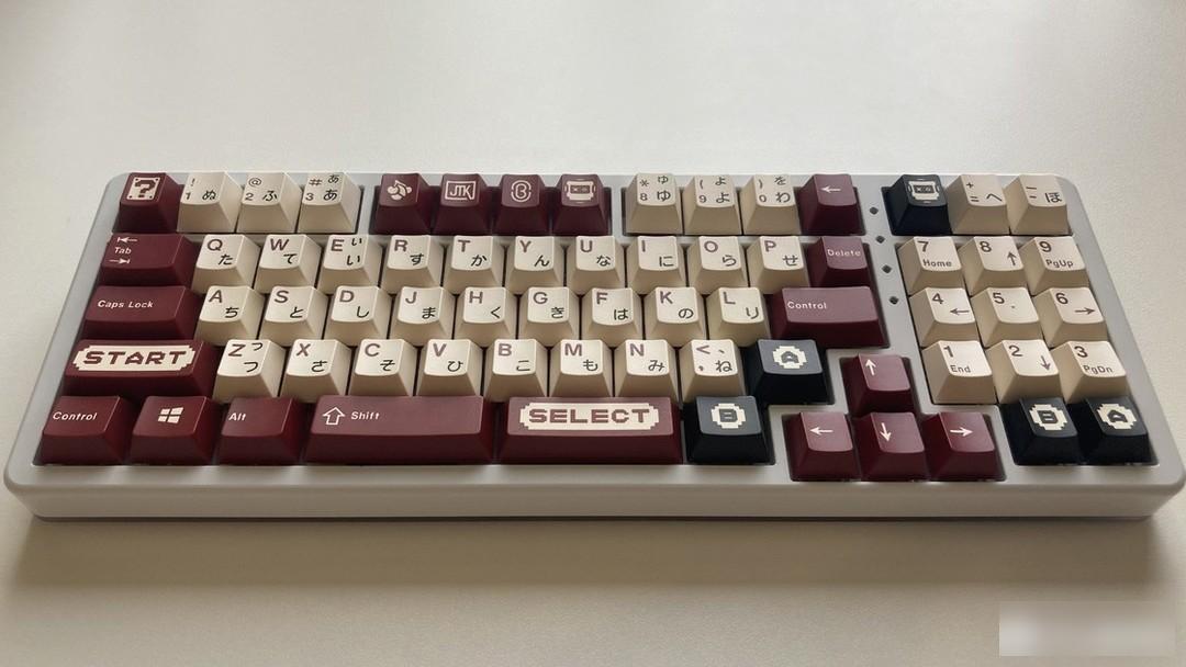
Photo by Nine JF

Le total shooting
Keycap information:
Manufacturer: JTK
Material: ABS
Process: two-color, three-color
Height: original factory height
When a Fool's Joke Comes True - The Minimalistic Minimalist Keycaps

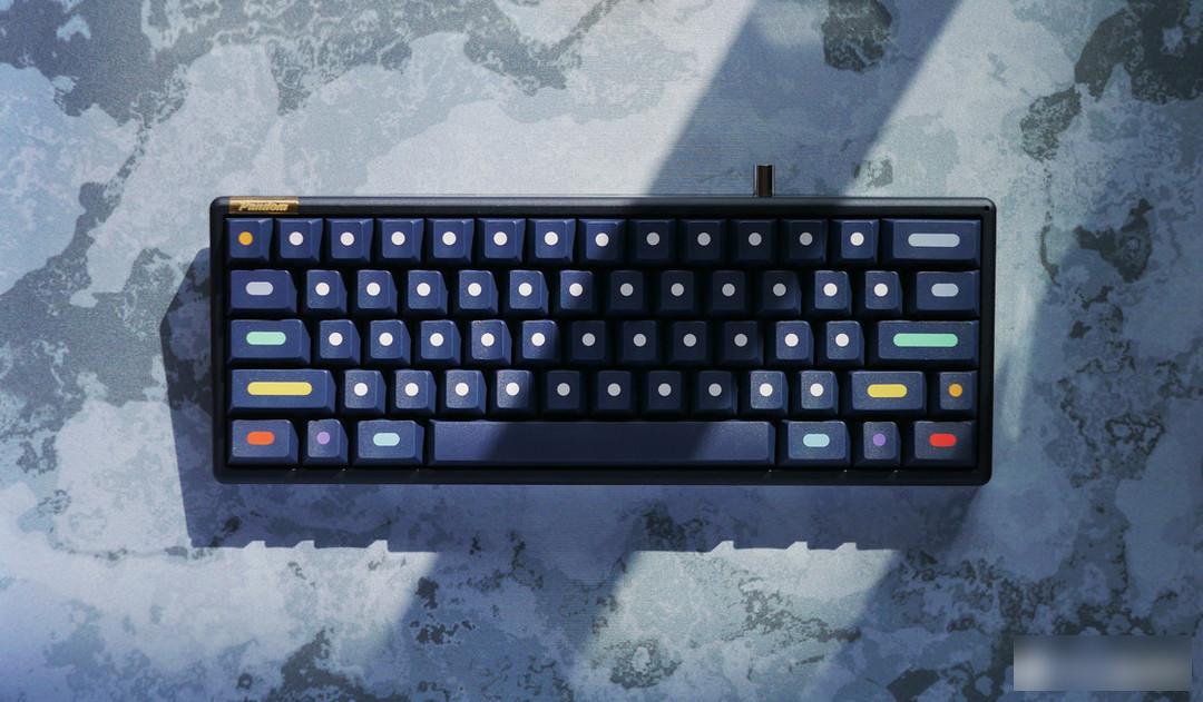
This keycap is a minimalist keycap designed by French designer Biip. This designer has designed many interesting works and is also the character designer of pbtfans.
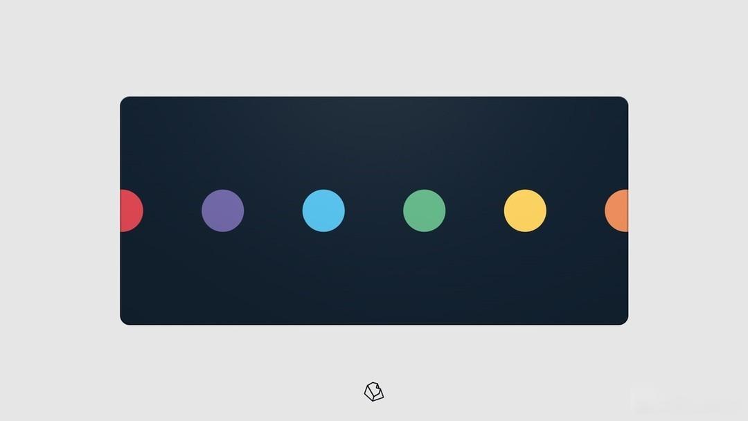
What minimalism advocates is not absolute nothingness, but to ensure that design elements, colors, lighting, and raw materials are simplified to the minimum, so that the focus is placed on the texture of materials, creating a subtle and refined product aesthetics. Regarding the dots set of keycaps, his sales alone are enough to make people awe-inspiring. The design of this set of keycaps is just like its name. It is all origins, with origins and bars replacing characters. Compared with a whiteboard with nothing, this keycaps better explain the minimalism on the keycaps. Simplicity ≠ Simple.
Color matching:
Compared with the minimalist style, this keycap can be said to be very rich in color matching, and it also adds interest to the original monotonous polka dot pattern.
Personality section:

Seeing so many polka dots, I can't help but think of Yayoi Kusama, who is known as the "Queen of Polka Dots"

Metal keycaps:
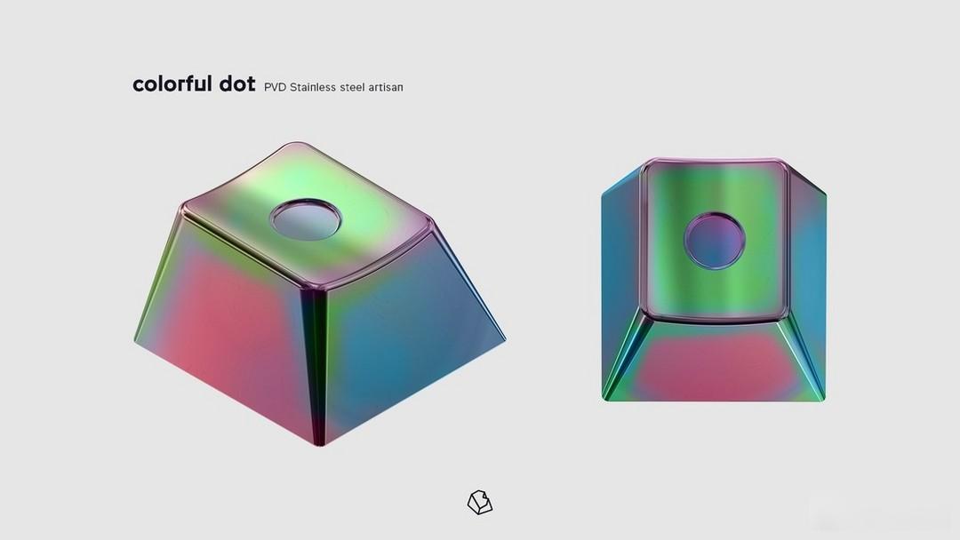
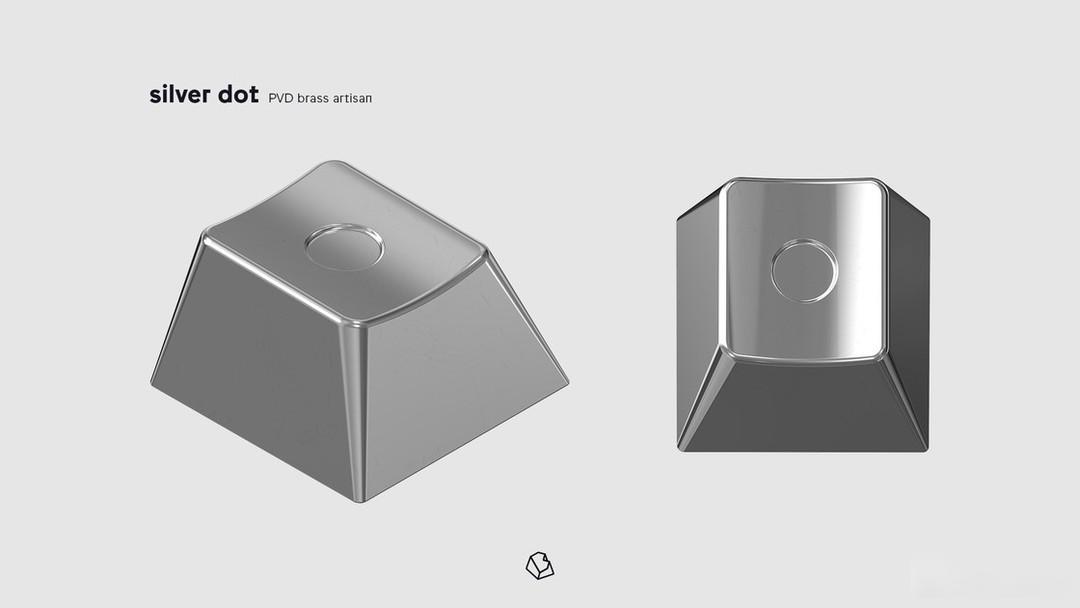
Table mat:
The following are some excellent real shots in the forum
Real shot display:
Photo by Negotabayu

Photographed by Mr. Qin Northeast
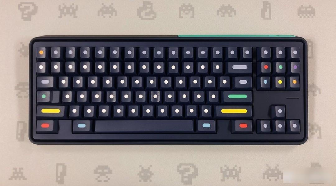
Photo by Re9456
Keycap information:
Manufacturer: GMK
Material: ABS
Process: secondary molding
Height: original factory height
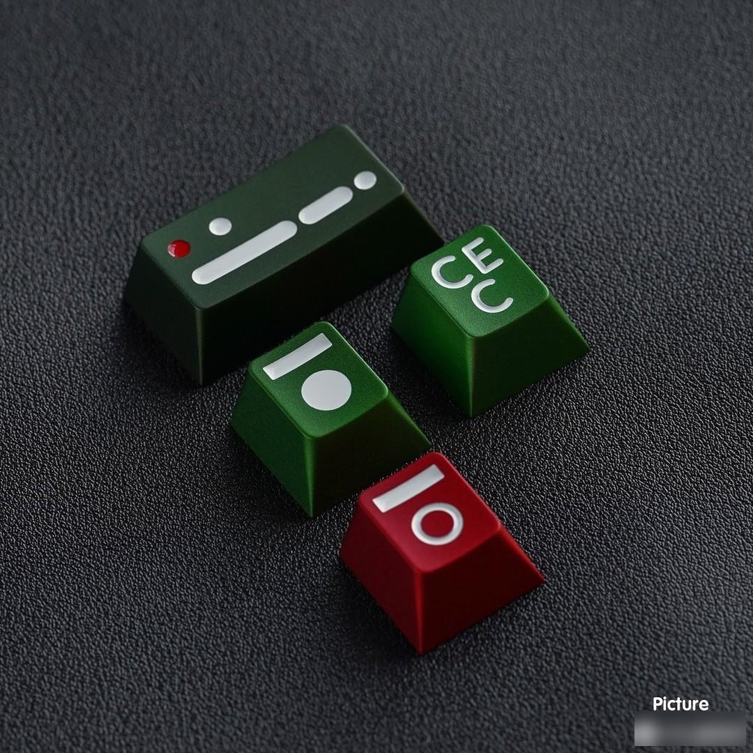
This is the resonance of the design
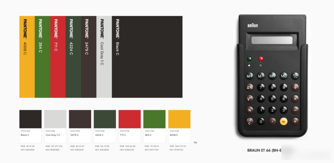
This keycap is designed by "oK-C" who designed the Phase One 65 keyboard, and inspired by the et series of Braun calculators.

Phase One 65 with vibes
In fact, this calculator has also derived some other keycap designs, such as SPSA's computer and GMK Taschenrechner, but the former has been discontinued, while the latter has been shelved due to the existence of the former.

SP SA Calculator Rendering
In fact, when it comes to Braun calculators, the first thing that comes to my mind is the design of Apple.
Imitation is the sincerest form of flattery
Braun's shadow can be seen in many early designs of Apple. Whether it is plagiarism or tribute has not been verified, but there is no doubt that Braun's design concept is worth learning and learning from. And all this is due to Braun's chief designer, Dieter Rams, whose design philosophy is "less, but better".

Design logic is self-evident
And this calculator was once considered to be the prototype of the original iPhone calculator.
Looking at this calculator again, compared with many calculators at that time, the Braun et66 is the most brilliant is to abandon the non-essential elements on the calculator and the cluttered elements that distract the vision, and the keys are adjusted according to their own attributes. dealt with. The advantage of this is that the user can immediately understand the function of each row of keys. This also corresponds to one of the designer's good design principles.
Good design makes the product easier to read
Although it is not realistic for users to fully understand the product without reading the manual, it is a very important product design principle to allow users to quickly get started with the basic functions of the product through design.
The ET66 distinguishes the color of the buttons very well. It is not all black, but a functional partition through color. Although this is a very basic product design concept, there are not many calculator products that can do it so well at that time. Design, which also shows that a good designer must have user thinking.

Color matching:
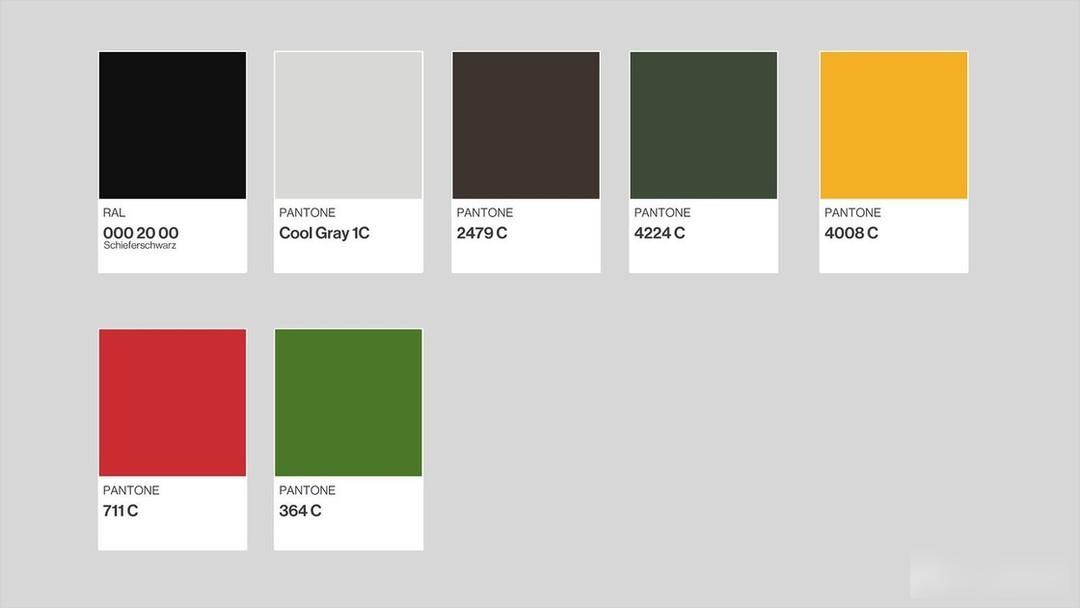
Rich and colorful color matching, but the use of this set of keycaps does not appear cluttered. It is very ingenious that, just like the different colors of Braun calculators correspond to different functional blocks, the key base colors of different partitions of this keycap are also distinguished, corresponding to different input functions.
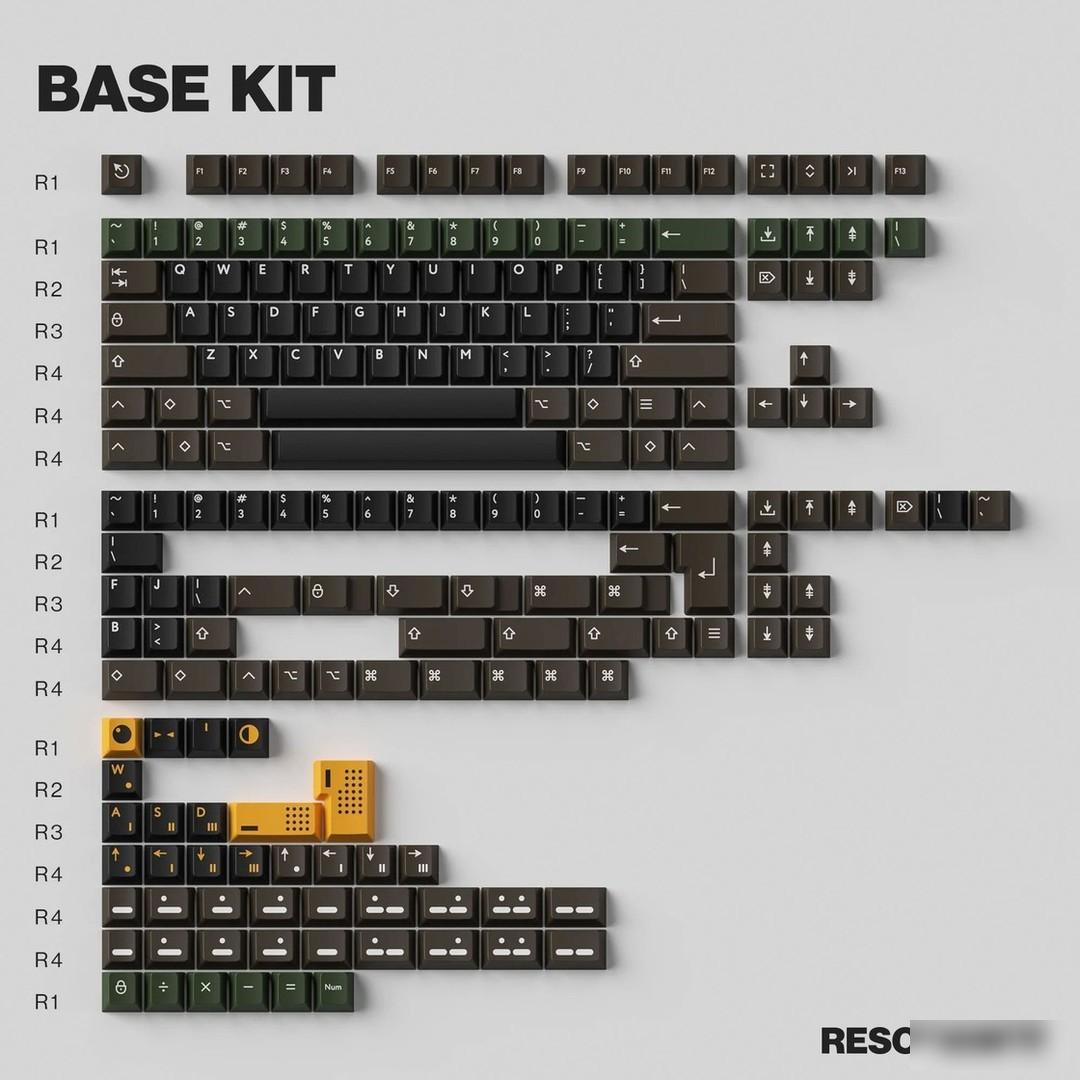
Personality section:
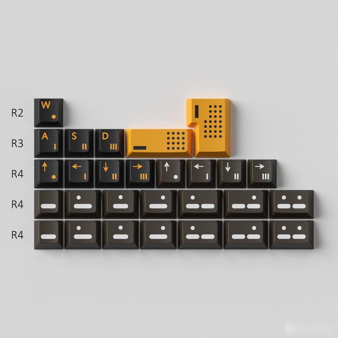
In terms of personality design, the dot matrix and operation symbols are used, which is more in line with the theme design of the calculator, but the real personality of this keycap is still in the metal keycap part.
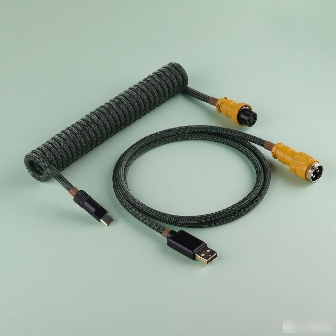
Metal personality:
Aviation plug-in line:
The following are some excellent real shots in the forum
Real shot display:
Le total shooting
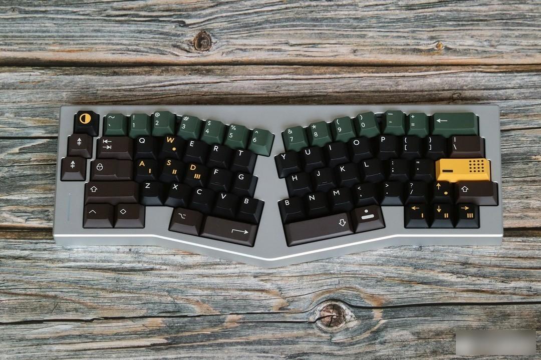
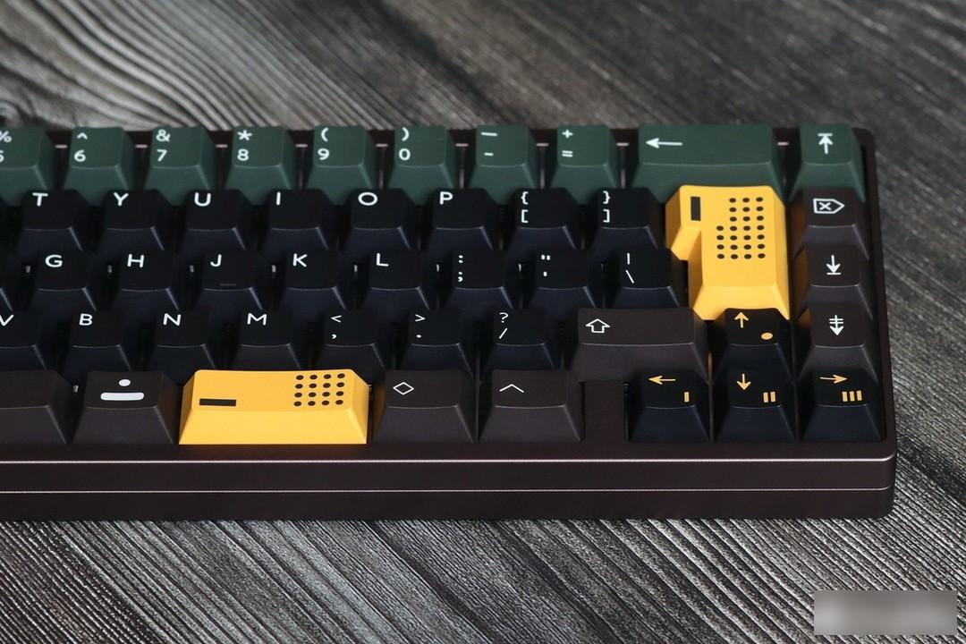
SKY CASTLE SHOTS

Keycap information:
Manufacturer: PbtFans
Material: PBT
Process: two colors
Height: original factory height
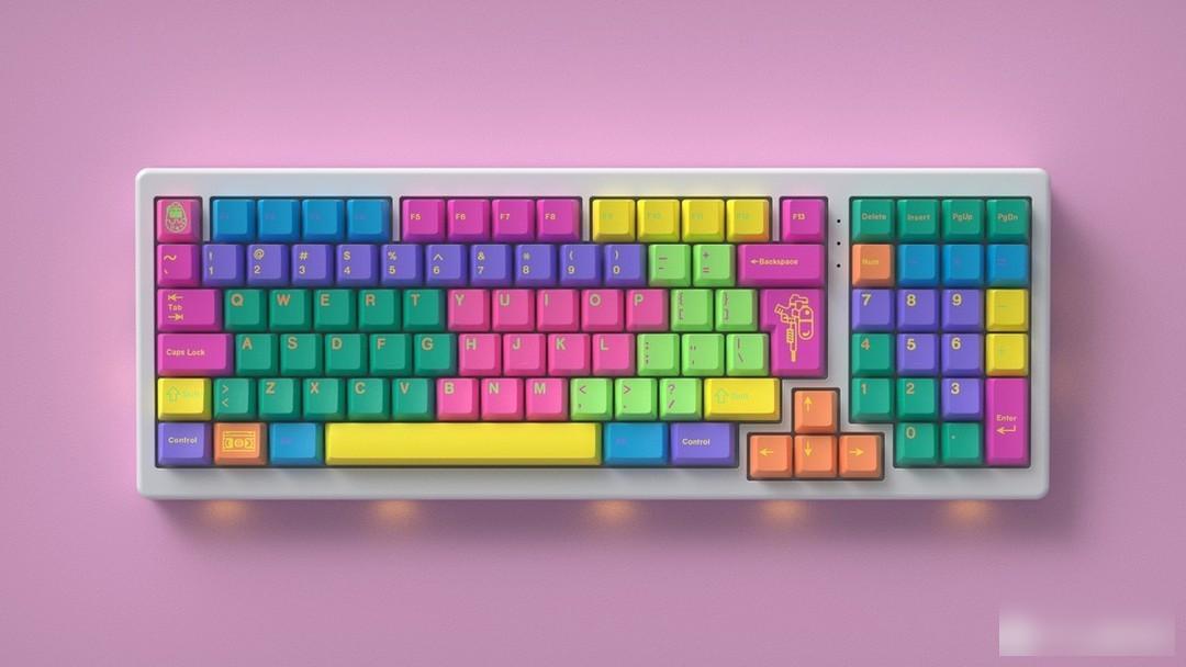
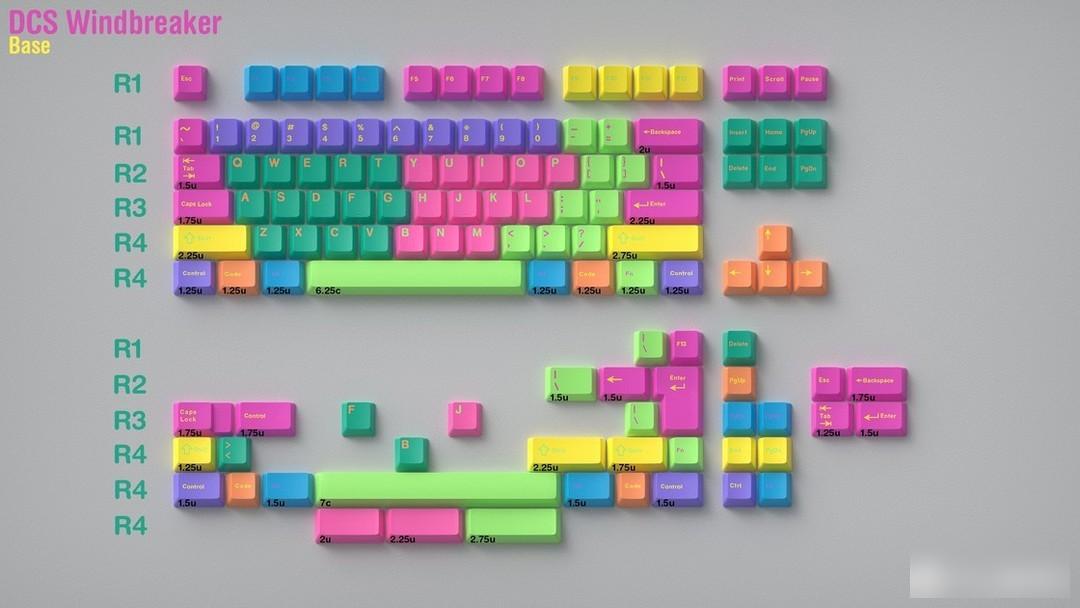
Return to the 90s and enjoy the fashion of windbreaker
This keycap was purchased by the designer "pwade3" in May this year. This keycap was originally intended to be produced by GMK, but due to the epidemic situation and factory queues in the past year, this set of keycaps has been delayed. To advance, so in May of this year, it was replaced by SP for production, but it is neither the SP signature SA height, nor the well-known flat-chested low ball cap DSA, but the DCS height, and the height of SP is the closest to the height of the original cherry factory. The keycaps are at a high and low ergonomic angle. However, what puzzles me is the construction period. Logically speaking, SA should have the largest proportion of molds and machines as the signature height of SP, but the construction period of DCS is much faster than that of SA. This keycap is expected to ship in Q2 of 2023.
Speaking of the keycaps, the theme of this keycap is the windbreaker, which is different from the windbreaker first. The trench coat and the windbreaker are actually closer to straight men than the trench coat or the lightweight windbreaker of later generations. Combat suits - assault jackets, and now that the fabric technology is relatively advanced, there is no distinction between windbreakers and assault jackets.
Color matching:
Although more and more keycap designers are beginning to use three or more colors to design their works, this windbreaker keycap can definitely be called colorful among the colorful ones. From the color of the characters to the distribution of color blocks, this keycap The use of colors in the caps is really dazzling, but this keycap does not feel dizzy and messy visually. On the contrary, the use of color blocks in this keycap is amazing, and it is also very Playful and energetic.
Personality section:
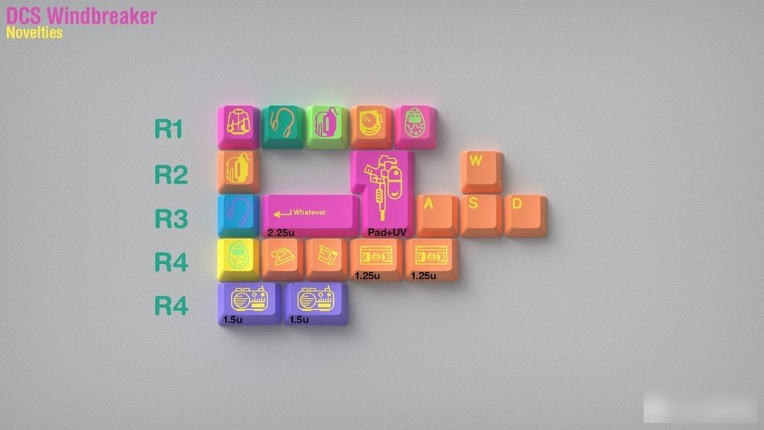
In the personality part, a lot of "trendy" elements of the 90s are used, such as walkmans, radios, tapes, and water guns. The design of this part may express some of the author's own "little selfishness".
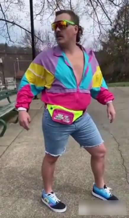
"Trendy Boy"
Rendering display:

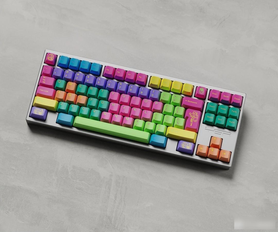
Keycap information:
Manufacturer: SP
Material: ABS
Process: secondary molding
Height: DCS Height
have a big adventure

This keycap is a "Dungeon and Dragon" themed keycap designed by "Zero-G Studio" designer "Zhang Duopang". The studio has also been active in the field of customization since the middle of 2020. At present, it mainly designs around keycaps, and there are also ideas for team-building kits in the future. Designer Zhang Duofang cooperated with DMK to produce three keycaps, "gift gift", "midnight", "Third Space third space", and this "Game Master" is the fourth cooperation keycap of their studio The cap is also the first sublimation keycap.
这款键帽的灵感来源于「龙与地下城 (Dungeons & Dragons)」,是一款奇幻桌面角色扮演(TRPG)游戏,也就是俗称的跑团。
Color matching:
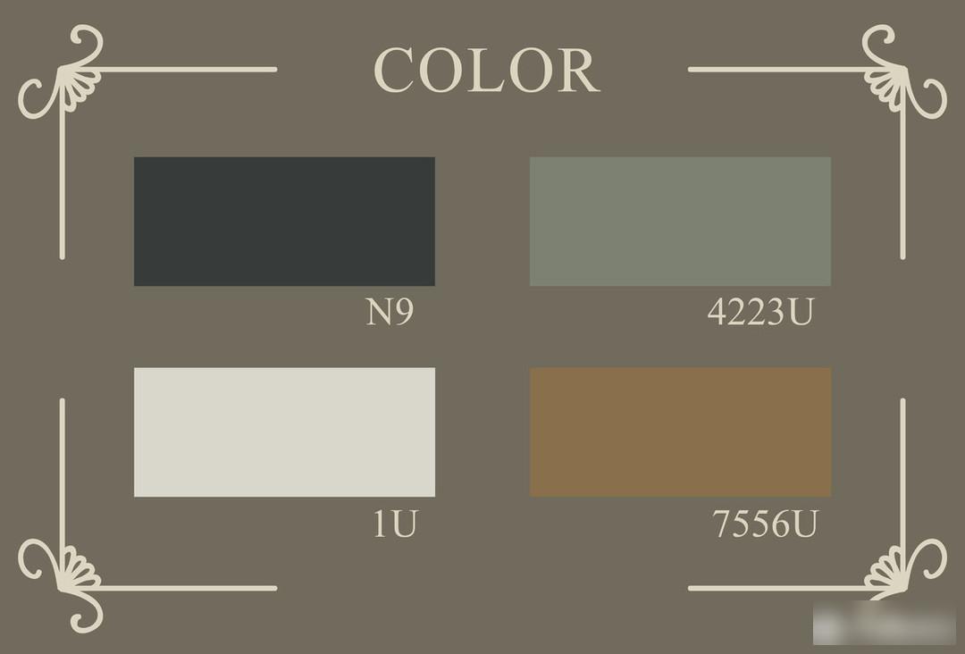
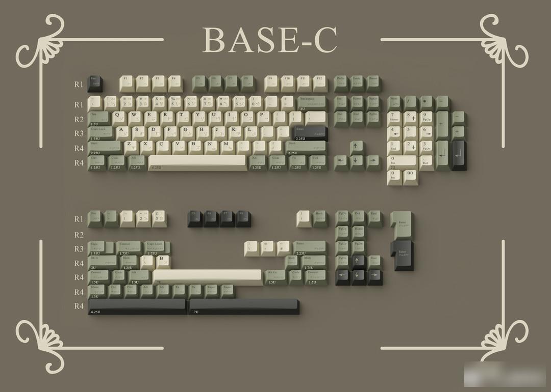
The source is the color matching of the sand table. The dense forest and the earth color similar to the parchment map complete the main color blocks of the theme. The graphite gray represents the city and the mountain.
The color matching this time is quite interesting. Usually, when you mention "Dungeon and Dragon", you think of magical landscapes and various magics, but this keycap is mainly based on terrain, creating a kind of Middle Earth. sense of the world. Green is similar to a deepened khaki color, which makes the texture a higher level. The old gray and white and the earthy gold embellished as the root are very good for the background. The graphite gray embellishment contrasts with the bright colors, and there are caves hidden in the dense tree world And the castle awaits the player to go on an adventure.

Radical design:
The root design of this set of keycaps is not the Japanese that is now full of streets, but "Dragon Language"
This time I used the serif font as the font of the Latin characters, and matched it with the dragon characters. I used dark gold to show the ancient and mysterious characters of the dragon characters. I believe this is also the first set of keycap design with complete dragon language characters you own, you can try to learn a few words of dragon language magic!
Draconic is a man-made language in "The Elder Scrolls 5: Skyrim". In the game, the language is spoken by dragons and the ancient Nords, who learned to use its powers against dragons.
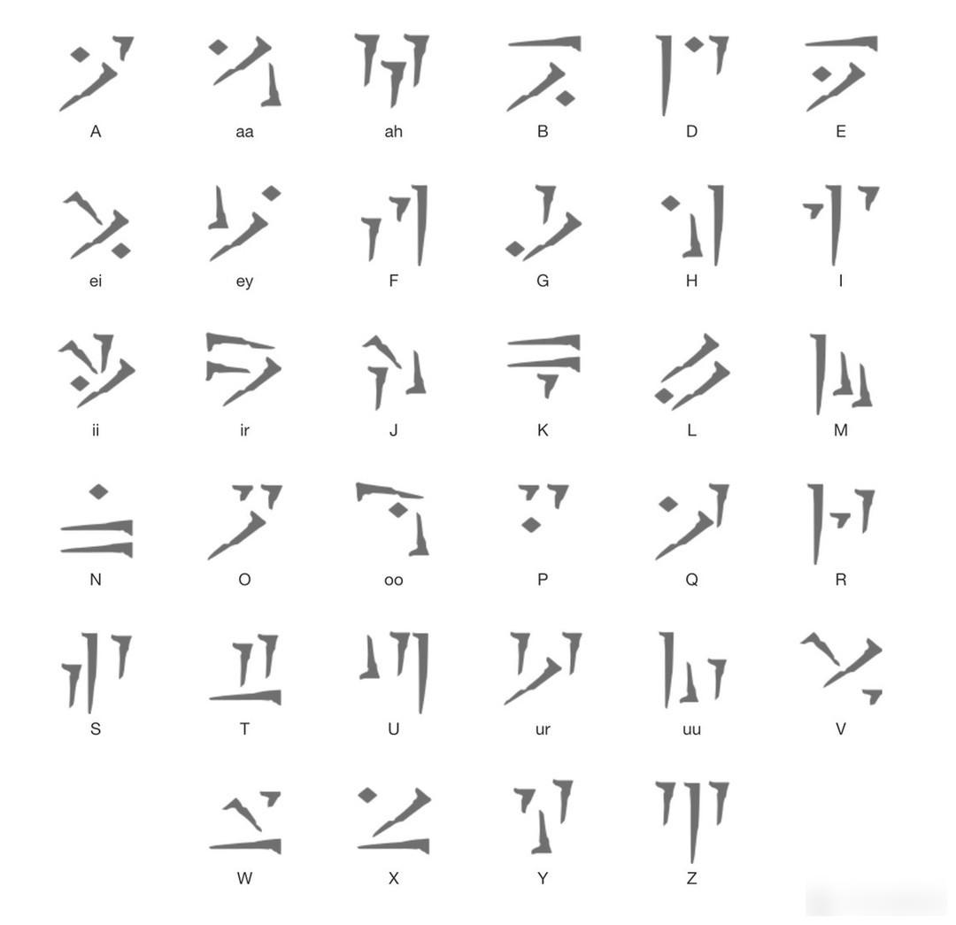
Dragon alphabet
Personality section:
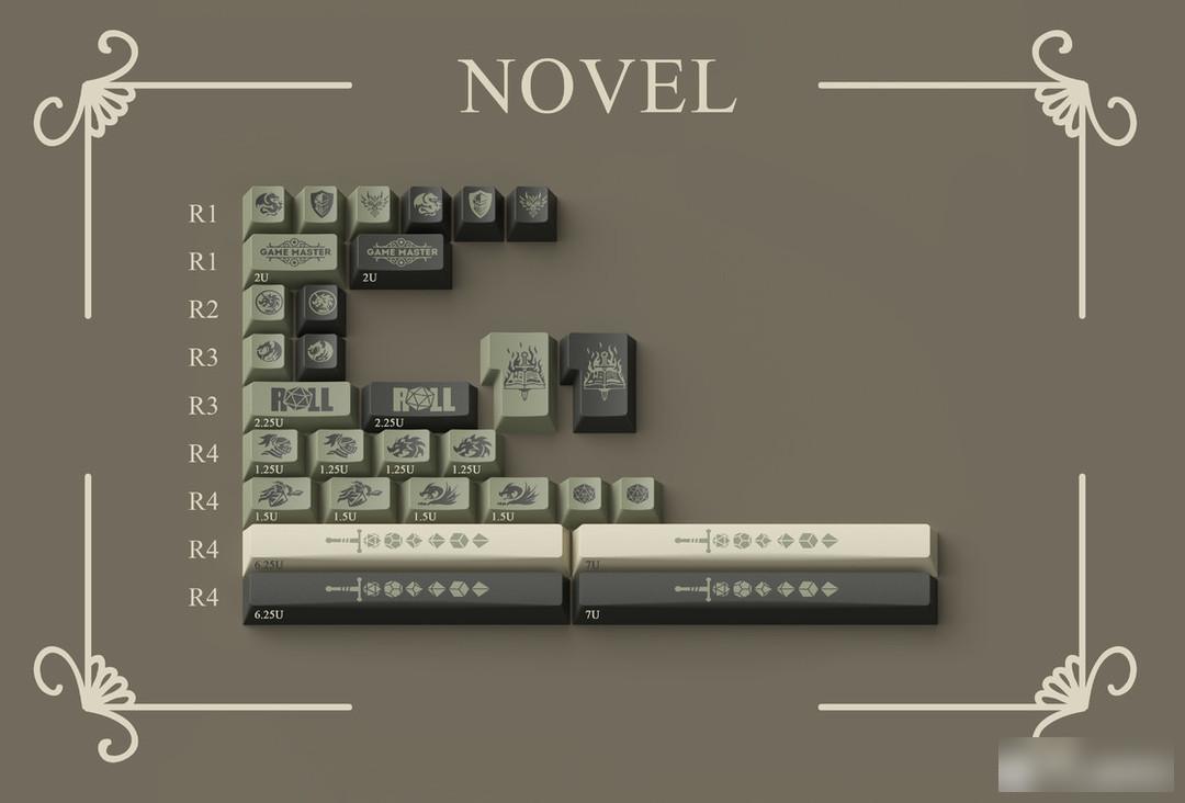
我们采用了游戏中最经典的龙与骑士的元素,搭配D&D系统中标志性的骰子以及”roll“的标语,以及整套游戏的核心三宝书!
It is worth mentioning that in order to advocate the protection of rare animals, I also designed an ICON that prohibits dragon slaughter, I hope you like it.
Different from the 6-sided dice of flying chess, which is widely known to the public, the complexity of the Dungeons and Dragons game makes the types of dice and the number of sides very different.
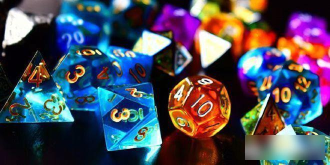
Holographic Aurora Resin
骰子代表了每一次互动的成功或失败,这使得骰子在D&D玩家中的地位堪比神明。
This element of chance means that many players who specialize in Dungeons and Dragons often develop a certain level of superstition about their dice, or associate them with a specific character, while also spawning a variety of personality dice .
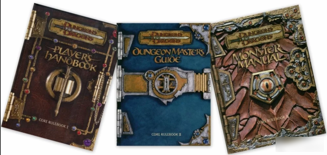
The so-called "Three Treasure Books" refer to the Player Handbook, Monster Handbook, and Dungeon Master Handbook.
The space design is also very interesting. The "weapon" in the player's hand is actually the cause and effect of each throwing point, so it is reasonable for the sword body to be composed of dice.
The following are some excellent real shots in the forum
Real shot display:
Le total shooting

Photo by SUEd1
blue sky shooting

Keycap information:
Manufacturer: Domikey
Material: PBT material
Process: sublimation keycap
Height: original factory height
This time I will share so much first, and there are still some keycaps that have not been included in the statistics for the time being, and some interesting designs will be added later when there is a chance.
Factory Adress: No.11,FengpingRoad