"Customized keyboard丨Buy and wait and see" retro trend and several second-generation and customizable side-engraved keycaps
This article only represents personal views, and is used to record and watch some keyboards.
The color card should be based on the real object, as sublimation will produce deviations.
The personal scoring part is a subjective part, and will be scored according to the manufacturer's status, design, and personal preferences. It is for reference only.
keycap
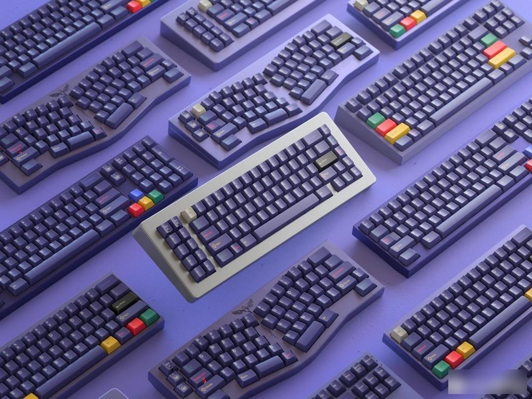
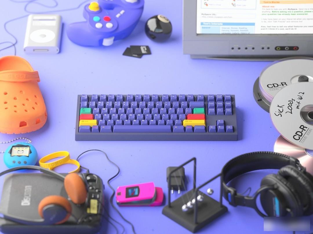
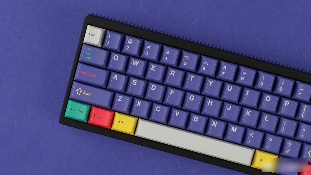
Domikey
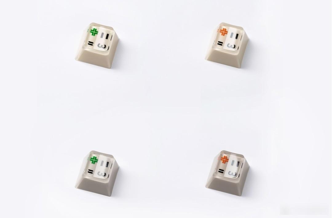
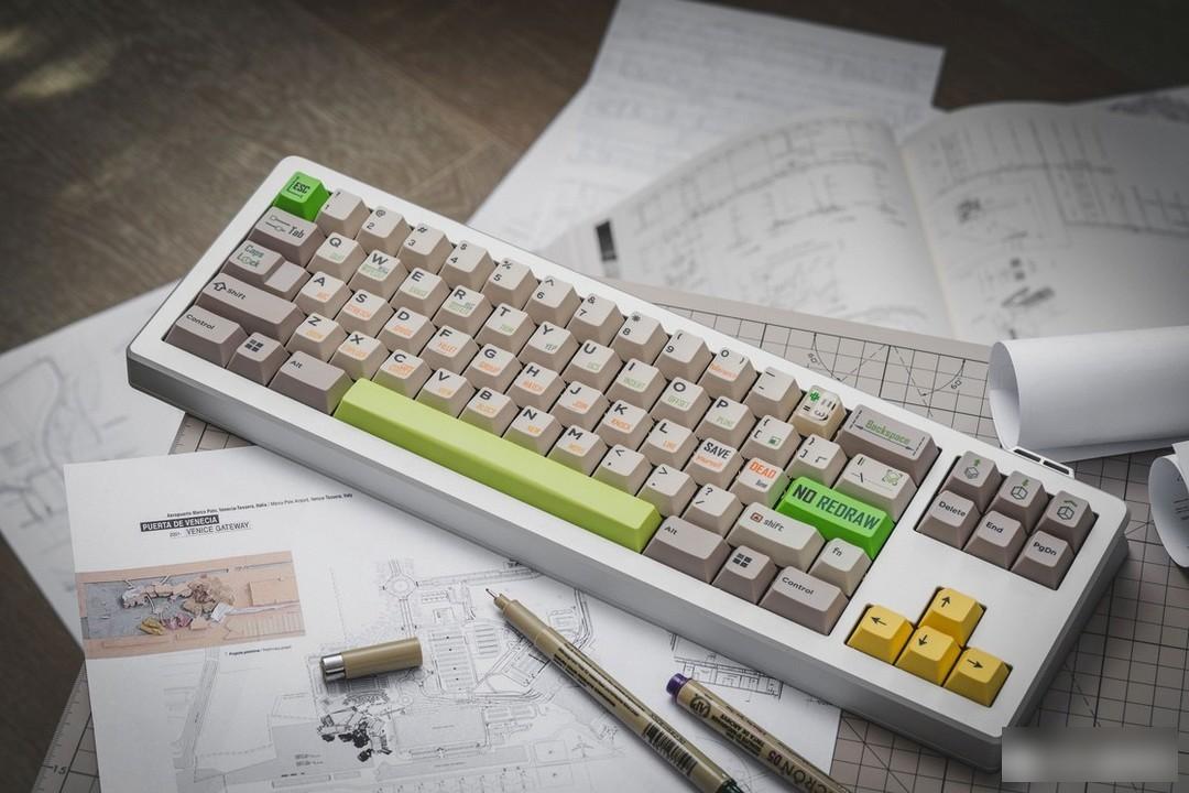
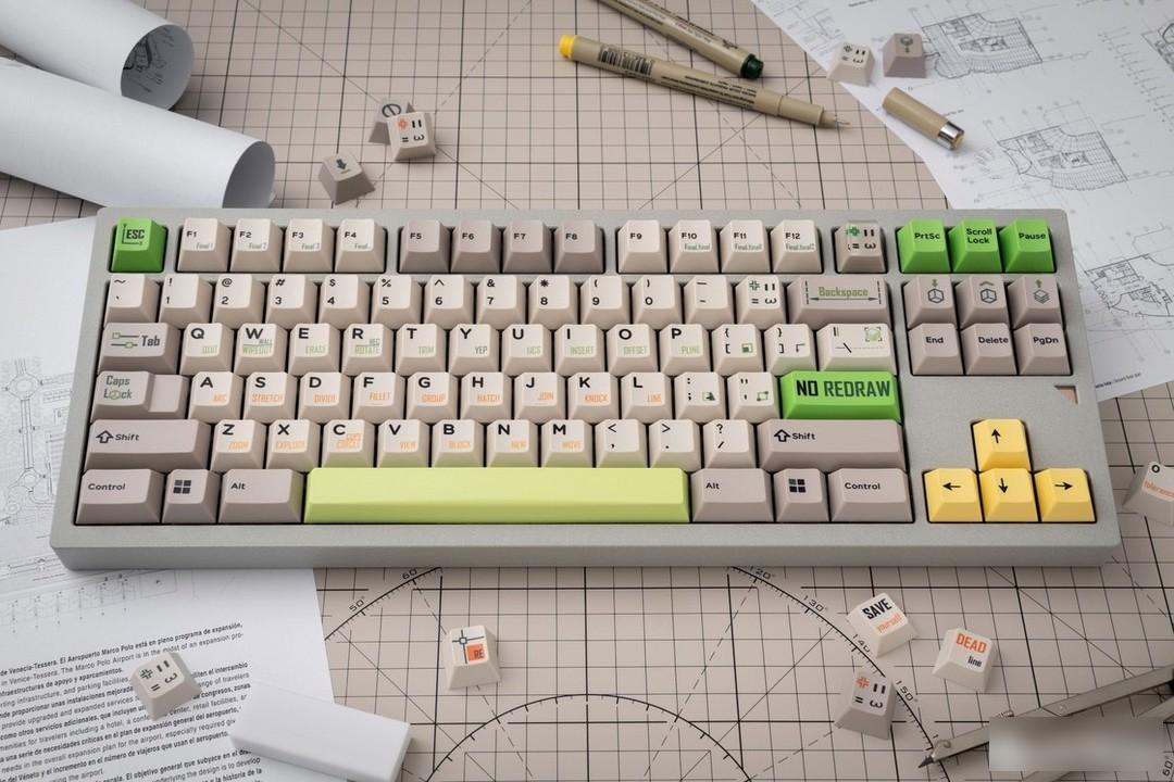
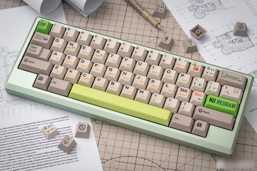
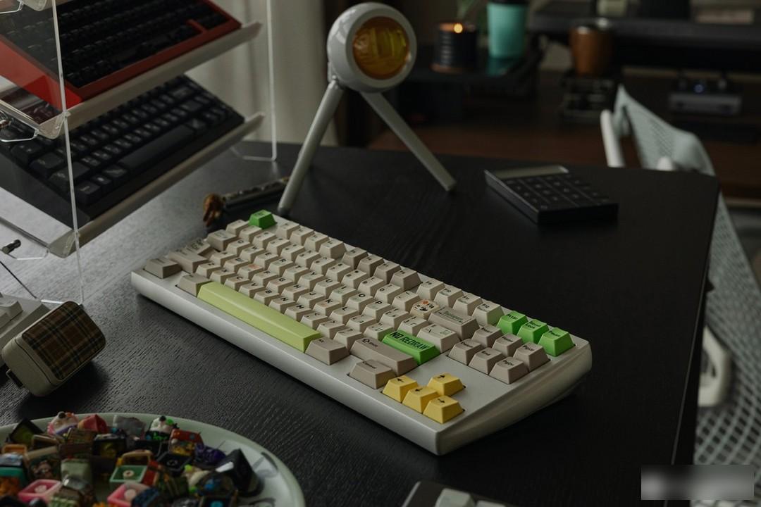
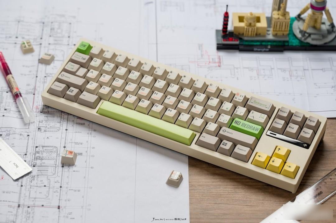
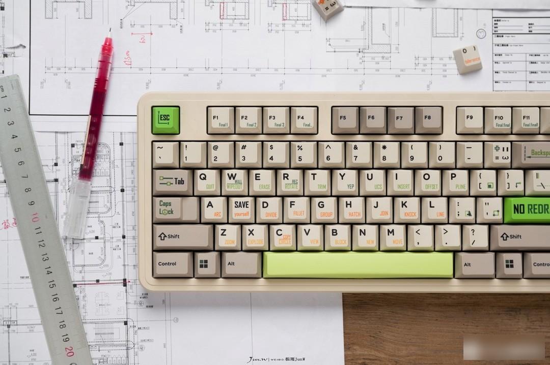
The CAD that was previewed in June last year finally landed successfully recently!
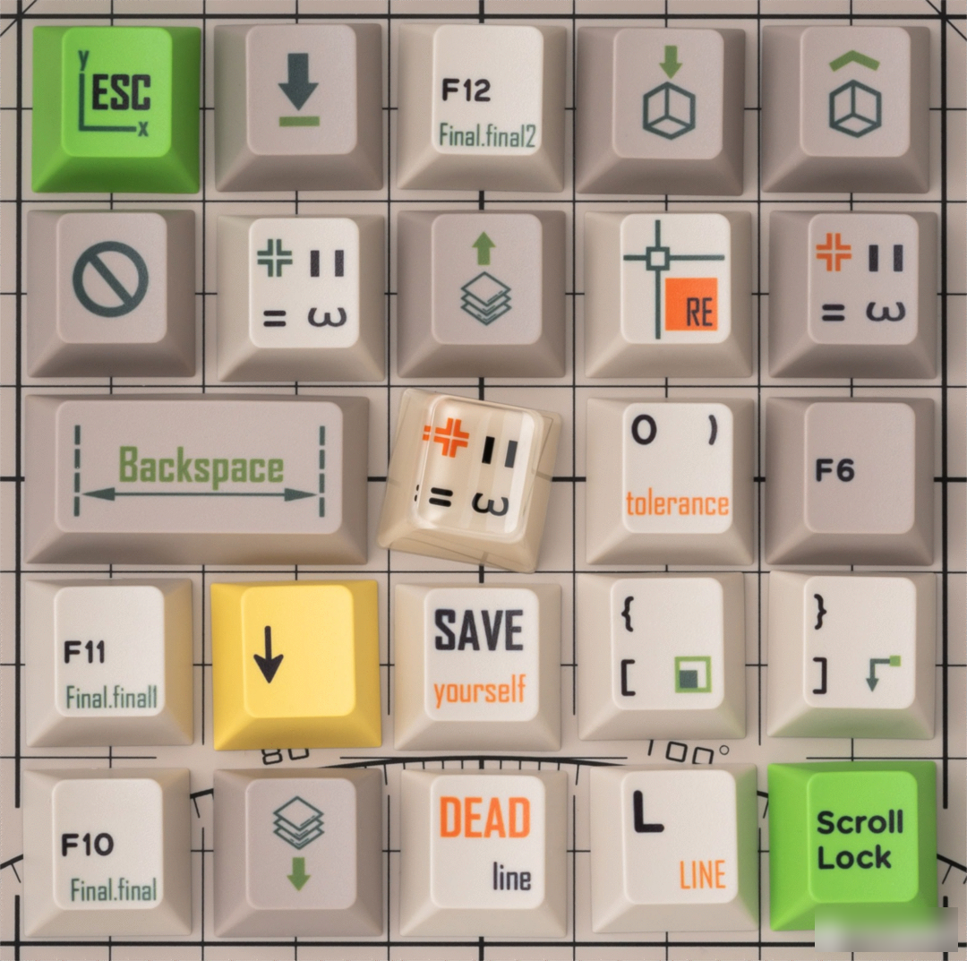
Retro: ND REDRAW cad-Ver丨Retro: no redraw cad version
I really don't want to draw anymore
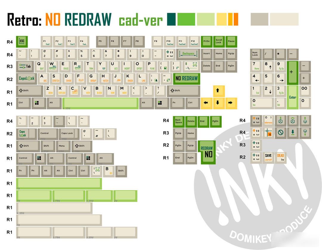
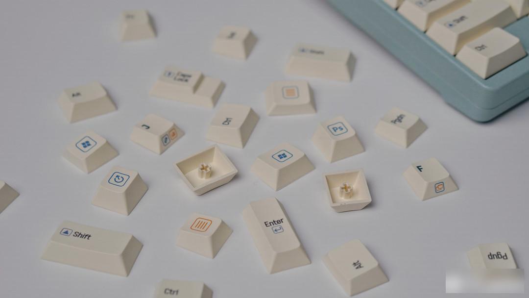
This keycap is a software-themed keycap designed by Headphone Fox, the designer of INKY Studio, inspired by the drawing tool CAD.
"The main theme expresses the sense of retro, supplemented by CAD elements, adjusted by drawing dog's daily work stalk"
Color matching:

Use light gray and light yellow-white as the base color of the keycap, match with black characters, supplemented by dark green, light green, light yellow, bright yellow, orange yellow and orange as root embellishments to add brightness, the overall tone looks retro, In fact, it is quite modern, fresh and natural, full of vitality, and at the same time, the overall contrast is strong, and the root effect is outstanding.
Personality section:
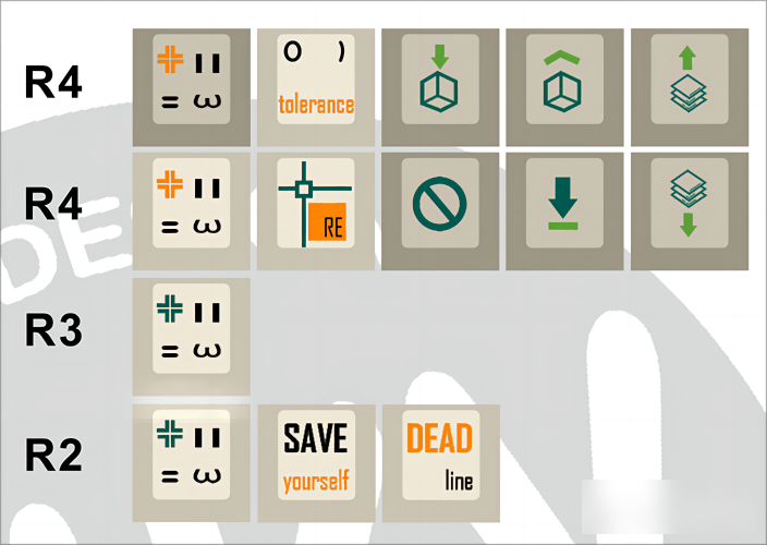
The personality of this set of keycaps is mainly focused on the root position of the keycaps, and some shortcut keys and tricks have been made. Among the pattern personality, the most eye-catching one is the head of the angry cat.
Resin personality:
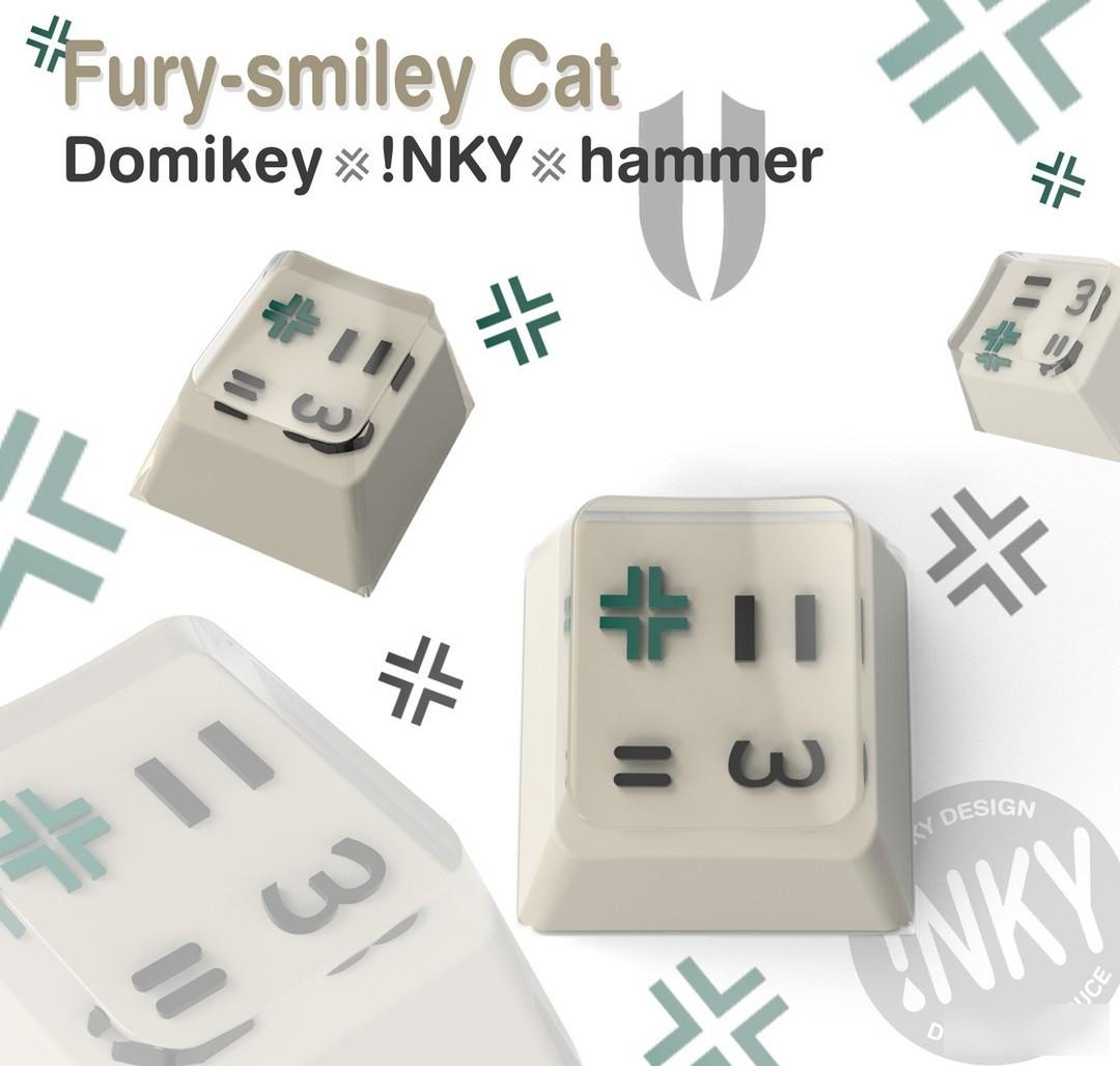
Resin personality crafted from a hammer and a fun, angry cat head.
Real shot display:
summer wood
blue sky
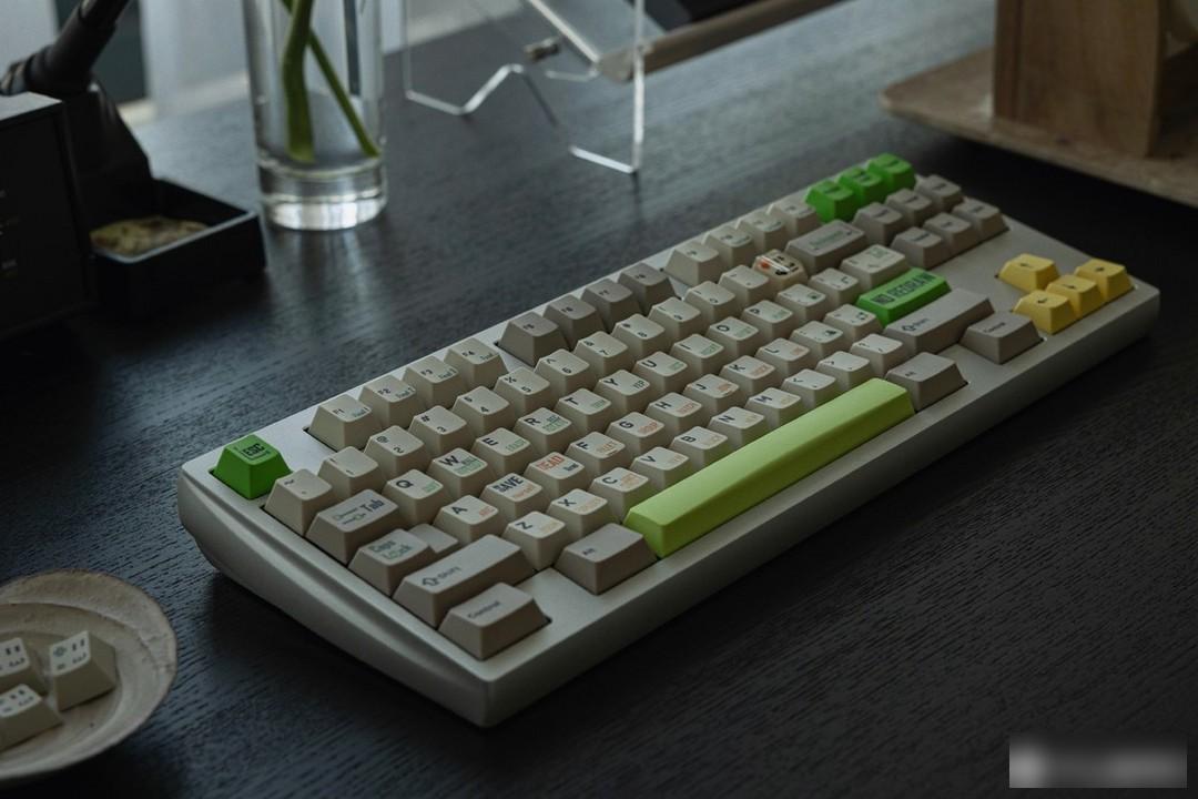
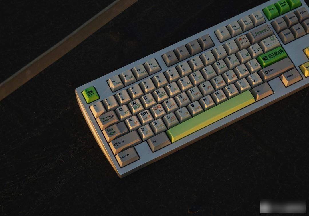
wolf peach look around
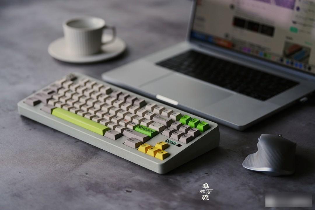
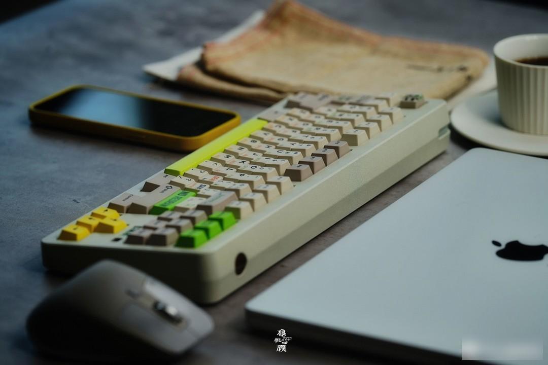
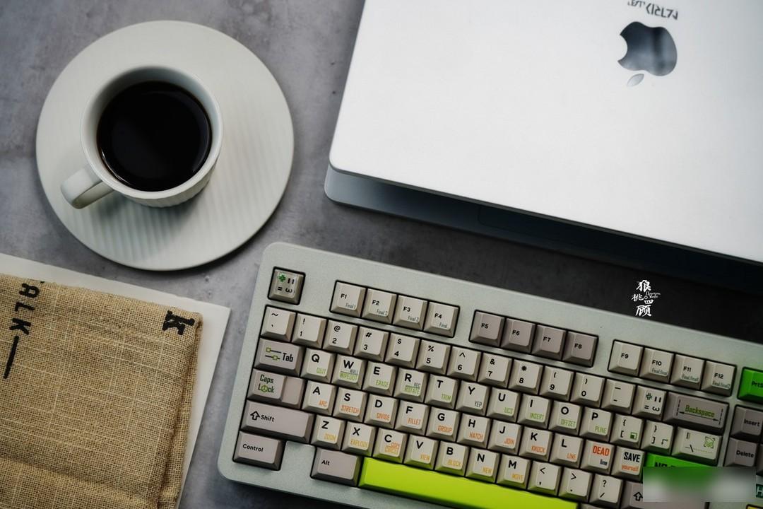
桭雨JunW
Keycap information:
Material: PBT material
Height: original factory height
Process: sublimation keycap
Personal Rating: 7—9
Retro tone, but not old-fashioned, the embellishment of the big green key makes the overall vitality, the essence of the angry cat head, but there is one thing that is a pity, it would be better if the font part can also be adapted to the theme, and the original DMK is used The font on this set of keycaps is still a bit of a show.
Purchase suggestion: 500 sets are sold out
The retro gray and white base is still very versatile, and it is a good choice to match milky white and silver.
GMK
The old group purchases have been shipped one after another, and it is not known whether the follow-up products can speed up the output.
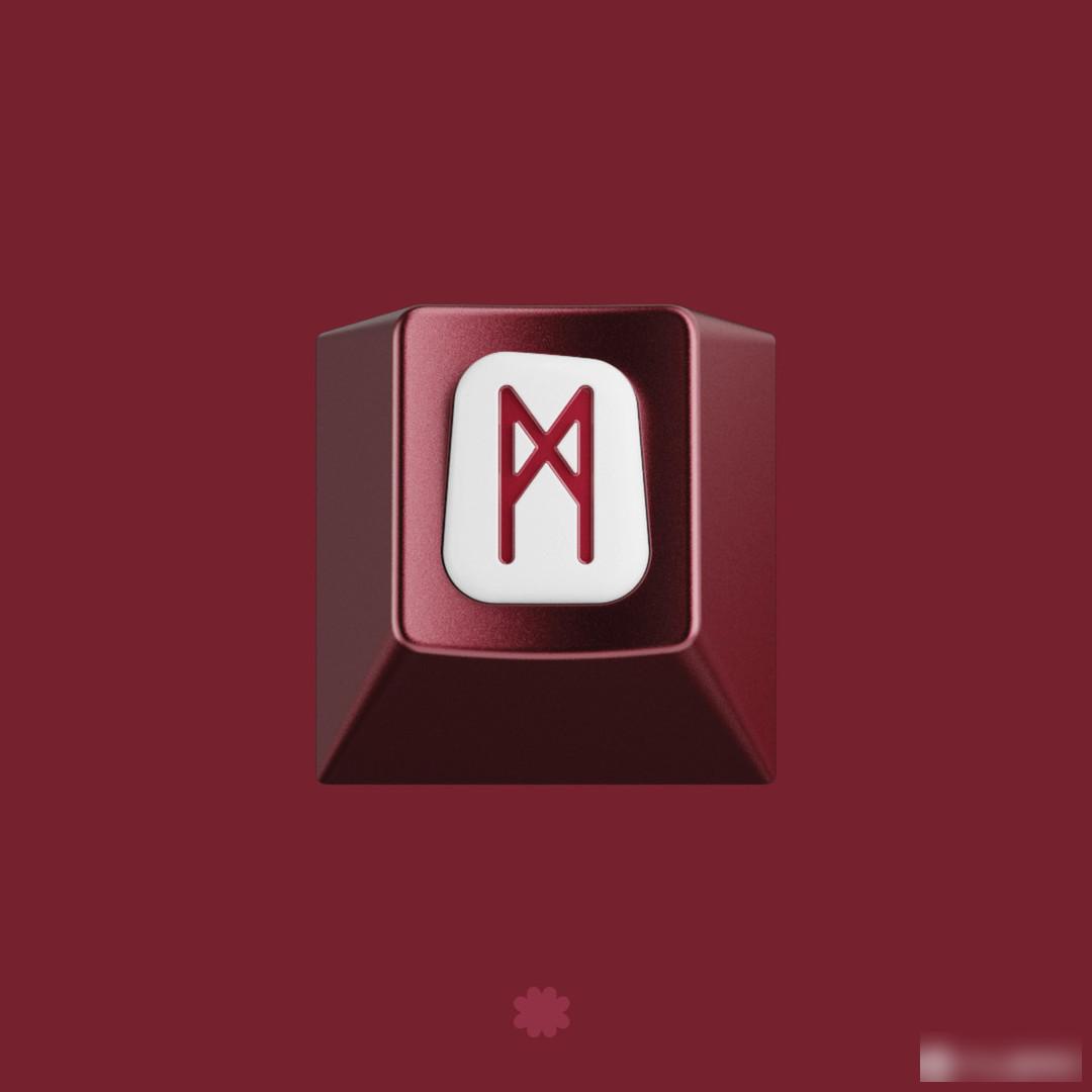
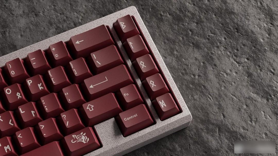
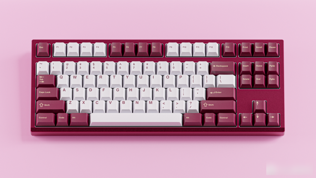
Blot blood sacrifice
swear by blood

This keycap is designed by the designer MANU, inspired by the Nordic blood sacrifice ceremony. The designer also designed DMK eraser before.
"In the cloud of blood, make an oath."
Color matching:
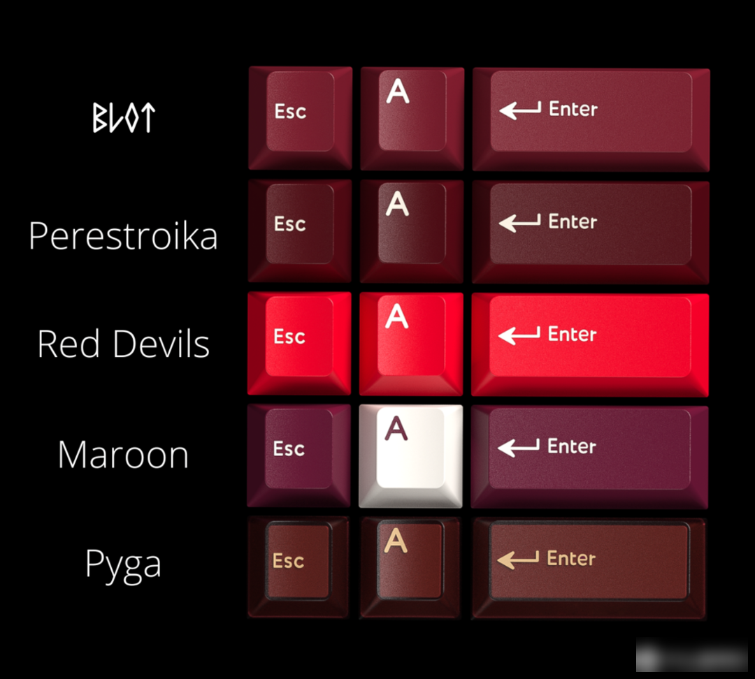
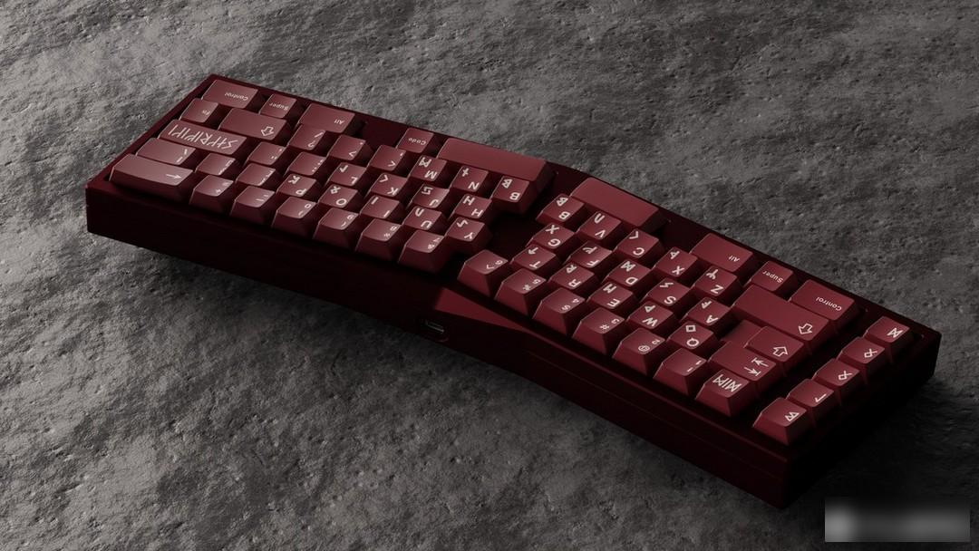
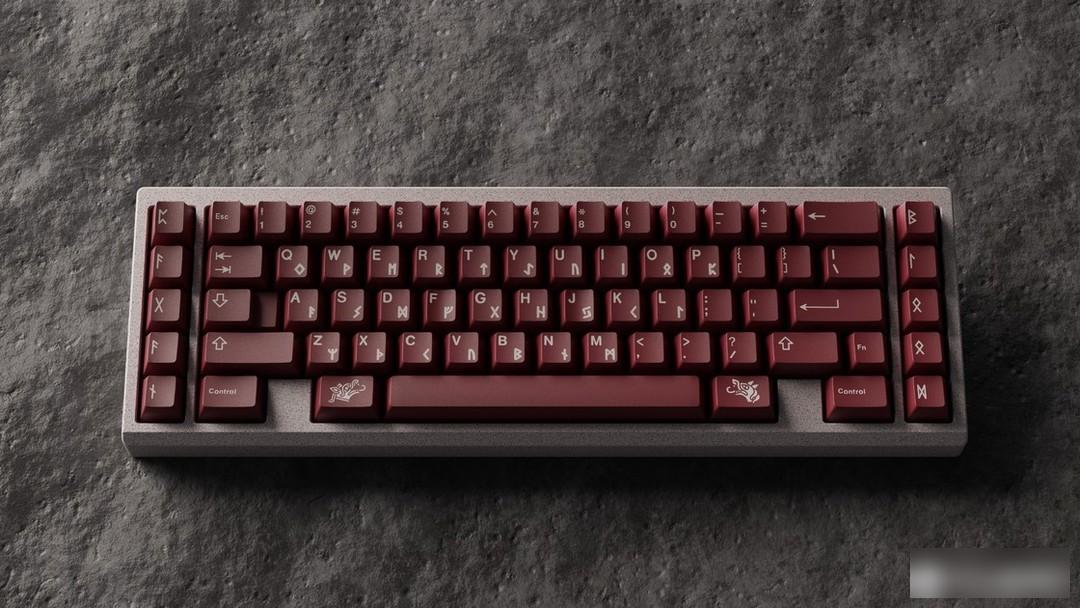
This is a set of solid-color keycaps. A red color with obvious wine red characteristics is selected, which can be said to be dark red, deep wine red or brown red. Compared with the color of blood, this color is deeper and more saturated, with a mysterious feel.
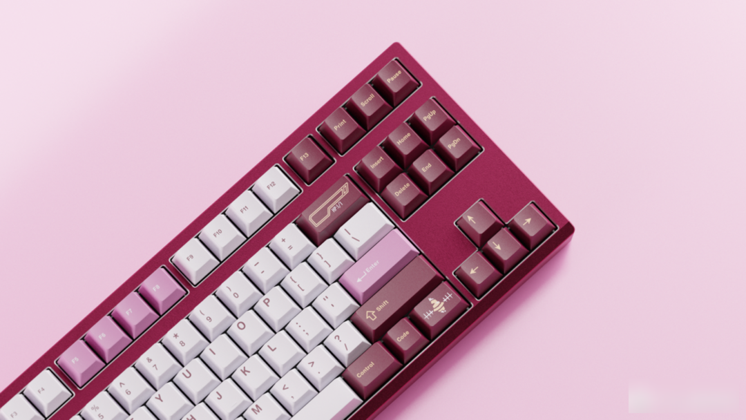
Radical:
The theme is inspired by the blood sacrifices in Northern Europe, and naturally the ancient texts in the Nordic region - runes!
Personality section:
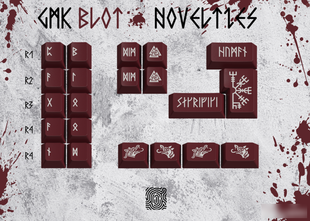
The personality is designed with a large number of rune letters and animal heads. Although I can't understand any of them, it is full of mystery.
Animal heads, such as wolf's head, pig's head, etc., are considered to have special symbolic meaning in Nordic culture, and are used in blood sacrifices as ritual objects symbolizing sacrifices and gods.
Seeing this personality, I will think of another set of keycaps - GMK Norse North. However, in comparison, I personally feel that Norse's personality design is better, the content is richer, and there is a handsome big axe.
This version of the personality rune text did not find an explanation in the IC post, but I contacted the designer and got their answer.

Column 1 TX means pagan, column 2TX means blood, Esc means death, backspace means human, carriage return means sacrifice.
Metal keycaps:
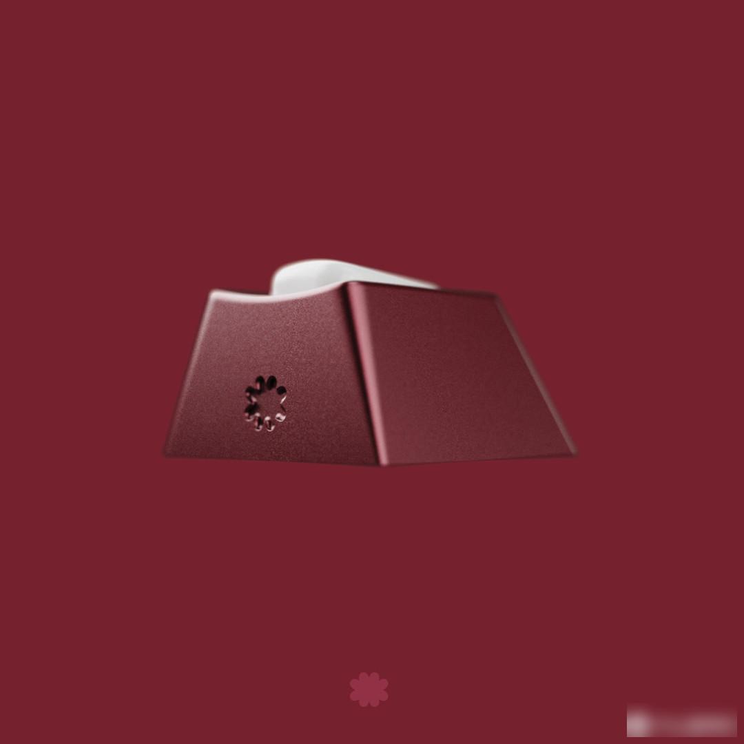
Rendering display:
Keycap information:
Material: ABS material
Height: original factory height
Process: secondary molding keycap
Personal Rating: 7—8
The color is very poisonous, but lacks some changes, the personality is very handsome, but the versatility is less, but I personally still like the decoration of the runes very much.
Buying advice:
It is a good choice to match silver, black, red and some dark keyboard cases.
GMK ³ Cubed cubic
dream back to the millennium
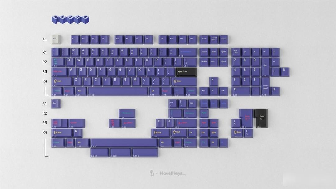
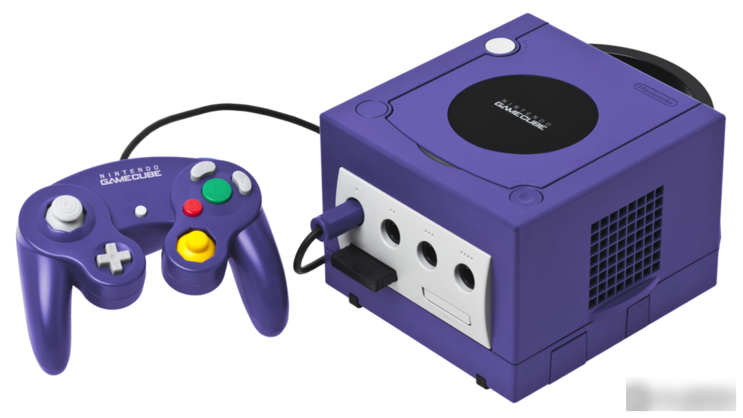
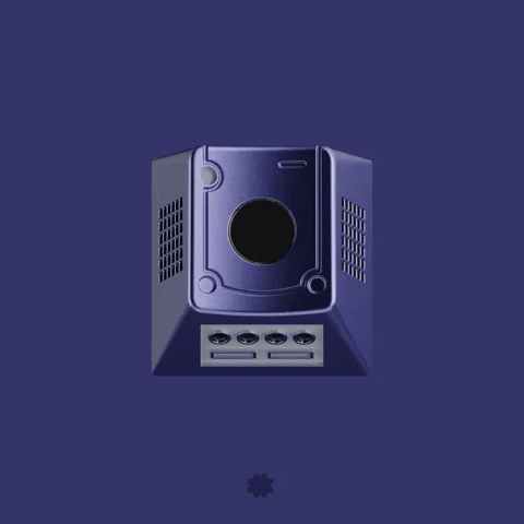
This keycap is a game console-themed keycap designed by designer MrBingo (Mr. Bingo), inspired by the Nintendo GameCube. The designer has previously designed GMK thick milk matcha
The main color of this host is purple, which is unique. However, it failed to restore the market share of the former Nintendo 64. Sales have been weak throughout the console's lifecycle, lagging far behind rival PlayStation 2.
In addition to lower sales than expected, the GameCube also gave birth to many classic games, such as "Pikmin" and "Little Robot", which later became Nintendo's hit games. In addition, some games later spawned multiple sub-series, such as Metroid Prime and Luigi's Mansion.
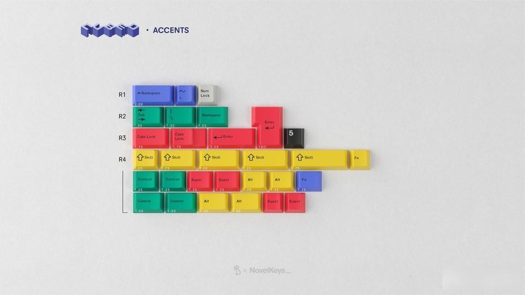
Color matching:
Light Grey, Dark Grey, Bright Yellow, Bright Red, Dark Blue Purple, Bright Green.
The color is taken from the color matching of the host handle, with dark blue and purple as the main tone, and light gray characters, with strong contrast and unique style.
The rest of the colors are used as supplementary embellishments
Personality section:
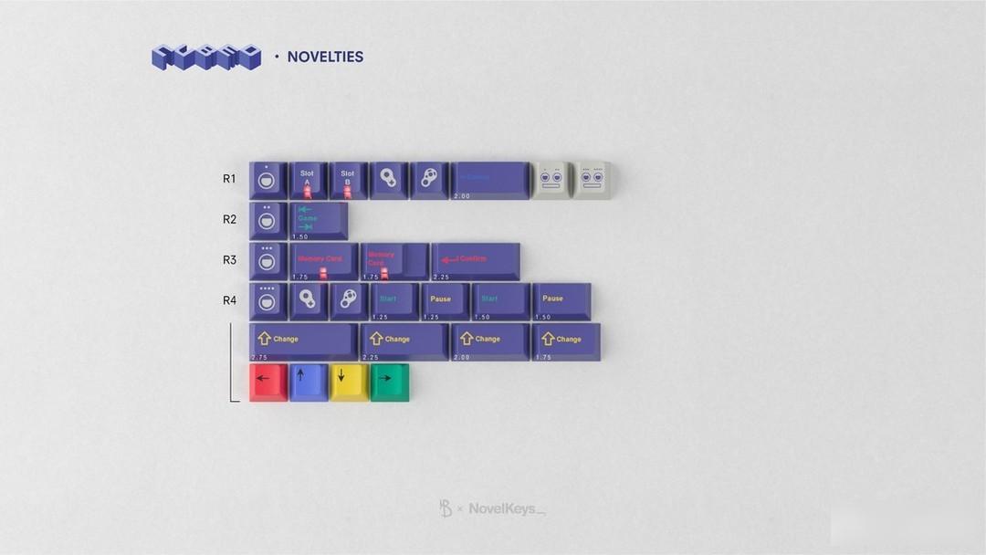
The personality part is quite interesting in design, the classic handlebar handle design, buttons, and several classic indicator words, as well as multi-color supplements for the corresponding buttons, and the lamp cap adds to the retro flavor.
Metal personality:
Rendering display:
Keycap information:
Material: ABS material
Height: original factory height
Process: secondary molding keycap
Personal Rating: 5—8
This keycap can barely be regarded as a secondary creation keycap, and there will be higher requirements for the secondary creation keycap. In terms of color matching, it is in the same line as the Gay Purple GameCube. Multi-color additions make the overall look not monotonous. The individual design is interesting and makes people smile.
Buying advice:
In terms of matching, the matching range of this keycap is limited. It is recommended to match it with purple, black, silver, and dark blue keyboard shells. Some bright color combinations may also have good results.
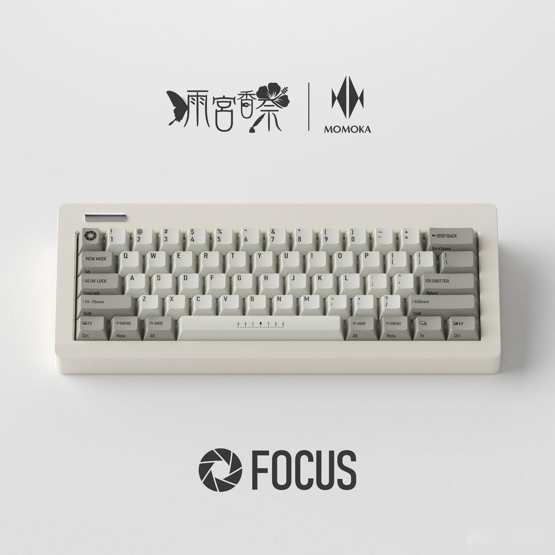
MOMOKA
Through the cold winter, momoka also brought some new works
character drawing
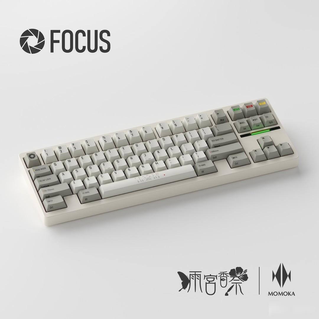
FOCUS
PLEASE "Focus" put your camera on the keyboard!!!
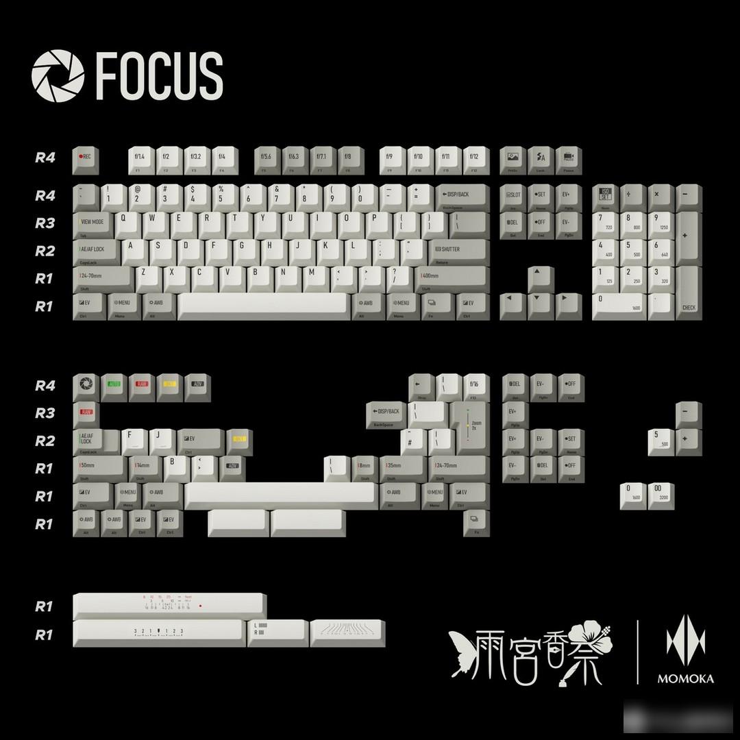
This keycap is a retro camera-themed keycap designed by designer Kanai Amamiya, with Leica cameras as the main conception direction.
It is not an old film machine, but a retro machine with modern and powerful functions, which just corresponds to the preferences of many key circle players.
"Lycra, timeless classic"
Color matching:
Retro gray and white with red, yellow, green and black as embellishments.
An off-white palette can convey a sense of simplicity, cleanliness and modernity, which can be very useful in many designs, especially when you want to accentuate other elements. However, if you want to convey a more emotional design, a pure gray and white color scheme is not enough. Although the embellishment of red, yellow and green can indeed add some interest, this color combination still lacks some novelty.
Personality section:
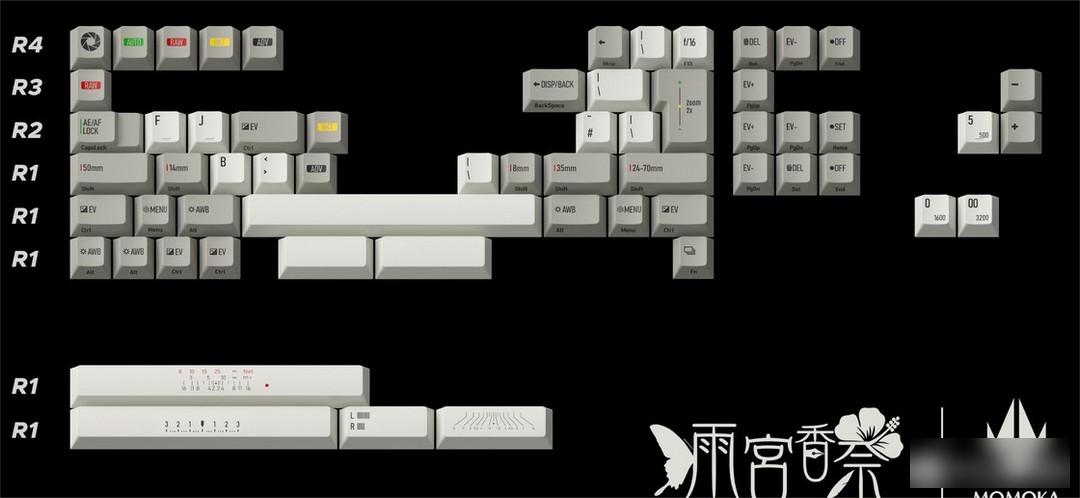
The design logic of the function area and supplementary keys of the whole set of keycaps is "the keyboard has the operability of a camera", and the letters of the function keys are replaced with the functions of the camera, and the computer functions are presented in the form of side engraving.
For example, the F area on the top is converted to the f value of the aperture, the screenshot key is equivalent to the landscape mode, the original icon of the Fn key is very similar to the camera’s continuous shooting function icon, etc.
You can even set the ISO value in the digital area, and the decisive function of Enter, of course, is to use the shutter as the protagonist.
"I thought about what function to replace Shift with for a long time, and finally came up with it"
It is the keycap with the most variable length, just corresponding to the lens with various lengths
Therefore, I designed Shifts of various lengths corresponding to the focal lengths of various lenses
From the shortest super wide-angle to the longest super telephoto, fixed focus, zoom...
Maybe one of the focal lengths is lying in your moisture-proof box!
Rendering display:
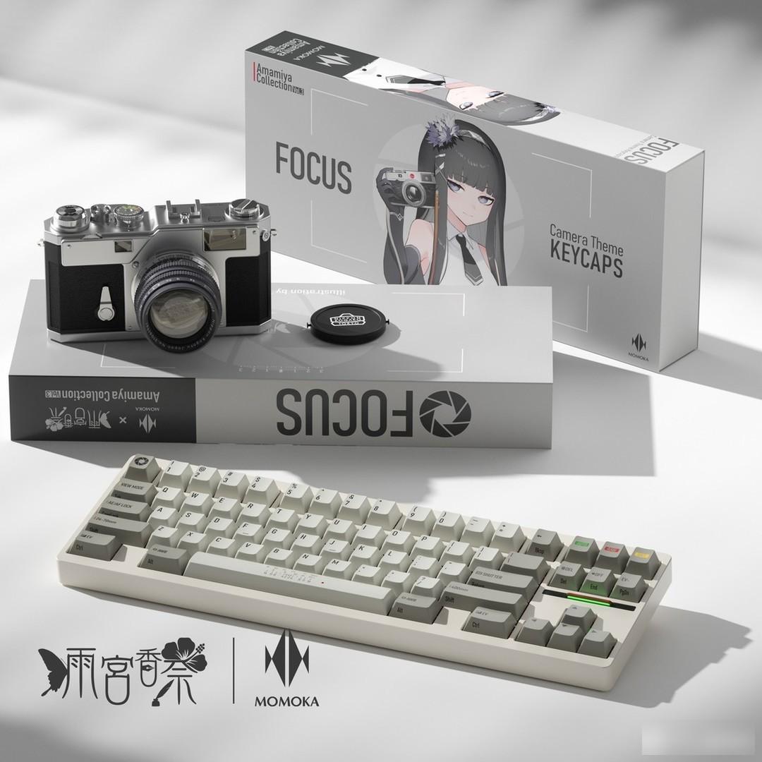
Keycap information:
Material: PBT material
Height: original factory height
Process: sublimation keycap
Personal Rating: 6—7
Although the details are very careful, and the thinking and design of shift are also very interesting, but the color matching is still a bit mediocre, retro, camera, operating system, although these elements are indeed related to a certain extent, can they be combined? To make a good work through mastery, you still need to think more. In fact, you don’t have to have a gray and white color scheme to do retro, and the retro styles are also very diverse.
Buying advice:
Players who are interested in the theme of retro cameras can consider buying it, and the matching range of gray and white colors is very wide.
WSPBT
Wucai also started to make keycaps. There are many kinds of them, but they are not cheap.
Soso's Kit Violetta
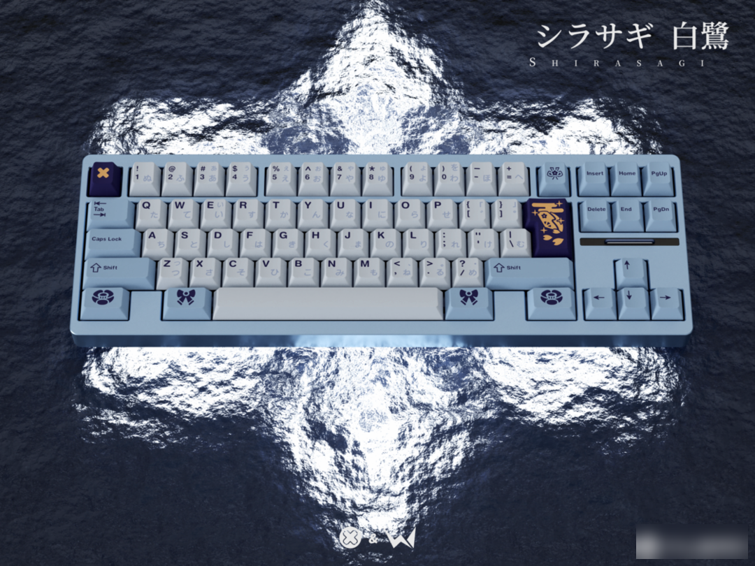
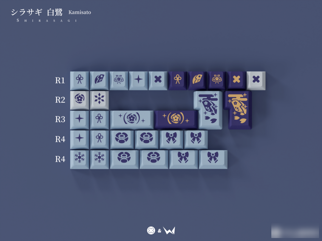
egret princess
Waiting for the clouds to clear and the snow to come, Fang feels that spring has arrived
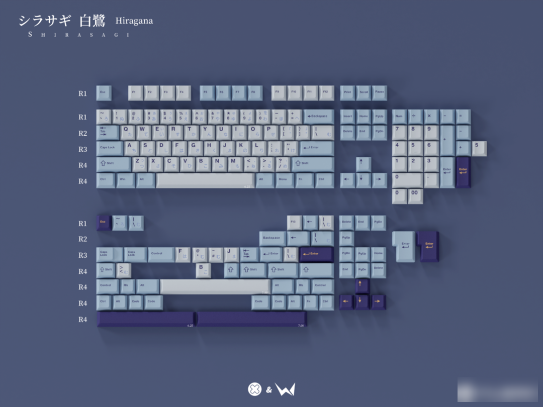
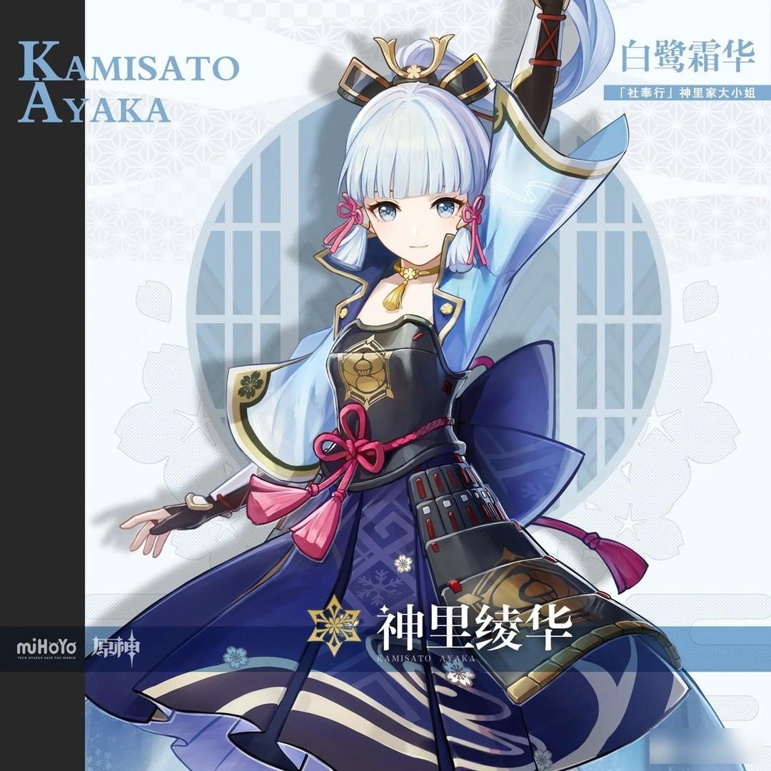
This keycap is a secondary creation keycap designed by designer Soso, inspired by the popular character "Kamizaya Ayaka" in "Original God"
character drawing
Color matching:

Simple extraction, non-final color card
light blue gray, light blue, steel blue, teal, light yellow
The overall collocation gives people a bright, fresh, mild and calm visual effect. At the same time, as an embellished supplementary button, the introverted, deep and light yellow are used to create a strong contrast and make the whole collocation more obvious. and highlight.
Personality section:
Personality design is actually an old-fashioned problem. It is often difficult to highlight the author's own design style in secondary creation of personality design, and it is easier to fall into the problem of homogeneity than complete originality.
The personality design this time is still based on the character's clothing and skill characteristics, but the design of the seventh round is quite good, and it is very ornamental, while the others are quite satisfactory.
Rendering display:
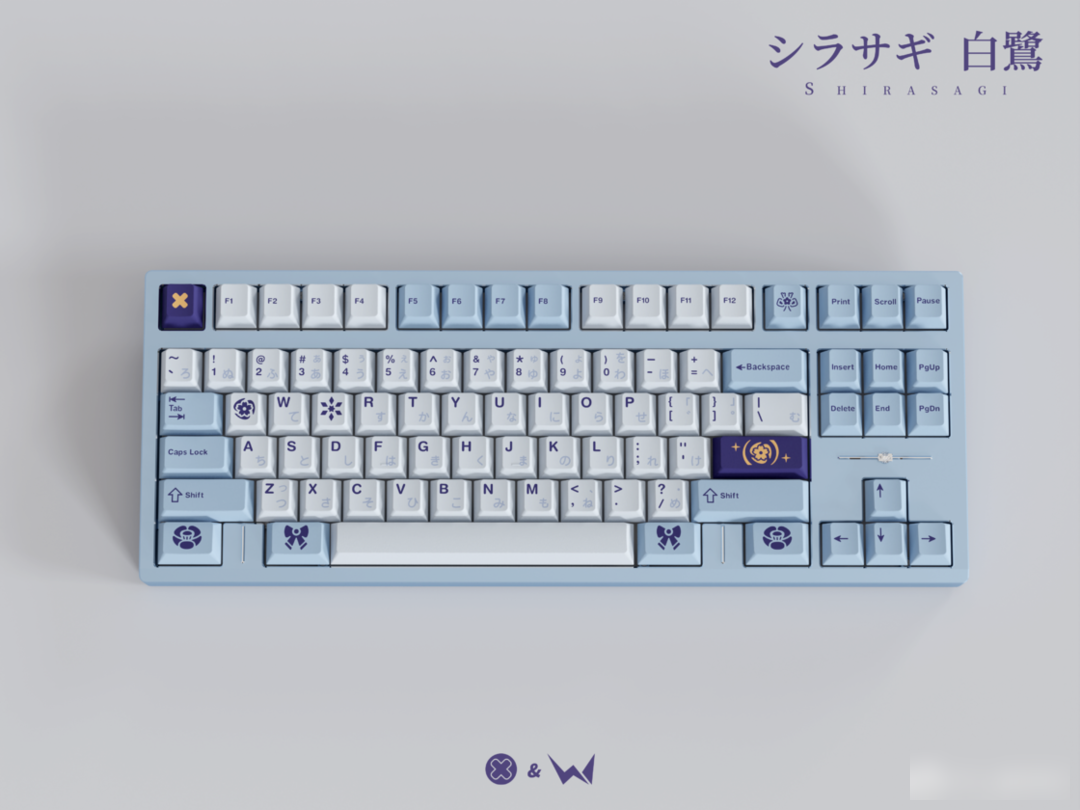
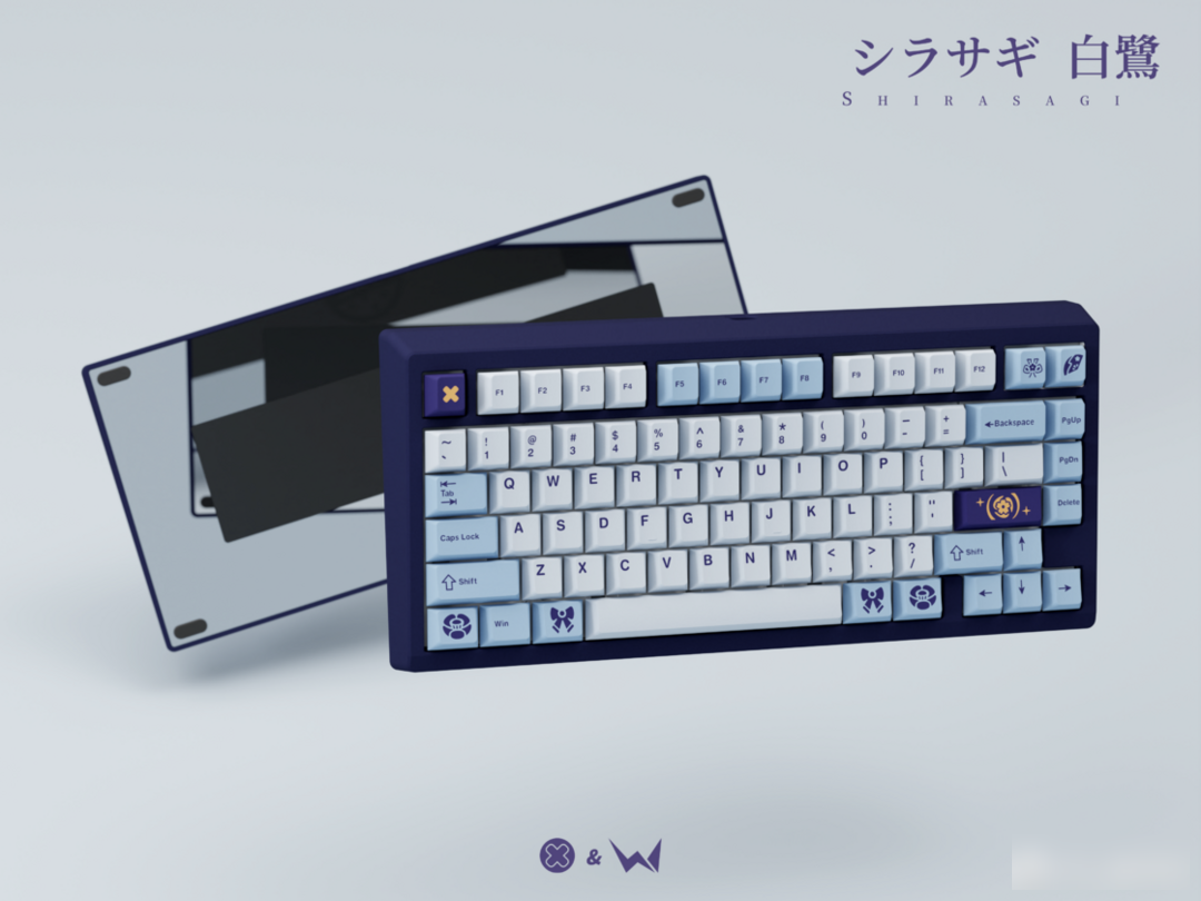
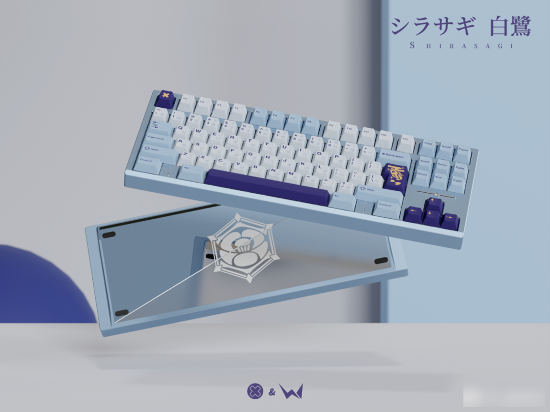
Keycap information:
Material: PBT material
Height: original factory height
Process: two-color injection molding
Personal Rating: 5—6
There will be higher requirements for the secondary creation of keycaps. In terms of color matching, this keycap is still a relatively common character color design, but the addition of dark cyan feels that the span is too large, neither completely reversed, nor The gradual color scale, maybe the physical color card will be adjusted in the later stage, hoping to make it more harmonious. Except for the seven chapters, the other personality designs are still a little mediocre.
Buying advice:
Currently only IC, waiting for GB follow-up
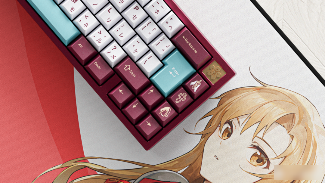
Senkou flash
LINK START!
This keycap is a secondary creation themed keycap designed by the newcomer designer Keepo, inspired by the heroine Asuna, a model worker in "Sword Art Online".
table mat
Color matching:

Lilac White, Sweet Cherry Red, Candle Yellow, Golden Oatmeal, Morning Glory Pink, Aqua Green. The colors are taken from the character's clothing traits. The red and white base color is a relatively classic combination, giving people a soft and warm visual experience, and the sallow yellow embellishment does not seem obtrusive.
Personality section:
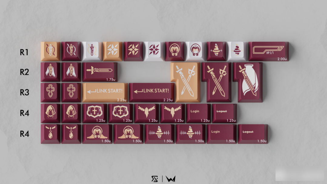
The individual patterns are mainly designed around the chapters of Aincrad in volumes 1 and 2 of the library edition. The character's sword "Shining Light", Kiritani Kazuto's sword "Interpreter", and some character appearance decorations and blood bars are full of design elements of the game. However, the repetition of elements is high. The image of the sword alone occupies about 1/3 of the pattern design, and it does not escape some problems of secondary creation, lacking personal style.
Rendering display:
Keycap information:
Material: PBT material
Height: original factory height
Process: Dyeing "full sublimation"
Personal Rating: 5—6
There will be higher requirements for secondary creation keycaps. Although it is a set of warm color design, it still does not reflect personal style like most secondary creation keycaps. The color matching is quite satisfactory, but there is a comparison with Soso’s set The good thing in common is that the matching is relatively simple, and the color of the keyboard shell is not too picky.
Buying advice:
Currently only IC, waiting for GB follow-up
Process question:
The so-called "comprehensive sublimation", after observation and analysis, I personally guess that this process is actually a dyeing process, similar to dip-dyeing keycaps. According to the "camping" sold overseas, this process was previously used by Mi Kewei in keycaps. It is also used on "Nezuko". The process principle is as follows:
Dyeing Buy disperse dyes, boil water, boil, and dye. Use "stickers" in advance, such as metal stickers or screen printing on some kind of substance, or pad printing, hang up after dyeing. If sublimation is to "print" the pattern on the keycap, then the dyeing process is to "buckle" the pattern and leave the outline of the pattern by covering it.
The reason for the guess is based on the following:
The blank surface here and the blank surface in the cross hole is to dye the color on the keycap instead of injection molding, and the character color is the base color of the material.
The Nidouzi photographed by Mr. Le before is more obvious.
With air in the pores, the dye cannot fully submerge, resulting in the color not being applied. This process has been proved to be a dyeing process, so by analogy, the perfect process is also a dyeing process.
However, since I don't have a complete dyed keycap at hand, I can't disassemble it.
Some useful keycaps
Singularity key set
Sickle Brother Comes Back
Adobe 《Designer》&《Film Editor》
Productivity UP++
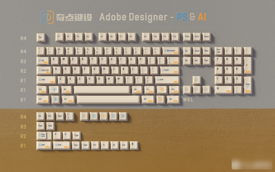
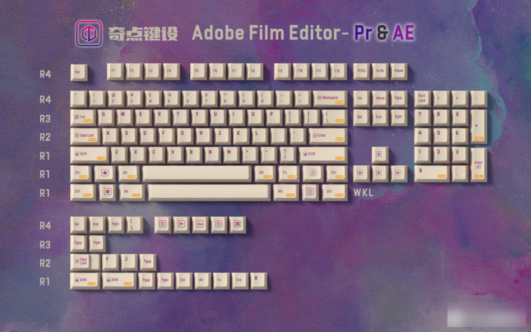
These two keycaps are the shortcut key side engraving series "Adobe Designer" and "Adobe Film Cutter" launched by Sickle Brother and his Singularity Key Design
Due to my own interests, I have been in contact with Adobe gift packs since I was a student, but I also feel that it is difficult to remember so many shortcut keys, so I refer to the design ideas of Cai Cai’s predecessors, combined with the classic design of C64’s side engraving, to produce These two sets of designs.
At the same time, Sickle Brother also provides a limited time side engraving customization service. The scope of customization is as follows
Customized content:
Printing color, Pantone C card color number is required
Specific keys, including R4-1U, R3-1U, R2-1U, R1-1U standard keys and R3-1.5, R1-1.25
Sickle also has Cherry original characters and all vector graphics, font files, welcome to customize (Editor's Note: If your customized keycaps are only for personal use, then the keycap manufacturer may not violate copyright issues. However, in theory, if There are still potential legal problems in mass production and distribution.)
Custom type:
For small-scale customization (only adding/changing side character graphics, within 30 pieces), an additional service fee of 10 yuan is required, including color proofing, position layout, etc.
A full set of customization, specific needs need to be carefully communicated
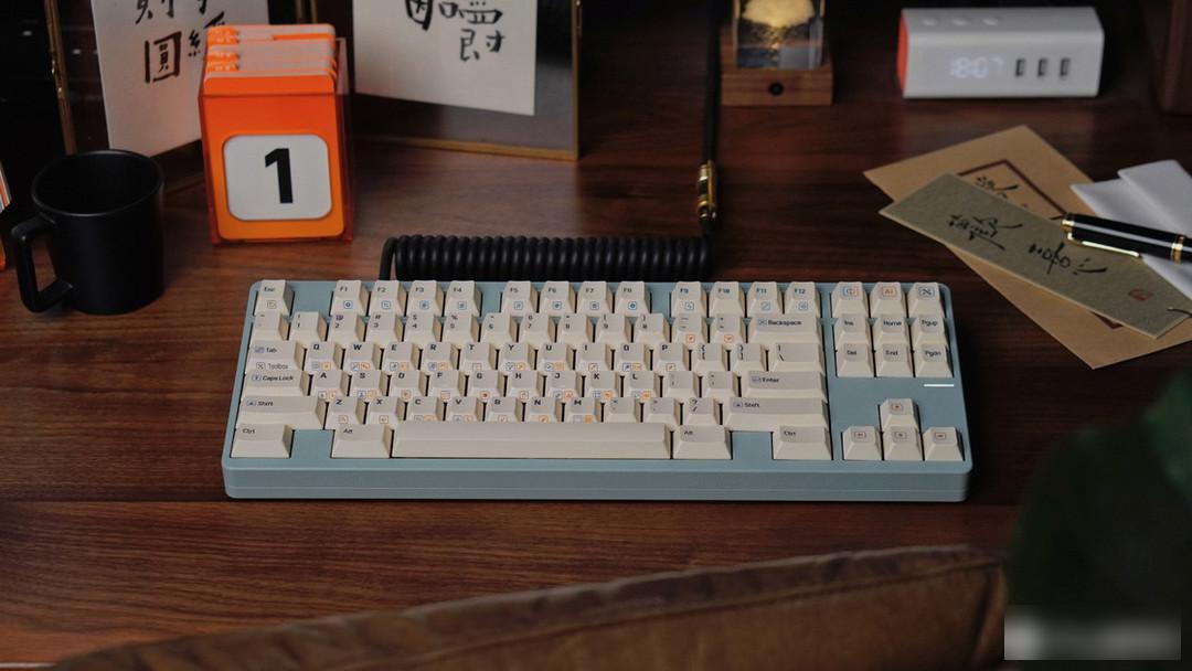
Xiaohe Shuangpin Customized Side Engraving
Real shot display:
Ye Feimu
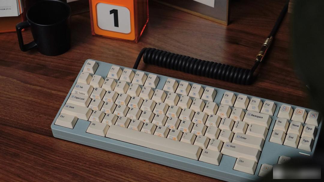
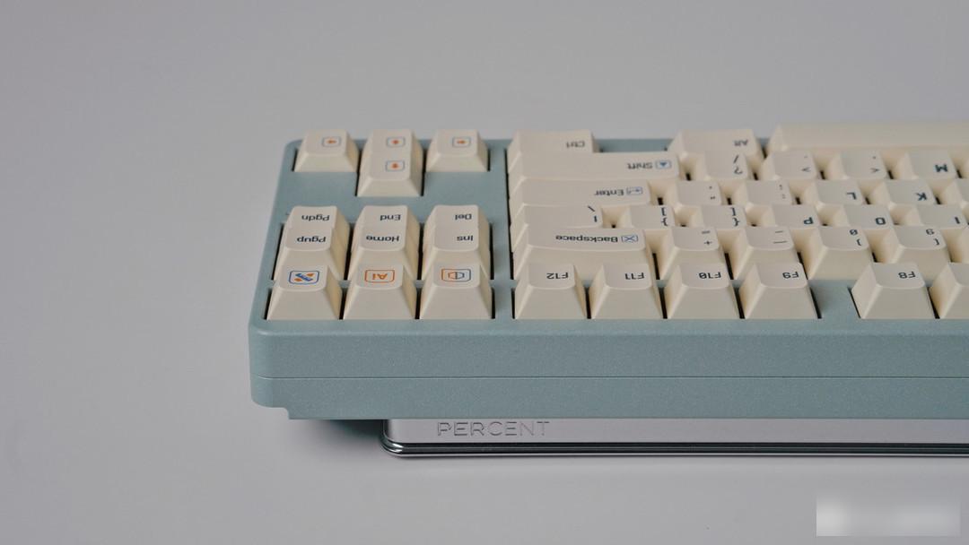
Keycap information:
Material: PBT material
Height: original factory height
Process: sublimation keycap
Buying advice:
Players who have a need for side engraved customization can consider buying it, but it seems that the event has ended, and I hope to open more events in the future to meet the needs of different players.
Factory Adress: No.11,FengpingRoad