"Keyboard wait and see" to see the latest interesting keycaps 2022.11 (2)
This article only represents personal opinions, and is used to record and watch some keycaps.
The personal scoring part is a subjective part, and will be scored according to the manufacturer's status, design, and personal preferences. It is for reference only.
keycap
An old German keycap factory, but the construction period is getting longer and longer, and the quality is not stable, but it is still the Iron Throne
 From IC Poster
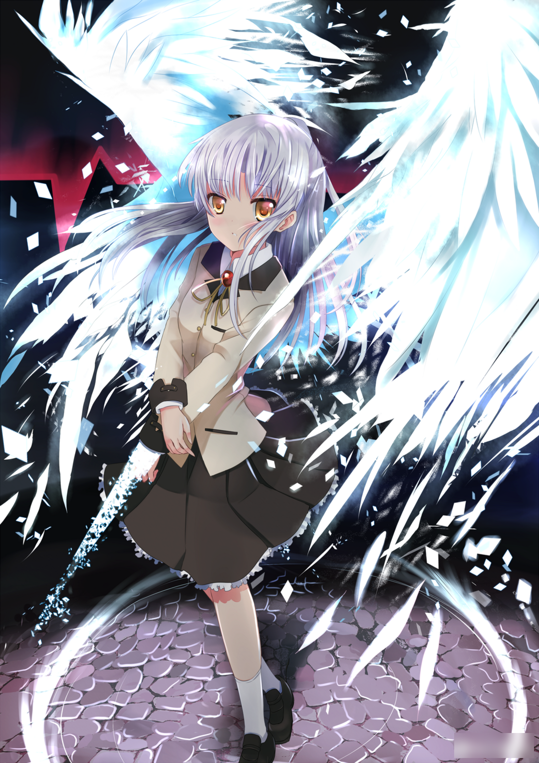
This keycap is designed by the designer misotsu (maybe we can call him miso sauce). This keycap is the first keycap he designed, and it is also a second creation that I think is very well designed. The prototype It's Angel Beats by Jun Maeda!
 Original promotional image
This set of keycaps is inspired by the popular female character in the play - Li Huazuo
 Lihua play role map
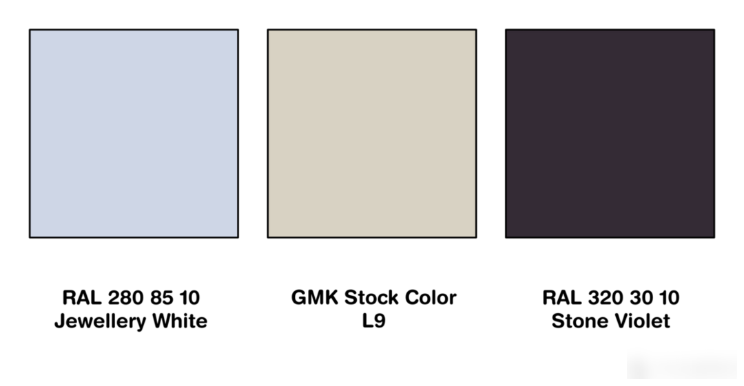
In terms of color matching, I chose jewel white, violet gemstone, and soy milk white, which are taken from the character's hair color and clothing color. Jewelry white and violet gemstone are used as the base tone, with retro embellishments, and the overall impression is cooler. It is more in line with the impression given by the character, with little expression changes, and also very reticent, "unintentional" and "cold".
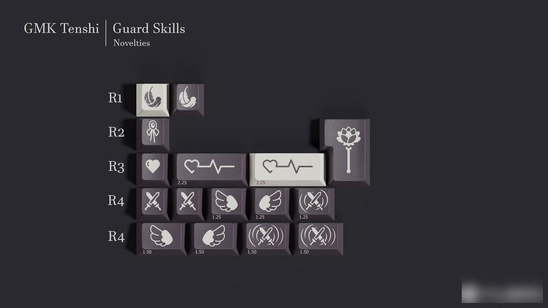
In the part of the personalized keycap, I personally think it is quite satisfactory and faithful to the original design. The feathers and wings of the angel, the bow tie of the student costume, the Hand sonic (sonic hand blade) representing the combat ability, and the seven-character carriage return design are the five generations of the Hand sonic. And the dark line running through the work, the beating heart-the bond between the heroine and the heroine, comes from the heart donated by the heroine beating in the heroine's body, just as the title of the work says - Angel Beats (angel's pulsation)!


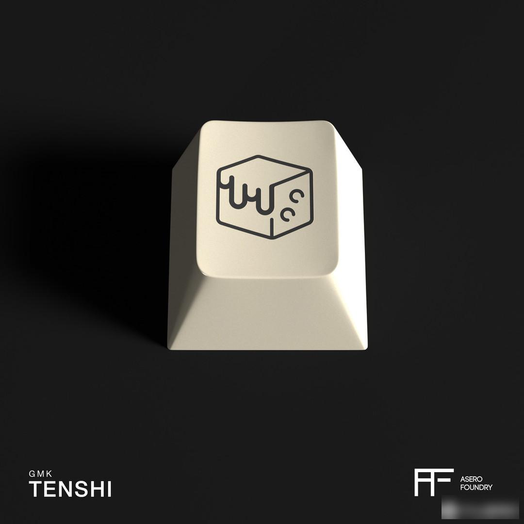
The personalized pattern of this metal keycap comes from the character's favorite food - mapo tofu.

Desk Mat Angel's Down
Table Mat Fallen from grace
Material: ABS material
Height: original factory height
Process: secondary molding
Personal Rating: 5—10
There will be higher requirements for the secondary creation of keycaps. This keycap is loyal to the original design, which is both an advantage and a limitation. Fundamentally speaking, this problem will occur in secondary creations, but there are still powerful authors who can make more than the original. I think the color design of this keycap is also very good, and it can give a higher score. As for how many points can be given, the feelings are priceless.
Buying suggestion: GMK’s construction period is really difficult. If you are not a fan of this animation and have sentimental bonus points, I don’t recommend buying it, even if the design of this keycap is really good. The price is also the regular price of GMK, about 990+ for a Base.
After a period of silence, JTK has gradually returned to our field of vision. The recent avocado keycaps and several sets of off-the-shelf keycaps, as well as the HSA keycaps produced after three years of pregnancy, hope that this old domestic keycap brand can gradually return. Normal production trajectory, shortening the construction period and improving the quality of materials
 base part
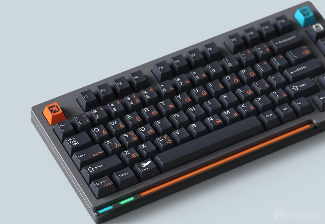
This set of keycaps is designed by the domestic designer BUGER. This designer has designed many well-known works with profound strength. And this time it brings flight keycaps.
In terms of color selection, BUGER said that it chose dark blue, which looks almost black in the rendering. Such a deep blue, I tentatively understand it as midnight blue. The white characters are in contrast to the dark blue, and the bright orange injects vitality into the entire set of keycaps, making the overall look less dull.
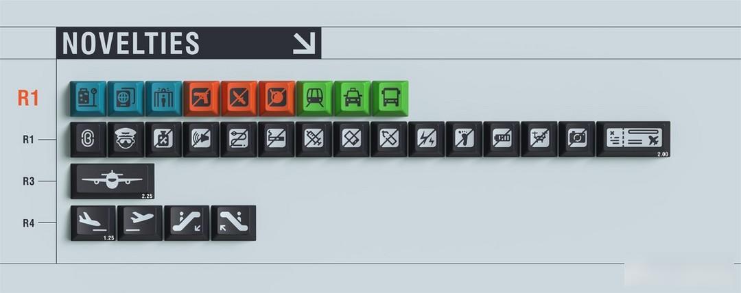
In the personality part, in addition to the classic personality icons of the BUGER studio, there are also a large number of traffic-related symbols, prohibited items, and patterns of subways, taxis, and buses that are obviously flights.
Orange Irish roots add interest to the dark base.
Material: ABS material
Height: original factory height
Process: two-color keycap
Personal Rating:7
I like the color design of this keycap very much. It is a very attractive type, but the design itself is not so amazing compared with his previous works. I hope to design more amazing works in the future, but considering the construction period of JTK , can't wait
Buying suggestion: Keycaps with a clear theme and stable color matching, but the construction period is still a big problem.
The estimated delivery time of JTK is June 2023, and this should be based on the timely payment. According to the manufacturer, it will be 3 months after receiving the payment, and the tricolor will take longer, and what will happen on the way Changes are unknown, so if you get on the bus, you may still need to be mentally prepared for the delay.
DMK is in a hot state this year. The two-color keycap has a stable construction period and quality, and the number of keycaps produced is large.
 from IC
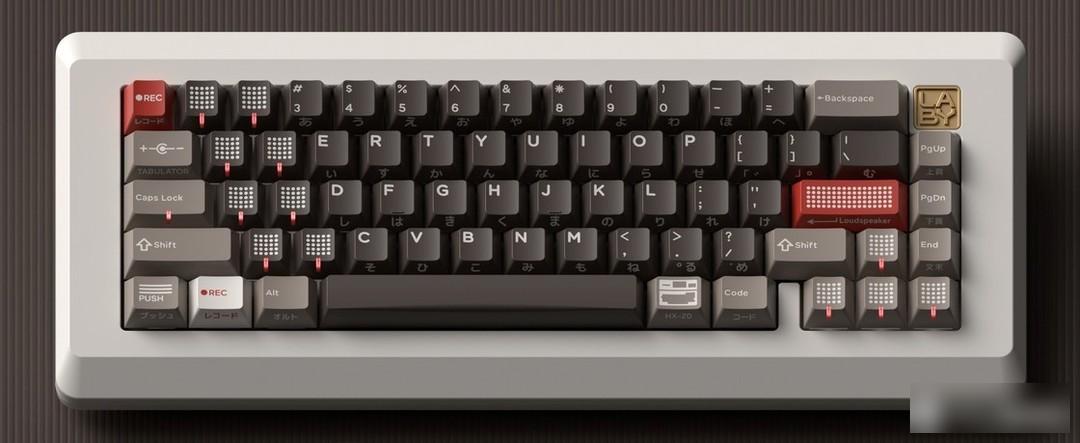
This set of keycaps is designed by the Chinese designer "GLOVE". This designer is also in a hot state this year. From the spread of the fire in February to this keycap, he has designed six keycaps non-stop, four of which have been completed and The production is close to completion, and I personally think that the keycaps he designed are above-average, even if some do not meet my personal aesthetics, there is no doubt that they are designed with care.
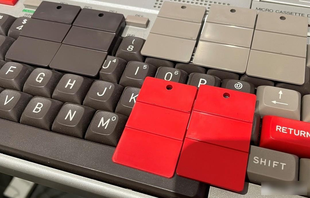
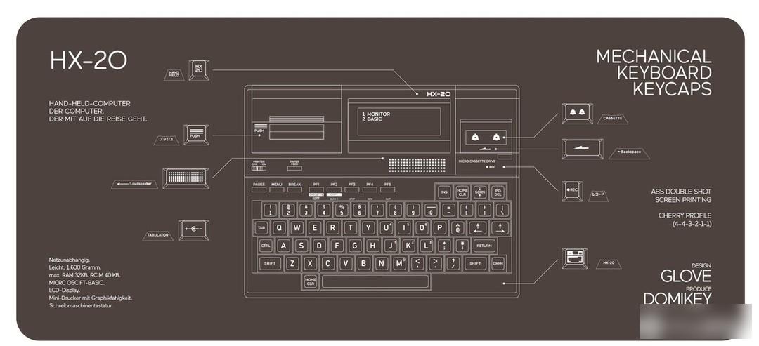
Inspired by Epson released the Epson HX-20 in 1981, the first portable computer with a built-in printer.
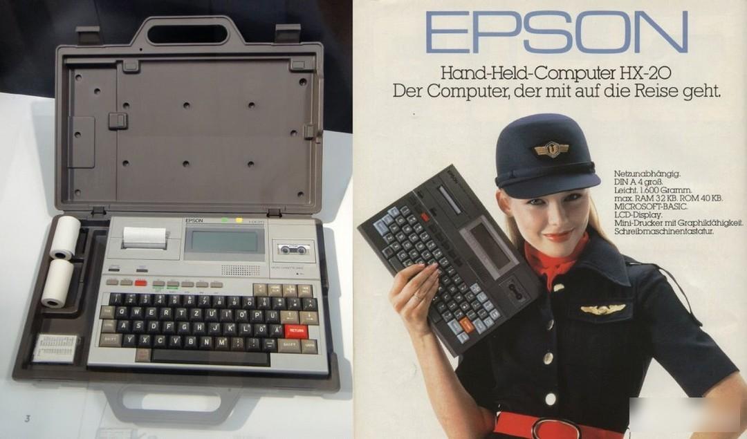 HX-20 Prototype, from IC
 Color sampling from IC color card
Since the exact color sample was not provided, here is a brief explanation, gray, black, red, dmk has sampled the color card for it, which is very close to the color of the keycap on the prototype, and it is also a classic color combination of retro keycaps. The font is selected classic white.
Different from the simple overmolded keycaps in the past, this time the HX-20 adds a version with side engraved characters on the basis of two colors for selection. The characters on the side engraved this time use Japanese characters as the decoration of the side engraved characters. HX-20 is a machine made by Epson, which is a Japanese company. There are also many Japanese characters on the body of this product, so Japanese characters are used.
 side engraved version
Considering that this design is a lightweight design, I also want to play with some new crafts. I used silk screen side engraving in both the BASE and NOV personality groups to add some details and interest to the single two-color keycap.
 Side engraved enlarged picture
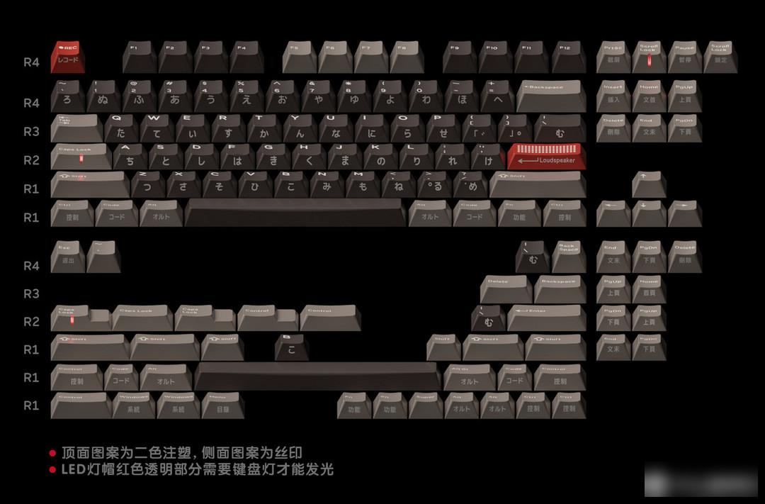
This time the individual design is completely deconstructed and reorganized around HX-20.
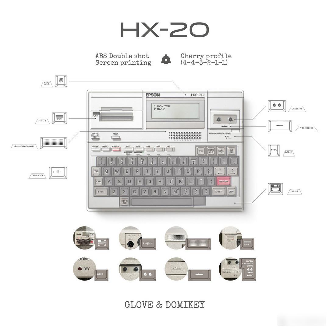 From IC posts, interpretation of personality design
 Lamp Cap Combination
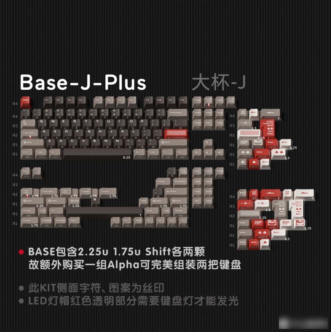
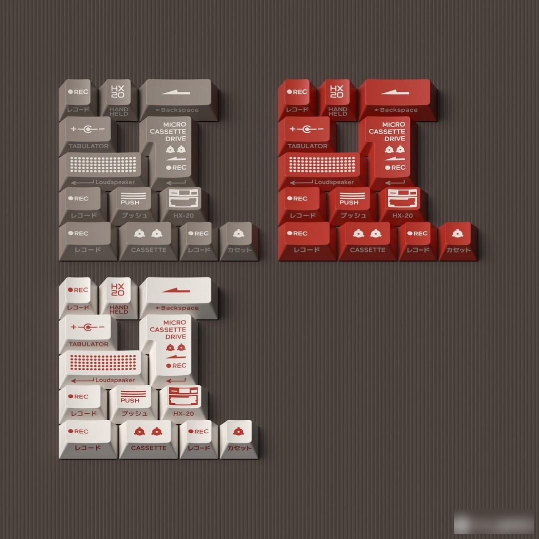
Various drivers and function keys, plus the lamp cap with buzzer dot matrix pattern, full of retro feeling.
60 column renderings

Numerous renderings of lamp caps

98 column rendering
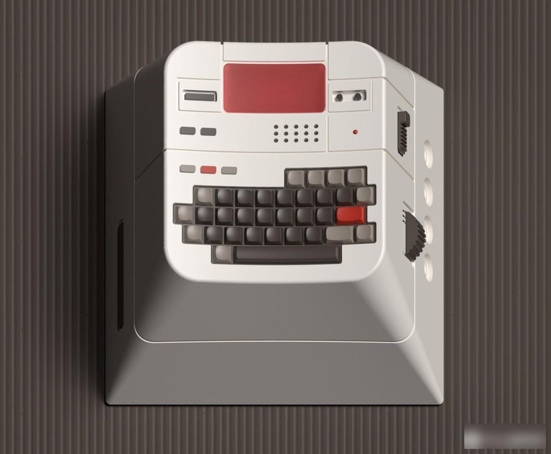
resin personality
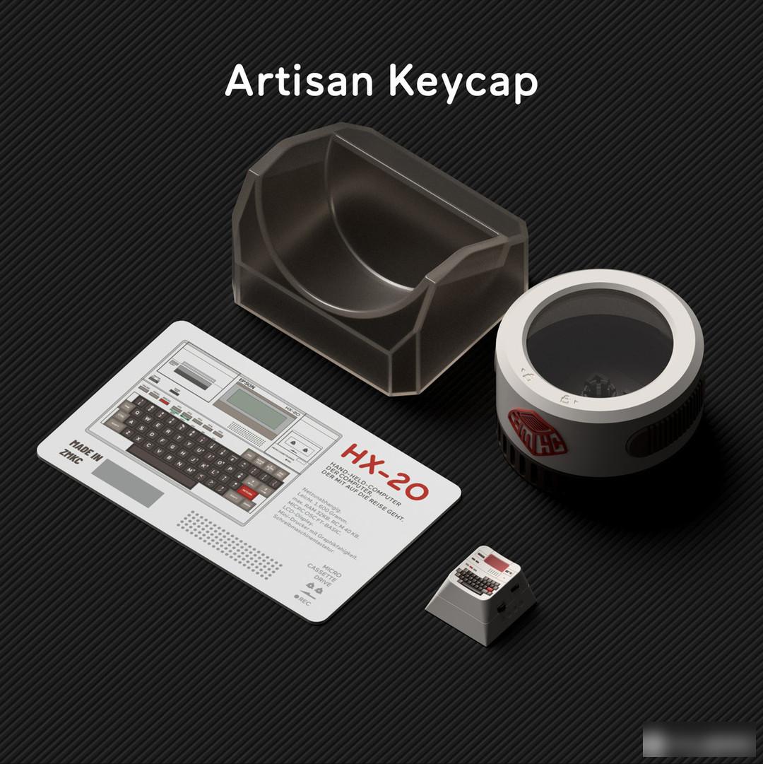
The resin personality is made by scaling the HX-20, but I personally feel that the display effect is not outstanding, if it is taken out alone, it may be confused with the personality of the game console. Handcrafted individuality, still need to make a three-dimensional design effect to give full play to its advantages.
Material: ABS material
Height: original factory height
Process: secondary molding
Personal Rating: 7-8
In terms of color matching, it is not a particularly stunning color matching. It is a relatively standard retro matching, but the deconstruction idea reflected in the personalized design is more colorful than the general retro keycap personality design. At the same time, the side engraving and lamp cap echo the retro theme. As a bonus item, the lamp cap design of the matrix point is very attractive
Purchase suggestion: If you like this retro design, you can consider buying it.
Domikey’s workmanship and construction period are guaranteed. Under normal circumstances, it will be produced within 3 to 4 months. This keycap is expected to be purchased in group purchase at the end of November. However, the Chinese New Year is approaching. Considering the epidemic situation and the Spring Festival, the production time of this set of keycaps may be delayed. It is later than expected, and the price still needs to refer to the specific configuration and group purchase situation, but generally speaking, the price of BASE is around 600-700, which can be regarded as the top price in China.
It is not recommended to wait until the end of the group purchase to receive the transfer order. There are a lot of keycap options this time. Correspondingly, it takes some luck to buy the transfer order option you like. At the same time, the number of buyers in this issue is also unknown, and the design is also It is not a design that has a very wide audience.
This set of keycaps is designed by the designer of the full stop studio, inspired by the accidental product of the keycap Salt Lake during the proofing and color matching process.
Mainly mint green and white, the semi-transparent texture is very interesting. It can be said that it is the most exquisite set of semi-transparent keycaps produced this year.
 personal shoot
The personality part is directly used the personality mold of the past. This set of keycaps is an accidental product. Naturally, there is no time to polish the personality design after opening the group so quickly, but I personally still hope to have a separate one. Design, after all, compared with other color-themed translucent keycaps, the theme and material craftsmanship of this set of keycaps are very suitable for "Jade", which is a rare fate.

Material: ABS material
Height: original factory height
Process: secondary molding (semi-transparent)
Personal Rating:6
The biggest feature of this set of keycaps is the combination of semi-transparent materials and colors, but similarly, there is almost no design. In fact, I personally still hope to have a unique design. If there is a unique design, this set of keycaps It can score higher. Of course, although the design of this set of keycaps is not high, I personally like it very much and will also buy it.
Purchase suggestion: Players who like semi-transparent materials and jade colors can consider starting
I think this is also the most acceptable one among the semi-transparent keycaps, the color is lifelike, and it is worth buying and collecting.
This year's Mikovi can be said to be in poor condition, with a large number of team starts and postponements, and various problems encountered in the middle.
My feelings for Mikovi are quite complicated. From my personal point of view, I hope that more and more manufacturers of domestic original keycaps can make them. Helping manufacturers.
But as a player, I’m not satisfied with this year’s Mikovi. Delays and various product problems, these costs will eventually be transferred to consumers, and will continue to kill the enthusiasm of players.
All kinds of contradictions have already occurred, and the past can no longer be rewritten. I hope that Mi Kewei can bring players a satisfactory answer in the future.
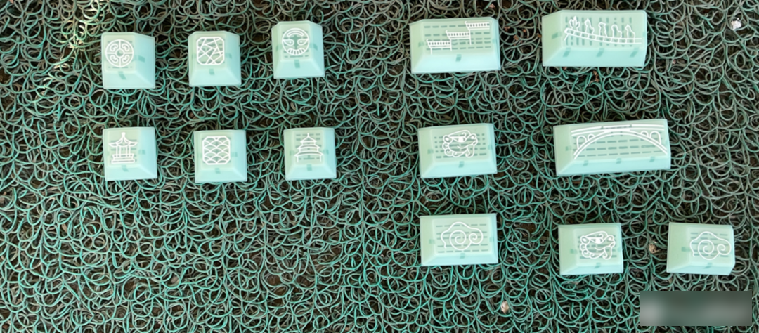
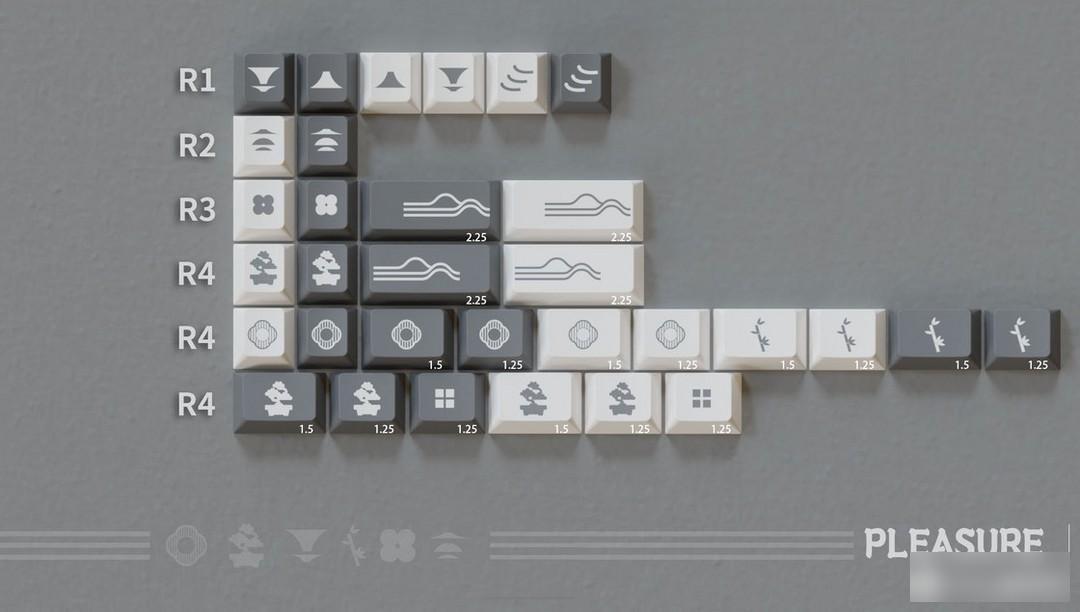
This keycap is designed by Xiao P, a designer of PL Customization Studio. The previous keycap style of their studio tends to be retro and cool, and the topics are also ingenious, such as barcodes, tattoos, etc. This time Their topic is Hui-style architecture, a school of traditional Han Chinese architecture, one of the most important components of Hui culture, characterized by "white walls and black tiles".
I have been trying to incorporate Chinese elements into the design of keycaps, from mountains and seas to oracle bone inscriptions, the response has been mediocre. PL will not give up, this time it will bring a new set of Chinese design, which restrains the desire of design and the frigid national style - Hui style
There is no shortage of aesthetics in China. After observing the Huizhou architectural complex by chance, I had the idea of making Huizhou keycaps.
(Personal subjective opinion, the main reason for mediocre response is because the product itself, workmanship and design complement each other)
This time, the cold keycap color scheme uses gray, black, and white as the keynote. White occupies most of the keycap and is embellished with black, which is more in line with the visual characteristics of "white walls and black tiles".
In terms of radicals, four-in-one radicals are selected-English, Zhuyin, Cangjie, and Dayi.

For example, the root phonetic notation of this keyboard
Many of the current new Chinese styles are based on the innovation of pure Chinese style, adding the style of Huizhou architecture, and gradually formed the new Chinese style. What the designer wants to express, apart from the freshness and elegance of the keycap color matching itself, is still deeply hidden in the personalized keycap.
The pattern on the right side of R1 is an abstract horse head wall, and the left side is tea and mountains.
According to the designer, the pattern of R2 is to express a kind of Zen.

The rest of the patterns, "Bamboo Window Shrink Tile" are all derived from the Huizhou artistic conception, but these are not detailed in the post. Personally, I still think that I should introduce and express myself in more detail in the post. The idea, the work itself cannot speak. Because the keycap design itself is to convey information or expression, if the call is encrypted, it will be a loss. Many personalized keycap designs are more vivid, or to incorporate some personal understanding for interpretation.
But in general, this set of keycaps is less "aggressive" than some previous designs, and is more acceptable to the public.
big cola shot
sex shoot

Material: PBT material
Height: original factory height
Process: sublimation process
Personal Rating: 5-7
Generally speaking, this is a set of keycaps that restore the architectural style of Huizhou, very fresh and elegant, but at the same time, the design of this set of keycaps is just like the slogan of their studio, "Make a unique design". Just sell it to players who understand it. But just looking at the color matching, the design of this set of keycaps is more in line with the taste of the public. In terms of personality, as far as my personal perception is concerned, I always unconsciously overlap this set of keycaps with JTK Shanshui, but compared to Shanshui, their personality is more abstract.
Buying suggestion: Players who like new Chinese style and elegant and quiet can consider buying.
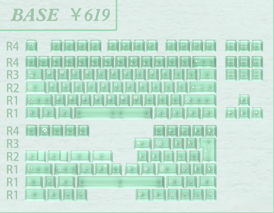
This set of keycaps will be made using Milkyway's R3.5 material. For details about the quality of the R3.5 material, please visit my homepage column to view it. The off-the-shelf sale eliminates the biggest pain point of Mikovi - the construction period, but at the same time, the price of this set of keycaps is not low, and there is only one large set of purchase options, 500+ sublimation products, there is no doubt that Well, the current product level of Mikovi cannot support this price. Even though it has the top after-sales service in the circle, the best after-sales service is no after-sales service. When purchasing this set of products, the weight of paying for the design may be higher than other customized keycaps.
In the field of keycaps, after half a year of silence, MOMOKA began to make efforts in the second half of this year. As a new regular army in the field of customization, MOMOKA has also gradually grown, and began to have more cooperative designers, and the degree of completion of the works has also increased. It's getting higher and higher. Hope to make more interesting products in the future.
 base
base
This set of keycaps is the second set of keycaps designed and produced by designer Kanai Amamiya, but it is earlier than her first set of keycaps "Ancient God Priest".
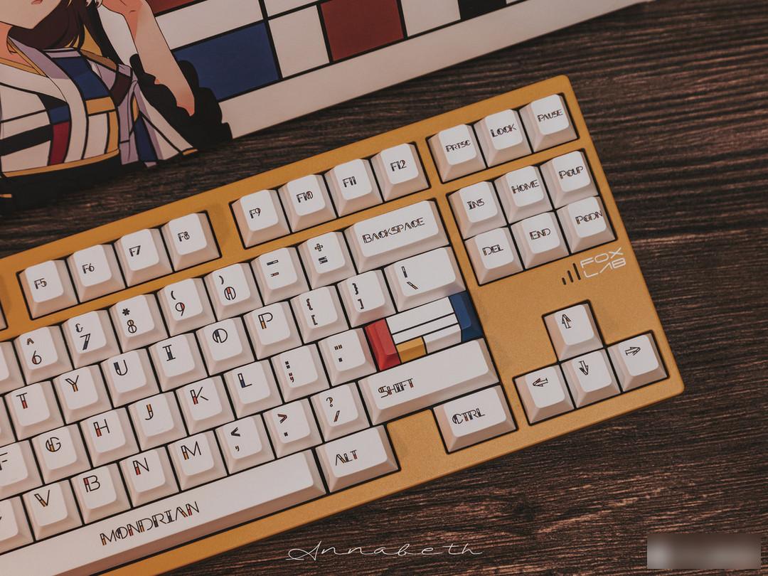
This set of keycaps is inspired by the artistic style of Piet Cornelies Mondrian, who advocates the use of geometric shapes to form the "beauty of form". Most of the works are vertical and horizontal lines, rectangular It is composed of various grids and squares, against the use of curves, and completely abandons the objective image of art and the content of life.
When it comes to Mondrian, we will immediately think of those rectangular grids with different specifications, and the keycap itself is actually composed of grids, but the idea of this set of keycaps is different from that of GMK Mondrian, which paints the color on the squares by players. Combined by yourself, this set of keycaps is mainly for the characters.
The color matching of this set of keycaps is very simple, pure red, yellow, blue and white, the four most basic colors. But the effect of the combination is amazing. The color is integrated into the characters, making the monotonous plain white tone more vibrant.
In the end, I chose an all-white base and finished it with a Mondrian-style font.
The following is my personal analysis, for reference only.
The character design is the core part of this set of keycaps. If you want to analyze the design of this set of keycaps, you need to start from the source of inspiration—the Mondrian style.
Let's first analyze Mondrian's style from Mondrian's masterpiece "Composition".
 Composition with Red, Blue and Yellow
Thick and heavy black lines delineate seven rectangles of different sizes, with a simple and clear structure.
Apart from the three primary colors, there are no other colors.
Apart from the vertical lines, there are no other lines.
There are no other shapes than rectangles.
These paintings also respond to his abstract geometric principles.
So in the same way, how do we use this method in designing fonts?
Before the color arrangement, it is the use of geometric style.
As one of the elements of Mondrian's style, rectangles of different sizes are used. In terms of font selection, I recommend using sans serif font 1 to achieve better results. After that, there is a choice between simple and traditional fonts. How to add Mondrian style to the original minimalist font without looking bloated is a test of the designer's creative skills.
In MOMOKA's Mondrian character design, we can divide the characters into several different types.
1. Characters like "L" are very in line with Mondrian's style and are natural characters. This type of character can be designed by extracting one side of the font.
2. Similar to "O", which is itself composed of curves, it is divided by vertical lines. However, if I design it myself, I may prefer to convert "O" into a rectangle "□" before designing.
If you want to study and design Mondrian's style more deeply, you need to consider "balance, proportion, contrast, unity, dominance", etc., and you need to study more systematically, so I won't expand here.

The part of the personality key is also presented with the classic lattice painting and the five-sided sublimation process. Although the three-color square style looks bold, the matching of the kit is unexpectedly versatile.
In the personality part, MOMOKA's icon and Mondrian elements are integrated, and the other part is to integrate the classic "composition" into the keycap. However, I personally think that the addition of solid color personality keys can be appropriately added. In Mondrian's classic works, there is generally one or a group of large-scale and brightly colored blocks, such as the red square in the above-mentioned "Composition". This kind of block often occupies a dominant position in the composition, making the whole composition have a clear visual aesthetic feeling of primary and secondary.
At the same time, in the division of lines, it is necessary to consider the impact of the three-dimensional shape of the keycap on the vision. The existence of the line segment of the golden ratio is an important source of the visual beauty of Mondrian's classic works.
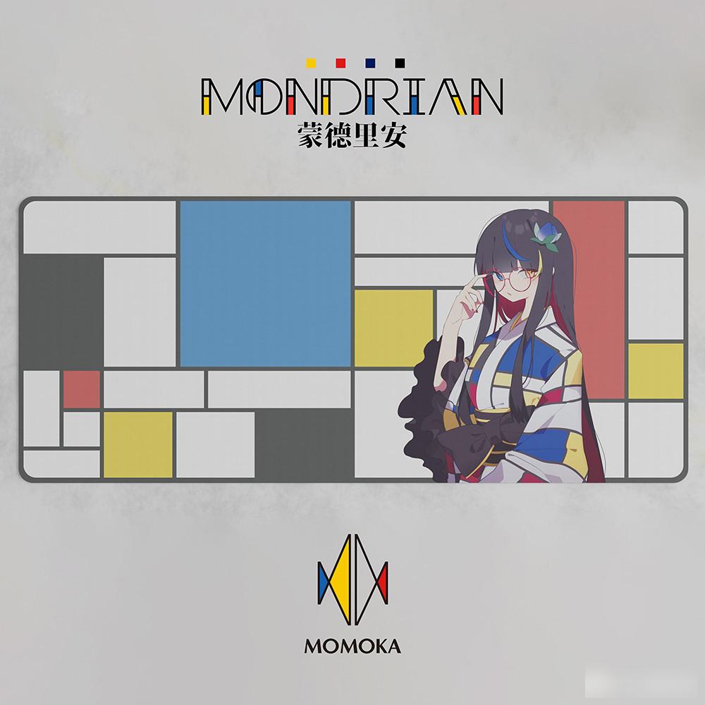
The table mat is the avatar of the author dressed in Mondrian-style clothing.

Le total shooting
Chang'an five-point sweet filming
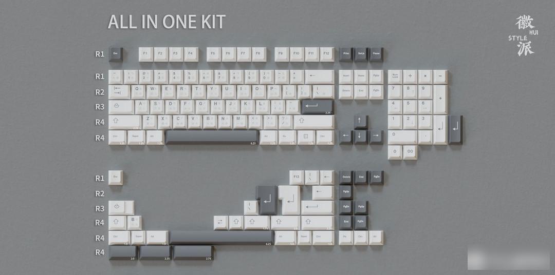
Height: original factory height
Process: single-sided + five-sided sublimation
Material: 02 mold material, high content PBT
Group purchase price: 299 yuan for a large set
Personal Rating: 6—7
Very interesting fusion design of art style, although it looks inconspicuous at first glance, but there is no doubt that the design of this set of keycaps is very careful, but it has the same characteristics as many plain white keycaps - versatile, but not amazing of. Similarly, I personally think it belongs to the biggest feature of Mondrian's style. The use of color blocks is not very well reflected on this set of keycaps. The design about Mondrian still has great potential.
Buying suggestion: Players who like elegant style and artistic style can consider buying
The price of this set of keycaps is not too expensive. At the same time, the careful font design is also one of its selling points. It is sold in stock, plus the formal platform and good after-sales service.
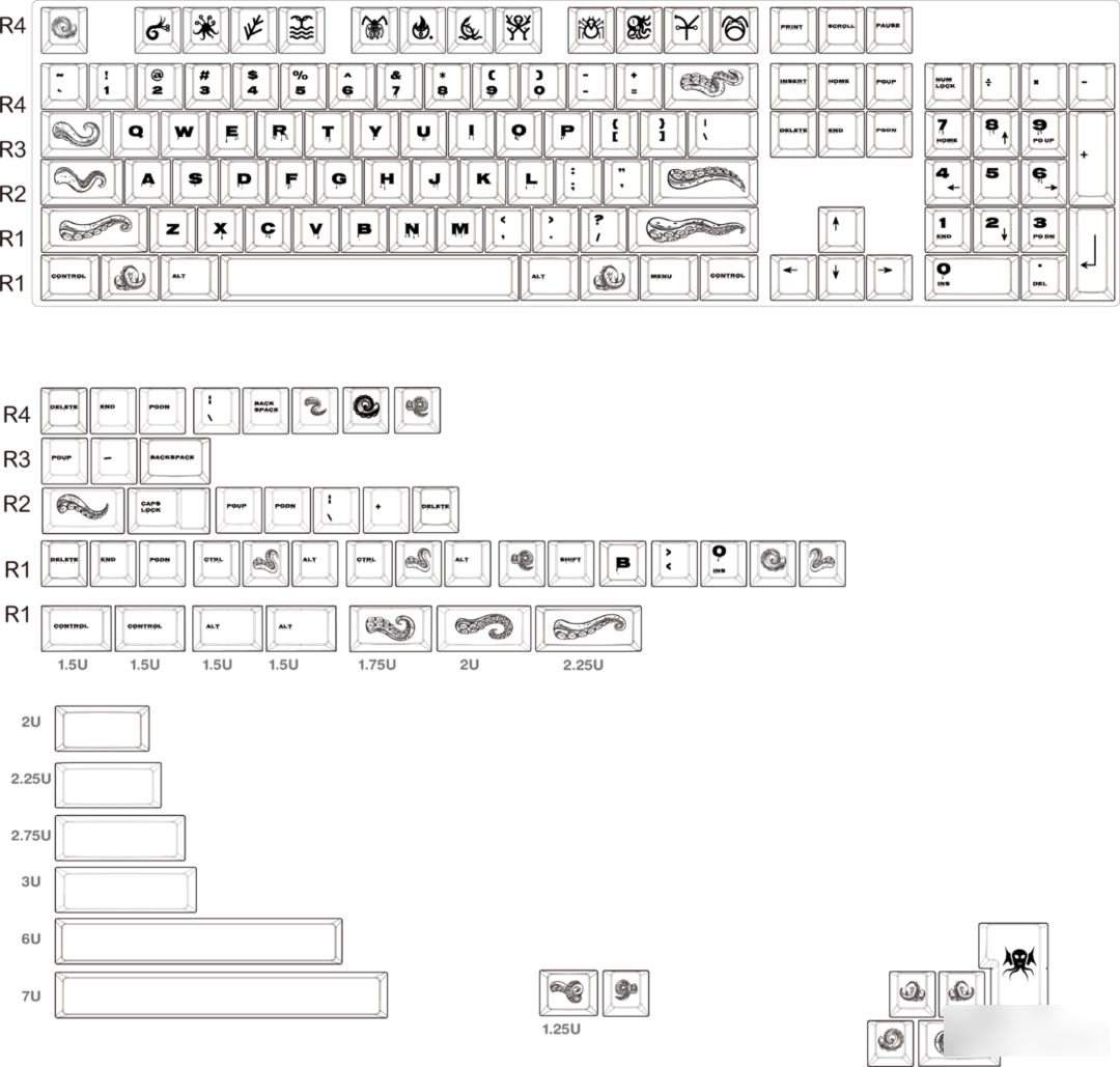
Cthulhu transparent keycap "shipkie" "cuttlefish game"
This set of keycaps is manufactured by Bumpy Studio, the character design provided by shipkie, and the graphic concept design authorized by Cuttlefish Games.
Above Cthulhu, there is a more powerful "Outer God". Cthulhu is a member of the "Old Dominators". "Other Supernatural Beings".
Horror comes from the unknown, so I have always wanted to express this dark, curious, and indescribable world on the keycap.
The theme of this keycap is a literary image "Cthulhu" - the existence in the myth of Cthulhu created by the American novelist Howard Philip Lovecraft. Old Ones).
Cuttlefish Game's Plane Concept Licensing
This is a transparent keycap, currently there is a pure transparent version, and there will be a black gold transparent version in the future.
This theme is the keycap of Cthulhu, and the personality part is also taken from the shape of Cthulhu
The description of Cthulhu's appearance in the story is abstract, and later generations of Cthulhu culture lovers have shaped the image of Cthulhu countless times. There are various versions, but several of Cthulhu's This feature has always followed the description in the original work.
The individual design of this set of keycaps reflects a large number of tentacles and wet environments.
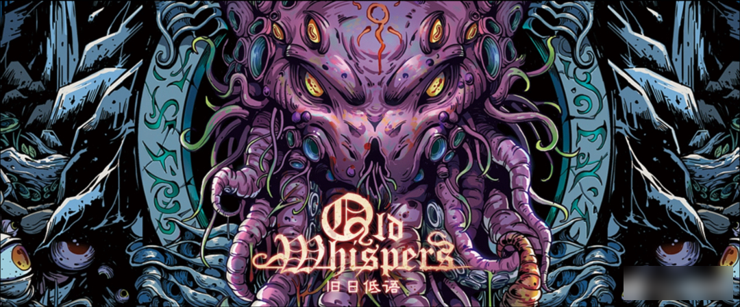
This set of keycaps is in cooperation with "Squid Game", and the outer packaging uses the Cthulhu card design in "Old Whispers"
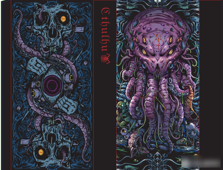
Keycap packaging design
"Whispers of the Old Days" is based on the Tarot of the Waite series, and is adapted based on the content of the Cthulhu apotheosis system. It contains a total of 78 cards, including 22 major arcana, 56 minor arcana and 2 PRО oracle cards.
A large number of characters mentioned in the Cthulhu Mythos appeared in the card, and some of the classic stories were vaguely described. Using comic-style artistic expression techniques to reproduce the glorious legend of this classic world.
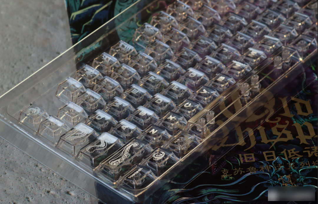
white
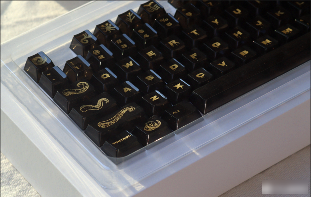
Black through
Keycap information:
Material: PC
Height: factory height
Process: pad printing
Personal Rating: 4—6
The PC material is flawed, and this set of keycaps can be said to be difficult to serve. Scratches and dust will greatly reduce the appearance of the entire set of keycaps, and the feel of the PC material is not flattering. It can be said that this set of keycaps was born for taking pictures and collecting. Its Cthulhu theme and character redesign can be seen to be very careful, and it must have a special flavor when paired with a PC with a transparent texture. But generally speaking, as The price of a set of keycaps with authorized graphic design is not too expensive - 249 yuan.
Purchase suggestion: Players who like to collect transparent keycaps to take pictures and like the Cthulhu theme can buy them.
The spot is sold on the platform, and you can buy it if you like it, but the PC transparent keycap is still only for viewing from a distance and not for playing.
1 Sans-serif fonts These fonts are usually mechanical and uniform lines, they often have the same curvature, straight lines, sharp corners
Factory Adress: No.11,FengpingRoad