Simple, not simple Durga Hi Keys dual-mode mechanical keyboard
At the moment when the key ring is rolled inward, if you talk about the functional configuration of the keyboard, you will not be too weak if you just pick one out. Compared with two years ago, the price, overall quality, and keyboard feel have all made long-term progress. However, in such a prosperous scene, few brands have innovated and tried in the appearance and style of the keyboard. The keyboard function configuration is full, but the style cannot get rid of the "rustic" or even "traditional" OEM style, which will inevitably cause visual fatigue. .
Hi Keys, as a new positioning brand of Dujia, has made a bold attempt in the design language. This attempt is not only reflected in the appearance of the keyboard, but also in the keycaps, font design and even the function keys on the keyboard. Let's talk more, let's take a look at the keyboard.
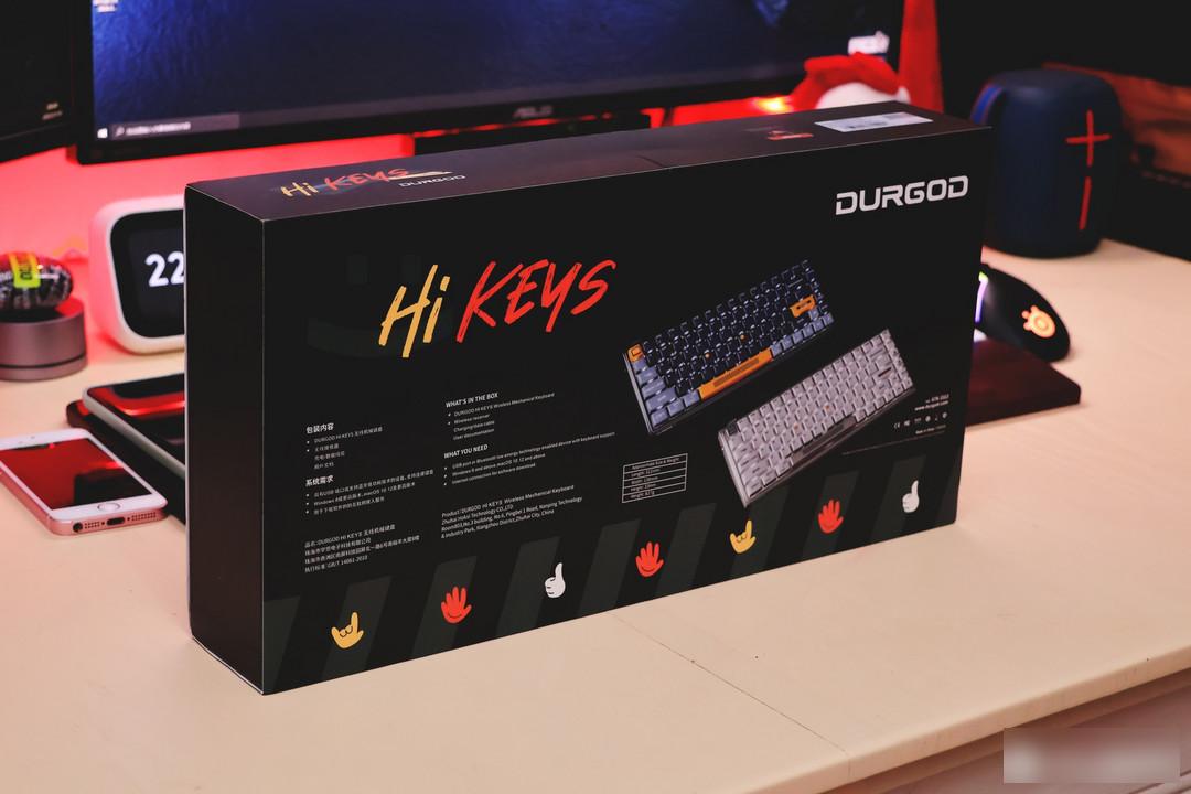
I have posted a lot of Dujia’s keyboards, and the blue packaging really does not make people want to show them. This time, the new packaging of Hi Keys can not only effectively distinguish Dujia’s previous products, but also is very interesting in terms of color matching and design language.
In my mind, the concept of futuristic design includes not only crowded and blocked cyberpunk medium and high saturation red and blue lights, but also the sense of neatness and order in "Arrival", and this Durga Hi Keys keyboard fits the latter very well. temperament.
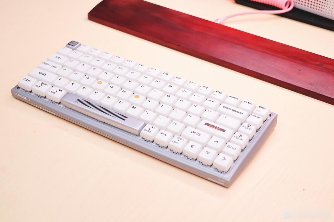
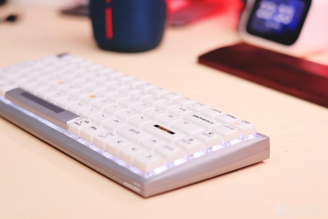
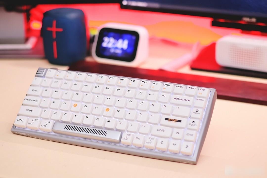
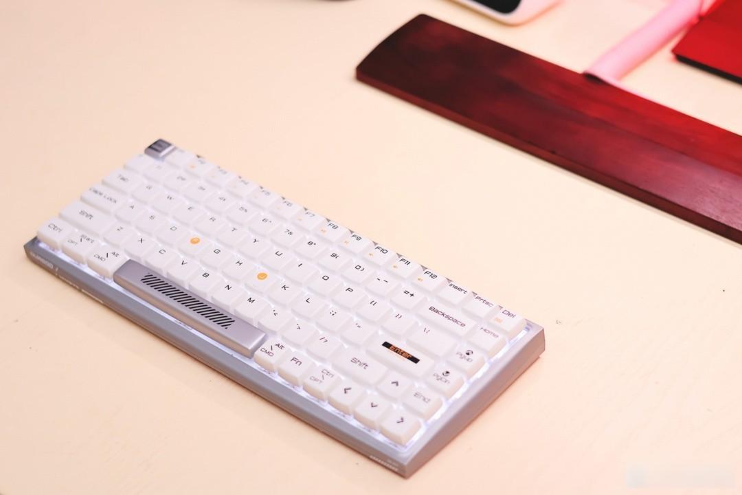
First of all, it is very restrained in color selection. The classic combination of metal body and white keyboard is not rare, but it is a classic color that will not be erased by time. The most typical one is the Apple Magic Keyboard. Products introduced decades ago still appear to be at the cutting edge of design today.
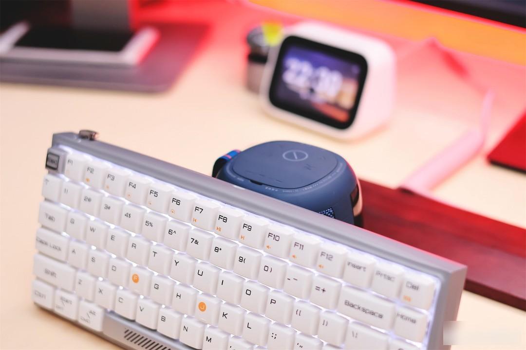
After the keyboard is turned on, the white light is lit, which adds a bit of sophistication
After being baptized by RGB light pollution for several years, seeing this white keyboard is like a table full of wine and meat with a plate of fried seasonal vegetables on the back end. After seeing too many beauty filters, a pure and plain face is even more eye-catching.
My love for the appearance of this Duga Hi Keys is largely due to the simple color matching. For most users, the beautiful curved body and round keycaps are the focus of attention, because it is really not more common.
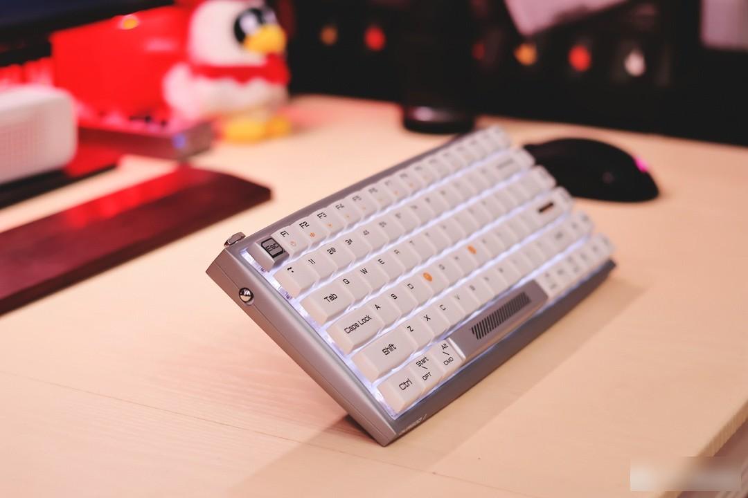
The arc of the Hi Keys body is not complicated, but it completely resolves the edges and corners of the traditional OEM appearance. There are smooth curves all around, but it is very sharp at the top corners. The smoothness and sharpness are harmoniously integrated on a keyboard. Friendly coexistence.
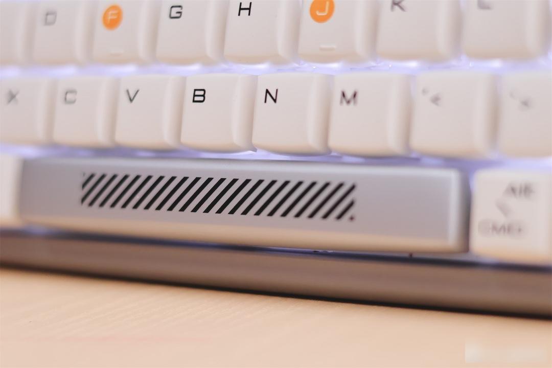
Many embellishments have been made on the body and keycaps, such as the black twill stripes on the space bar, which should be familiar to Gundam fans, and even the silver space bar is a good visual supplement to the entire keyboard.
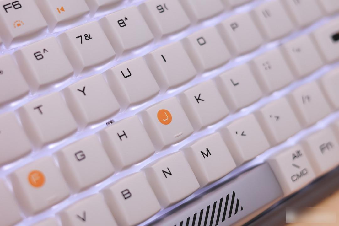
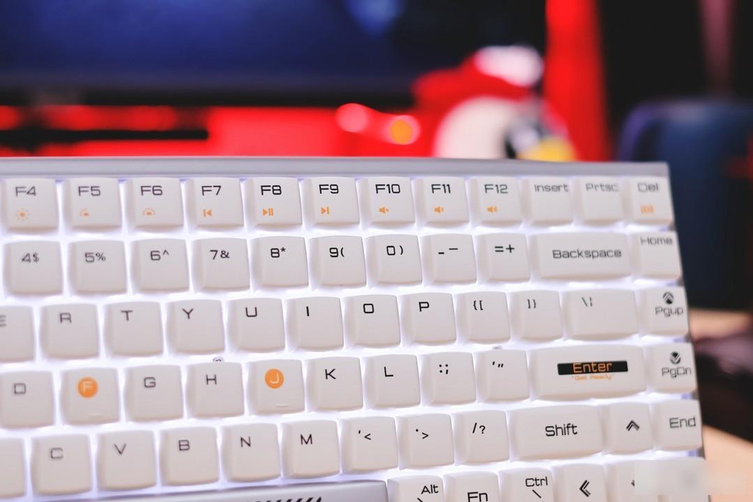
The letters F and H are individually marked in yellow
There are also lines, brand and model letters on the fuselage as embellishments
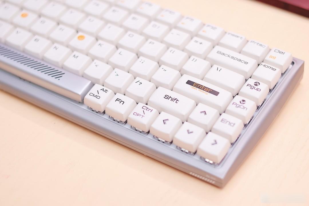
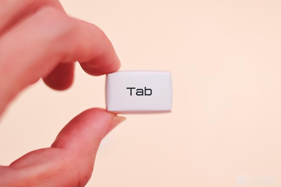
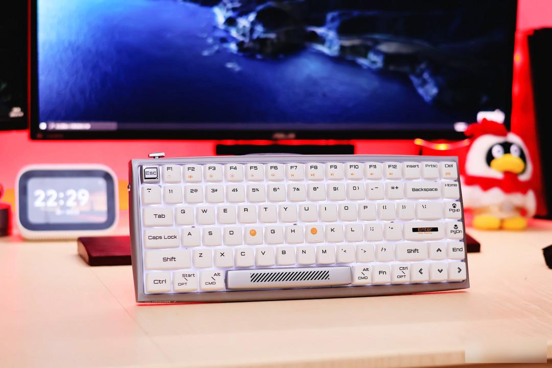
The newly designed keycap characters are not only in line with the simple temperament of the keyboard, but also very interesting in terms of functional appearance. The square round keycap abandons the curved surface of the traditional keycap, slightly bulging, relatively smooth around, and the top corner is sharp, not ugly The keycaps are individually customized for this keyboard.
The feel is also very different from traditional keycaps. After all, one is protruding and the other is concave, so the input experience is very different. You need to get used to it at the beginning, and the comfort will gradually come up after you get used to it.
The small steamed bun version of the keycap is so cute
When it comes to keycaps, the special feature of this Hi Keys is that it abandons the slanted keycap arrangement of the traditional keyboard with high front and low back, but completely fits the arc of the fuselage.
There is no need to worry that such adjustments will affect the input experience. The inclined body and bottom support feet will alleviate it to a certain extent. The compact layout allows fingers to reach every button without a large range of movement.
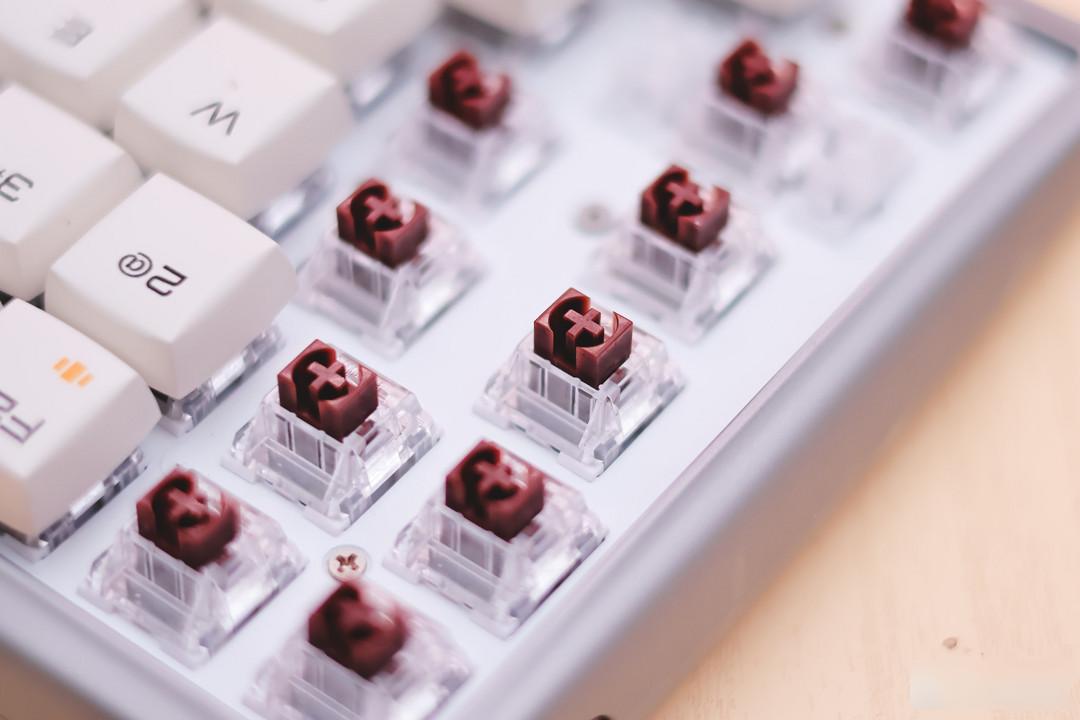
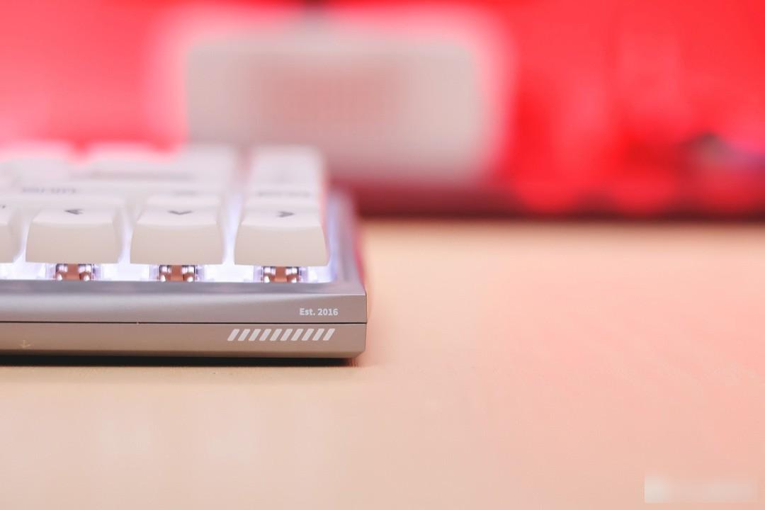
My model is equipped with Kaihua tea switch, and there is also an optional silent red switch.
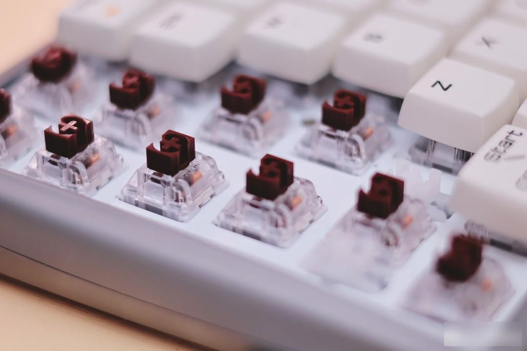
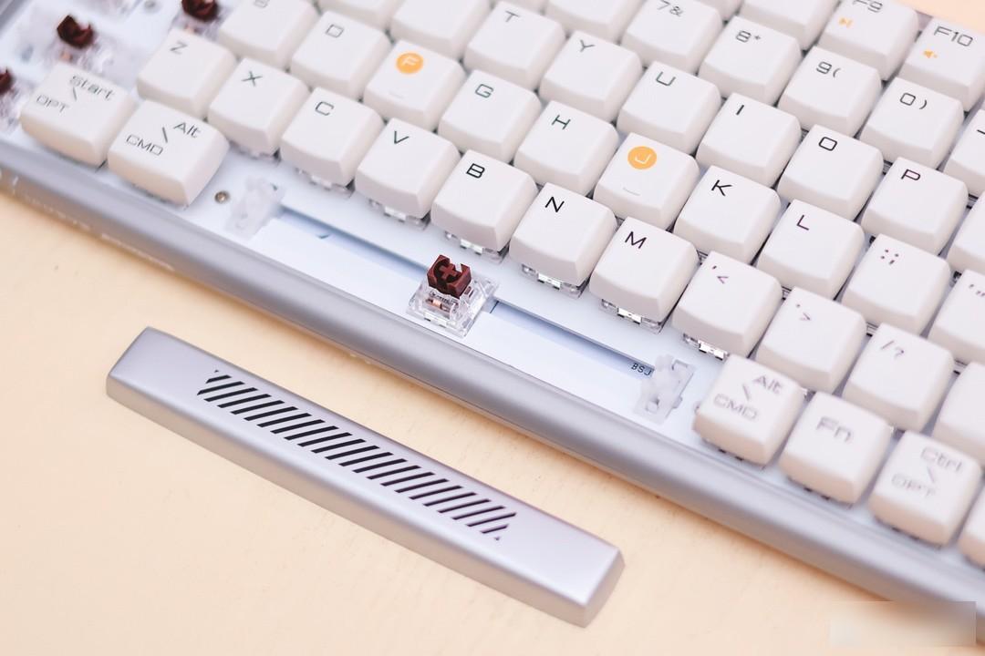
The feel is a very standard tea shaft taste, with a slight sense of paragraph. If you don’t pursue the ultimate mute effect, then this tea shaft is definitely the first choice.
The keys are smooth and the feel is excellent. As a Dujia who has been good at the feel since the beginning of his birth, the problem of keyboard feel can be skipped directly. The addition of high-quality customized switches magnifies this advantage.
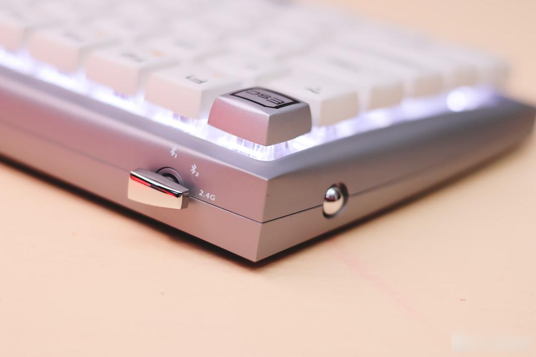
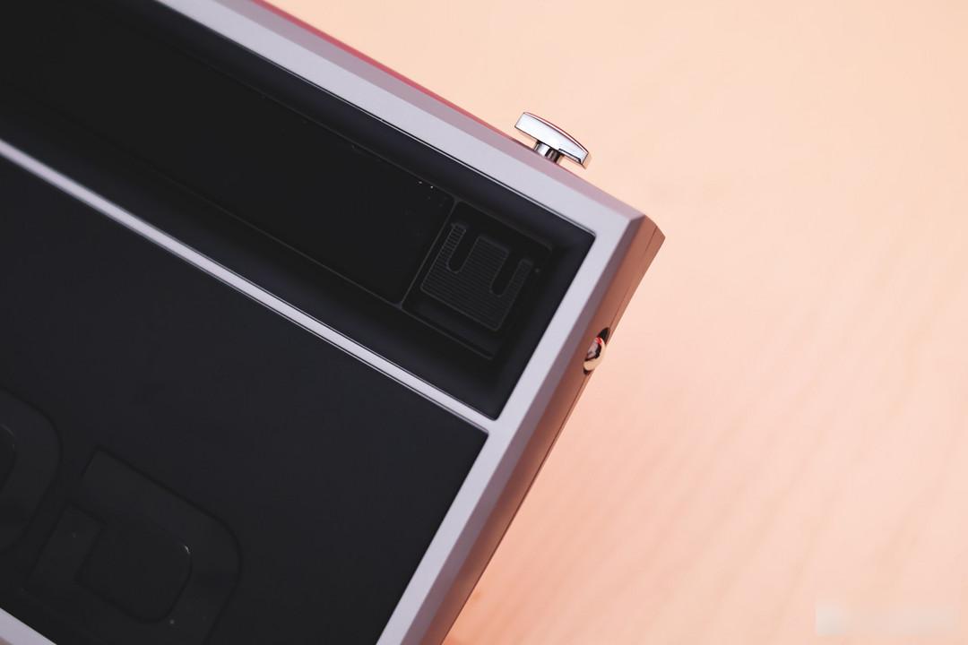
The appearance of the keyboard switch and the wireless switch button is ingenious, and the co-branded metallic color echoes the body. What you can never imagine is that there is an indicator light hidden under the switch.
I can only say that the appearance of the wireless toggle switch is average, and it even feels a little abrupt on such a simple body, but I can't think of a more suitable design solution, maybe it's better to hide it at the bottom of the body.
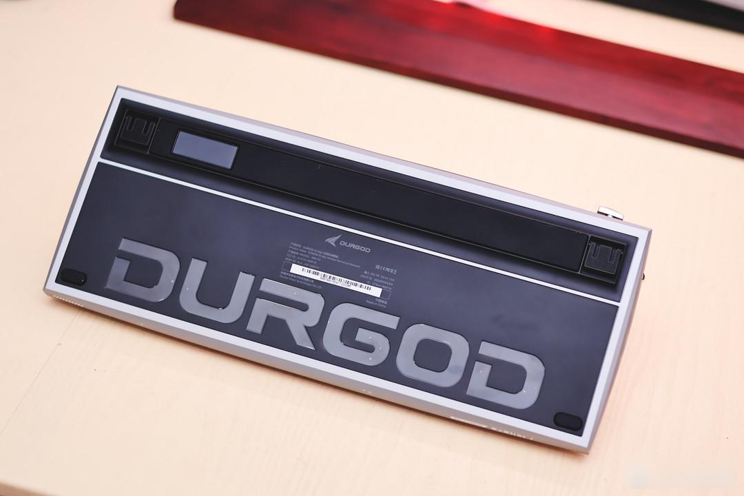
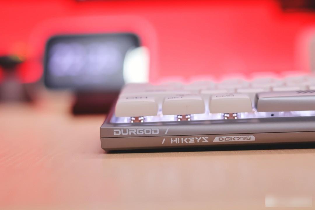
The bottom of the fuselage continues to implement the concise design language. The huge Durga letters should be the biggest logo I have ever seen, none of them.
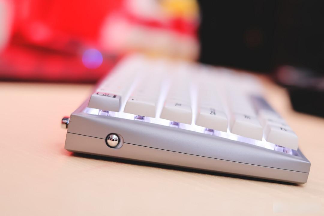
The whole anti-slip strip runs through the top to provide sufficient anti-slip effect
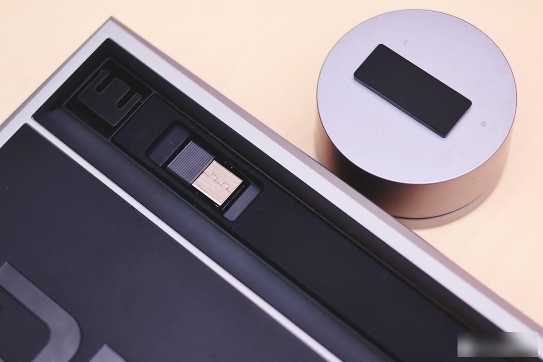
Hidden receiver storage compartment
The supporting feet lift the relatively flat body to a certain height
These are to be practical while taking care of the design aesthetics, and to be unified with the concise design language
Durga is a not-so-experienced peripheral brand, but it has a strong "stable" label. Whether it is the main K310/K320 classic and simple OEM appearance, or the original cherry shaft that has been insisting on, it all shows this temperament. But Durga completely broke this inherent label with the design of this Hi Keys, not only for Durga, it is also very unique to put the keyboard in the peripheral circle.
The futuristic lines combined with the classic silver color combination, it can be judged that this keyboard will not be outdated in a few years. Under the seemingly simple appearance, there are newly designed keycap characters, rich embellished lines, and elegant machine. A lot of details such as body and keycap curves. I always believe that a good design is to achieve reasonable self-consistency while doing subtraction. Behind each line is a lot of comparative verification and repeated scrutiny.
As a keyboard, an input device, a productivity tool, and a game equipment, the good feel may become insensitive due to habit, but the excellent design and pleasing appearance will become the best embellishment of the desktop, so that every Every time you use it, you have an expectation.
Factory Adress: No.11,FengpingRoad