Summer vitality is limited, let's see how the designer of Lofree Luofei played the transparent keyboard to a new height
This summer is really impressive, let alone avoiding the heat, there seems to be no other way than holding the air conditioner. Because I have been staying in the study, I finally have time to conceive a new idea for the table. If you see that a lot of my recent content is related to mechanical keyboards, I will publish some content about new switches in the future. If you are interested in this aspect, you can pay attention to it.
With the lowering of the threshold for customized keyboards, the mid-to-high end is more or less leaning there, but there is a brand that is getting smoother and smoother on another track-that is Lofree Luofei.

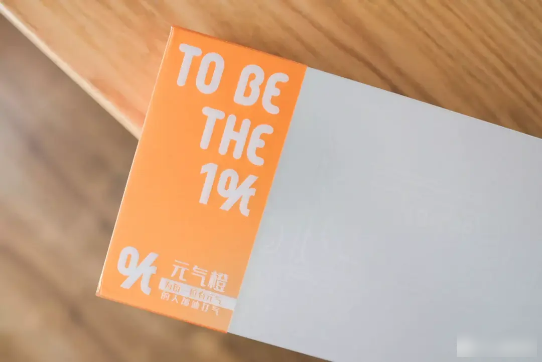
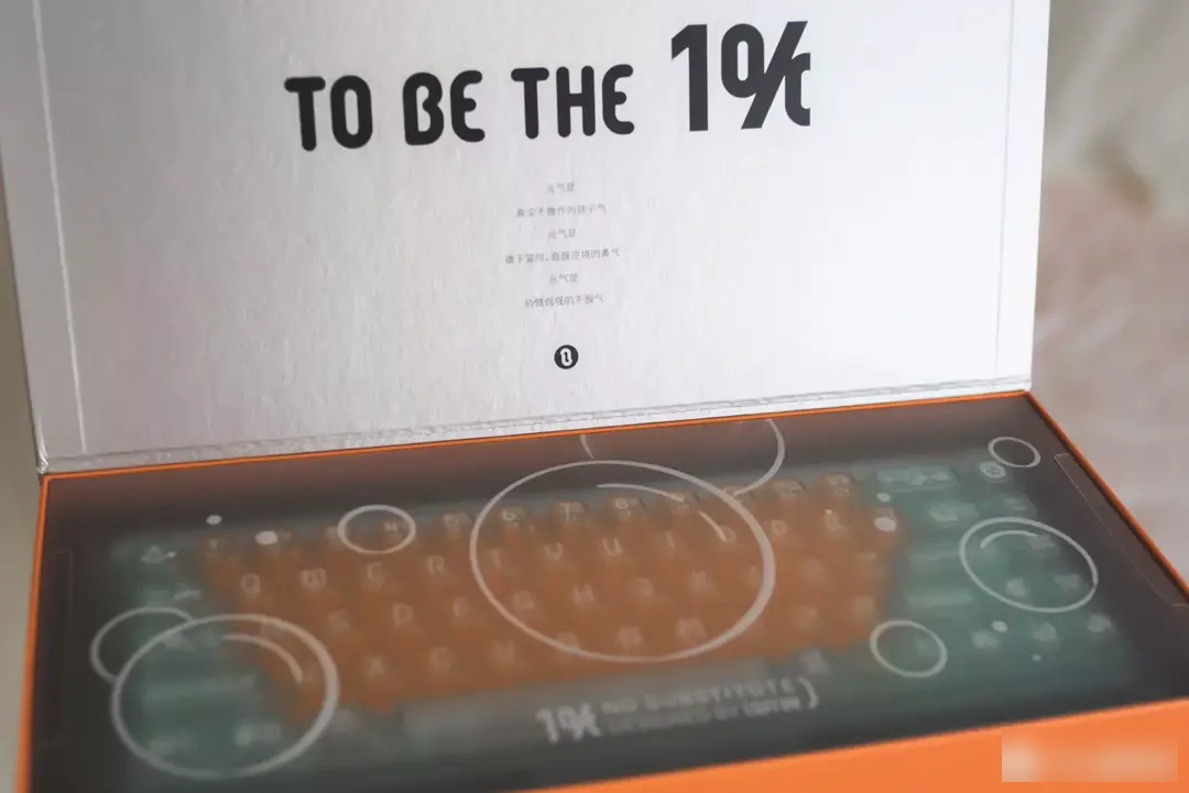
1% Vitality Orange, as a limited new product in the summer of 2022, is the second theme after the 1% transparent keyboard.
As a designer-led life-oriented brand, Lofree has a strong control over its appearance, and it is one of the few favorites in the peripheral industry in offline trendy play stores. Just this year, various 2㎡ concepts have been newly integrated, and it has been integrated into all aspects of life, not limited to a single category of peripherals. It may be the interesting part of this brand that it does not roll in the peripheral circle, but only walks its own way.
Also as a summer theme, the first release of "Ice Cube" completed the first chapter of refreshing and refreshing, and the enthusiastic "Fruit Style" opened a new chapter. Originally, I thought that Lofree would choose watermelon, but in the end, the orange became the protagonist full of freshness and vigorous vitality.
Creativity can be endless, and at the same time, exhaustion and homogenization are common, so it is conceivable that it is not easy for Lofree designers to surpass the existing hot items. Now the 1% series of keyboards are basically finalized. While retaining the original intention, it brings freshness through the new color scheme.

In simple comparison, the design of the Lofree 1% Vitality Orange transparent keyboard is basically the same as the original design, and the color change itself is also Lofree’s specialty.
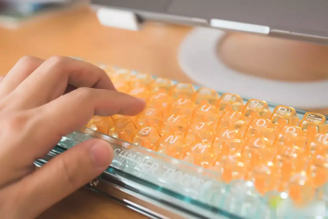
At first, I thought it was just a simple addition of vibrant orange on the main keypad. In fact, the rest of the keys were changed to a summer blue color scheme. Under the mapping of high-color transparent keycaps, it has a cool visual sense of ice cubes. With excellent matching and good product design, the 1% Vitality Orange transparent keyboard can keep pace with the original version, giving a different user experience.
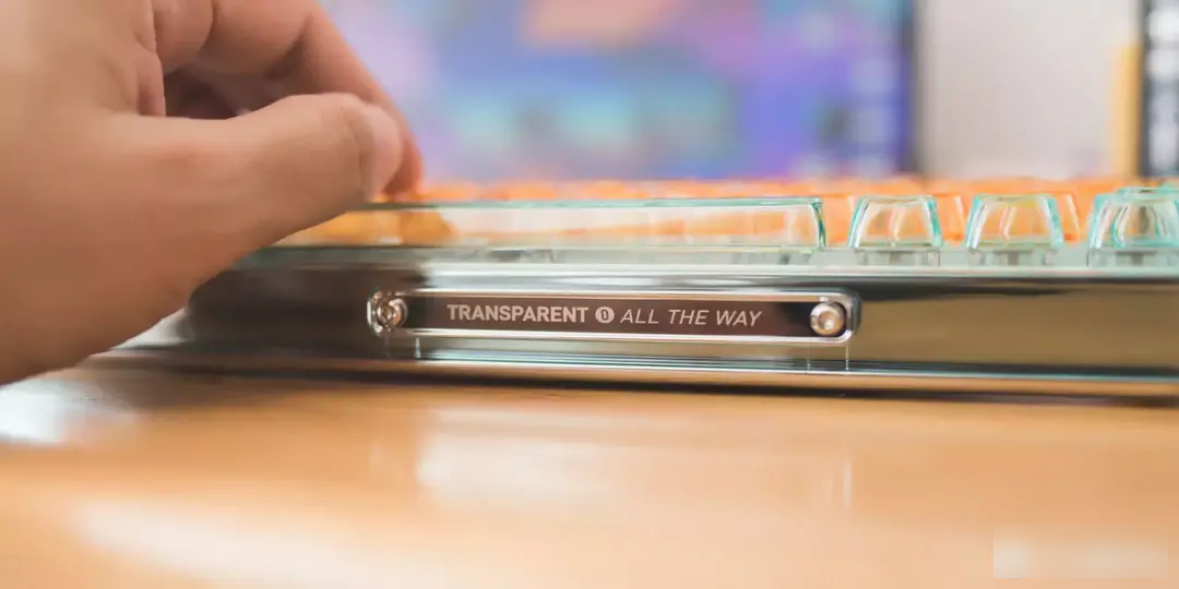
The panel of the 1% Vitality Orange transparent keyboard adopts high-gloss plating technology. Compared with the transparent keycap, this design is extremely amazing. Smooth and flat without burrs, it can be used as a mirror, and fingerprint mimeographs cannot be avoided. Perhaps this is the price of beauty.

The keyboard shell is made of high-gloss plating technology. After getting the real machine, I found that the side of the keyboard is covered with a summer blue shell. From the frontal view, this color scheme is completely coordinated with the keycap, and it comes with an anti-fingerprint effect. At the same time, it highlights the ins style of the laminated font. It can be seen that the designer's control of the appearance and details is very good.
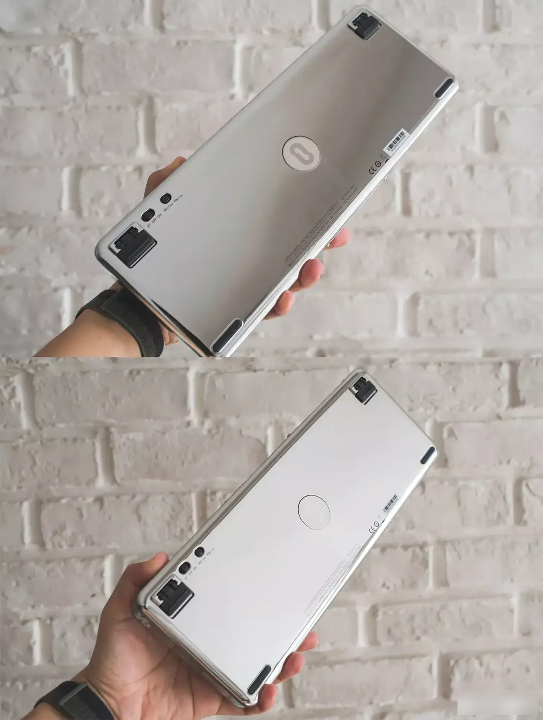
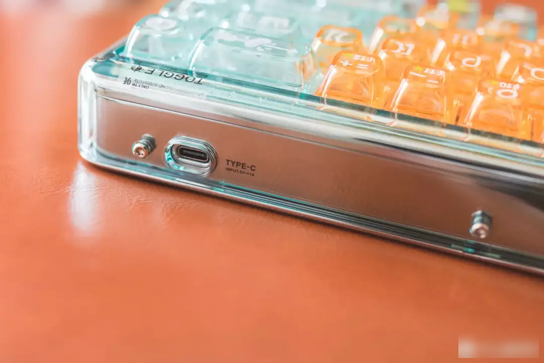
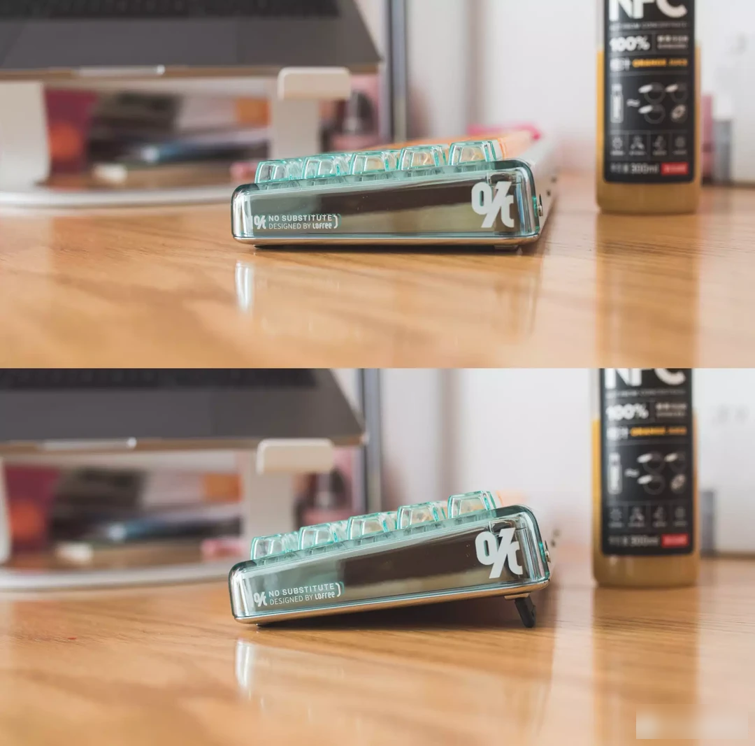
If you don’t see the mode (Bluetooth/wired) and system (Win/Mac) switching levers on the bottom case, you can only find an exposed Type-C interface on the side, and the sense of integration is very good. There are not too many height options for the stand, and one level of height is better than nothing. It is a normal configuration for positioning as a wireless keyboard.
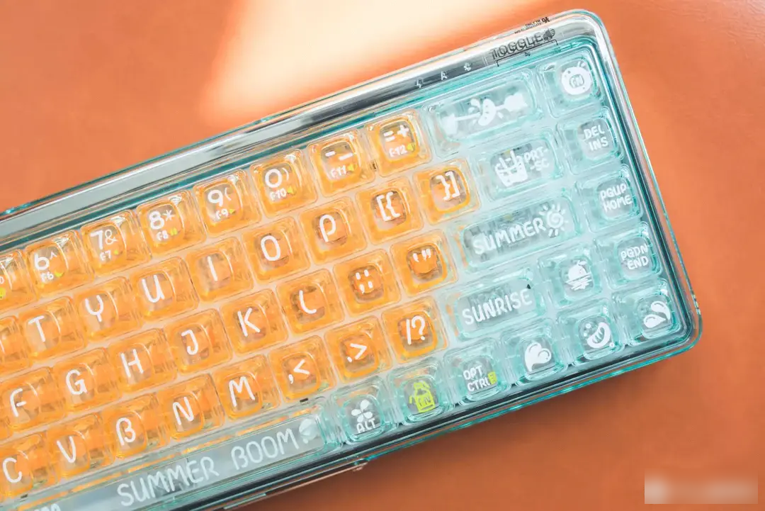

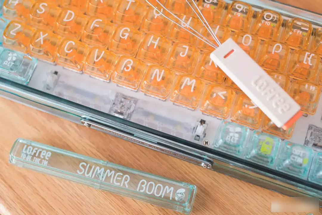
Vitality Orange uses new theme characters this time, plus various characters and graphics of SUNRISE, SUMMER, Freezer, and Orange, making the overall vitality and cuteness. Because it is a transparent keycap, the color is not coquettish, I feel that boys can completely hold this design.
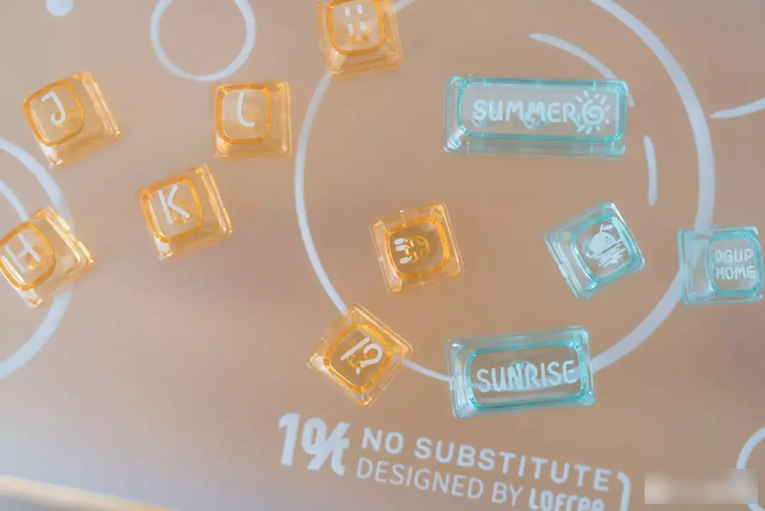

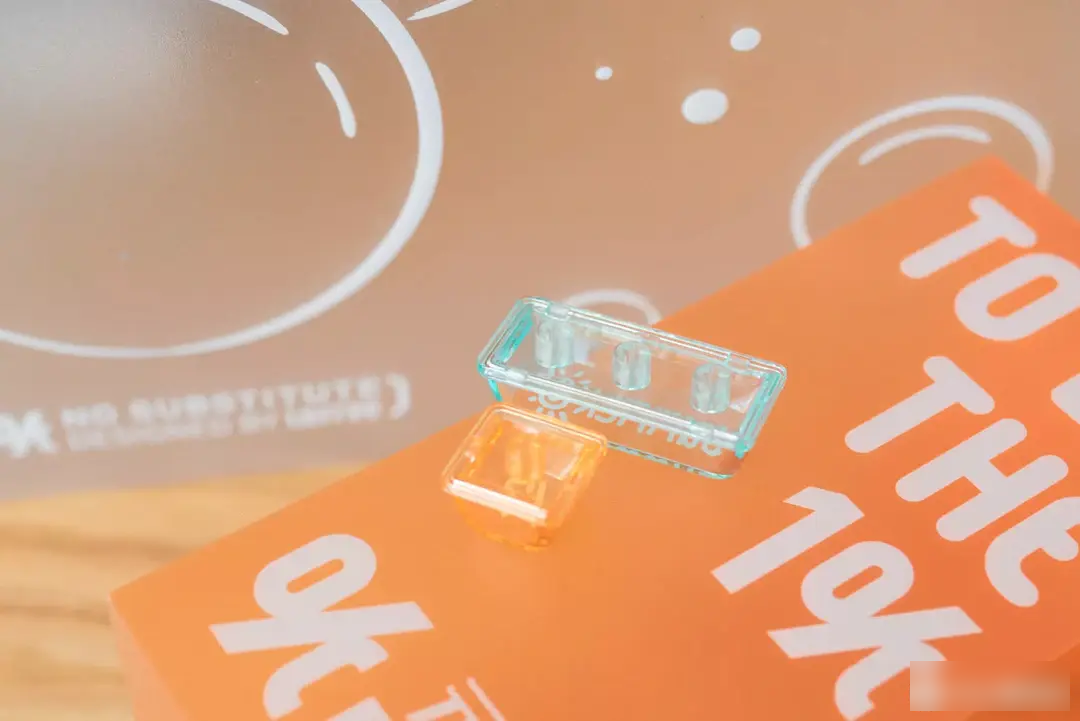

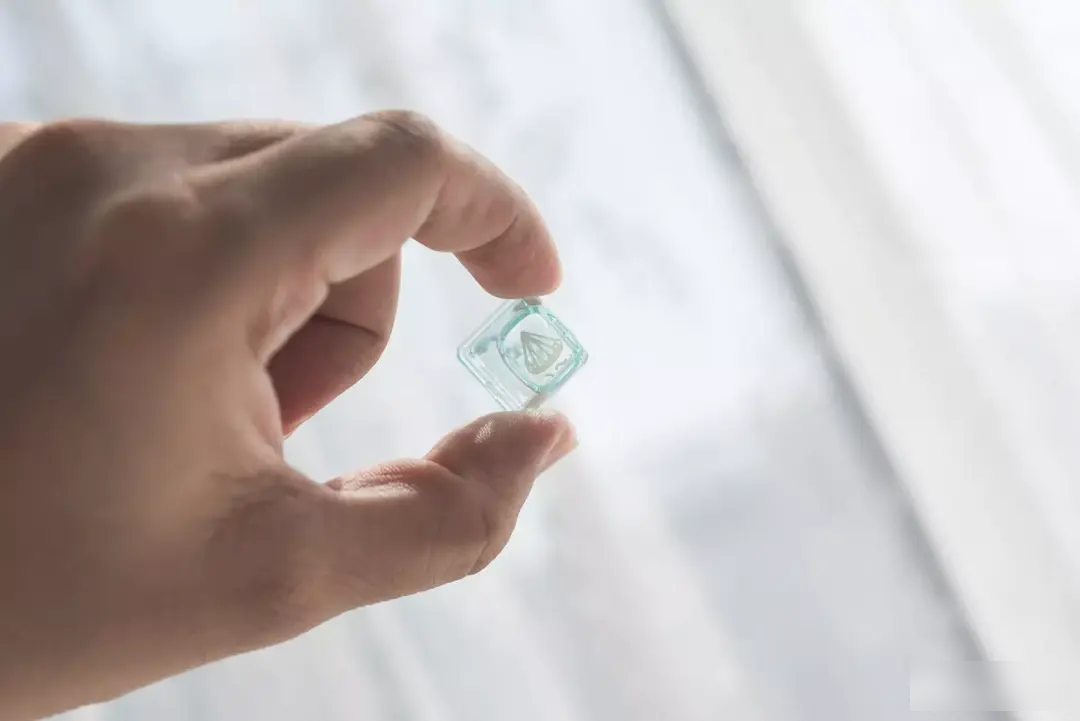
I think the best thing about Lofree is the idea of originality in everything, and the cross axis insists on having a patented keycap structure. The bottom of the keycap is completely sealed, and it is completely a small ice cube in the hand, which is why there is an interesting way to infuse UV resin DIY large keys.
In addition to design bonus points, the material does not use conventional ABS/PBT, but PC material imported from Germany. The advantage of PC keycaps lies in their high transparency. Last year, Lofree Luofei should have opened the prelude to the fully transparent design. Manufacturers who pay attention to appearance are starting to promote this design. Because PC keycaps are not mainstream, the feel is quite different. Lofree is more sophisticated, the actual machine is extremely delicate, and has a high-quality feel that does not lose to ABS.
The choice of pad printing + UV oil for fonts is also to ensure the characteristics of bright surface, round texture, wear resistance and scratch resistance. Perhaps in order to meet the summer theme, the white spray is more appropriate than the original black lettering, but the legibility will be weaker. I think that if you choose a keyboard at this price, you should be able to basically touch type, and perhaps the demand in this area is not particularly large.
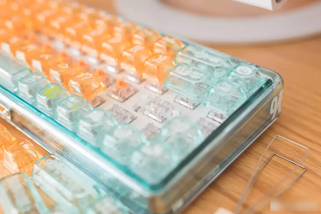
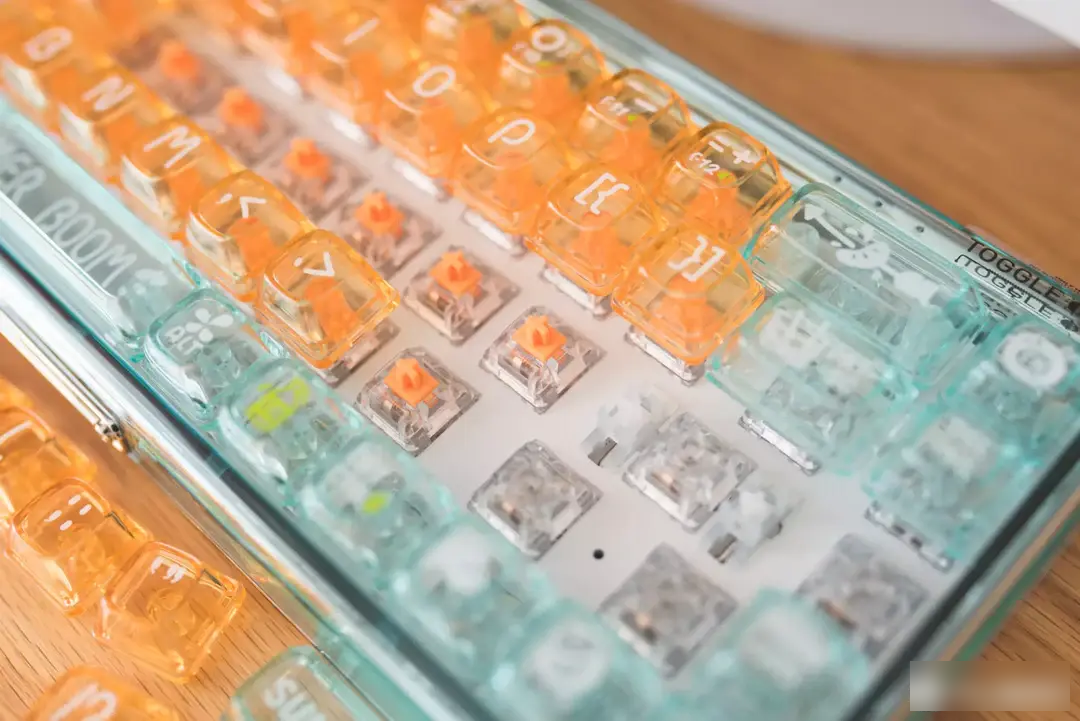
The 1% Vitality Orange transparent keyboard uses Kaihua's jellyfish switch because it focuses on transparency. In order to ensure the integrated type, the fully transparent + orange shaft configuration is completely unified with the keycap, and it is not hot-swappable.
BOX jellyfish actually has two versions of X-axis (paragraph) and Y-axis (linear), which are respectively used in two products of Lofree transparent keyboard. The retail price of the BOX jellyfish linear version is slightly more expensive than the paragraph version, which can be regarded as a small upgrade. The parameters of the BOX jellyfish linear version are basically at the first-line level, with a trigger pressure of 45gf, a rebound force of 15gf, a total stroke of 3.6±0.3mm, a conduction stroke of 1.8±0.3mm, and a life span of up to 100 million times.
The large key uses a satellite shaft, and the space bar is even specially added with a white dust cover in order not to expose the PCB. It can be seen that the details are considered very comprehensively.
The BOX jellyfish Y-axis belongs to the red-like feel without paragraphs, and the parameters are similar to those of our own BOX red. Personally, I think there is not much difference. Compared with BOX red, the hand feel is heavier, and the top touch sound is louder. The overall pressing is smooth, the sound is crisp, and the rebound follows the hand.
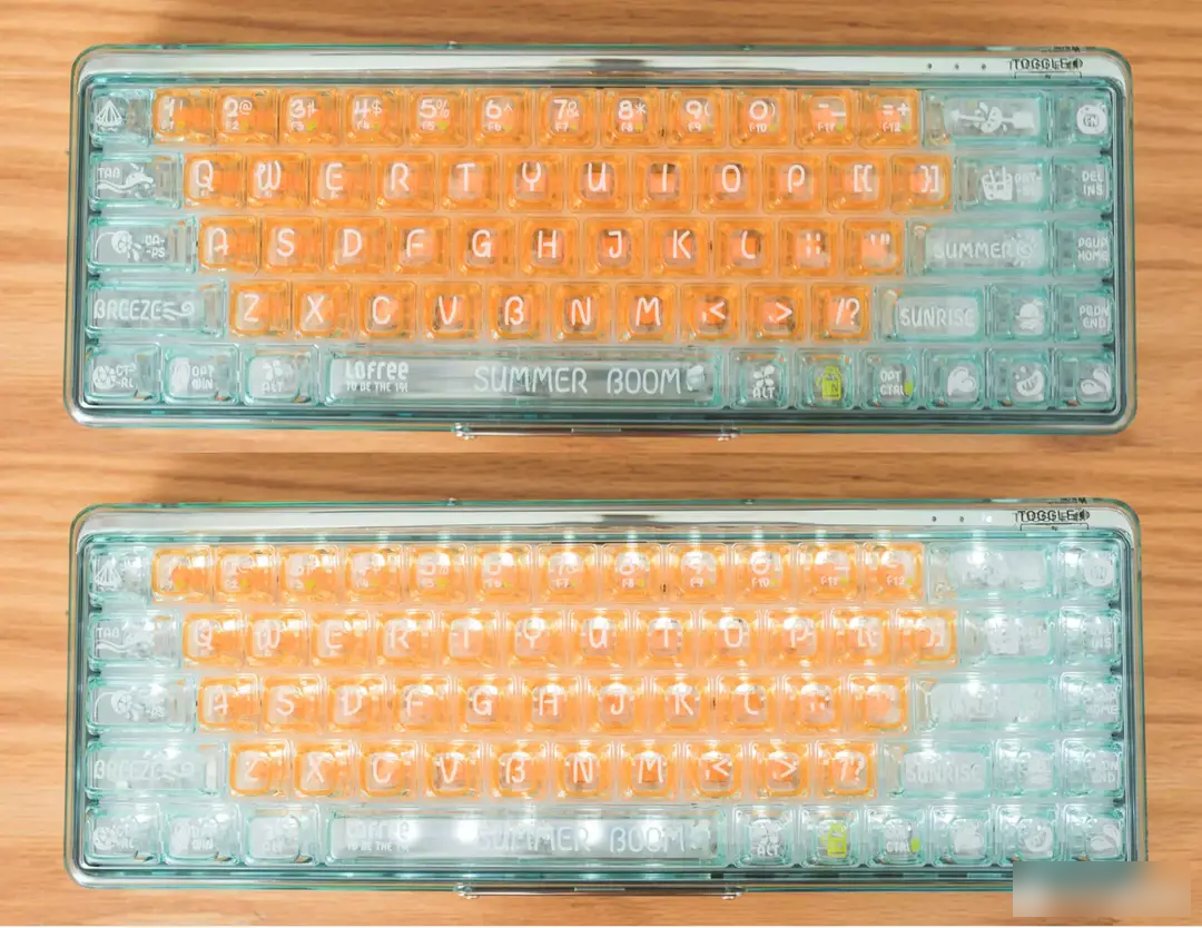

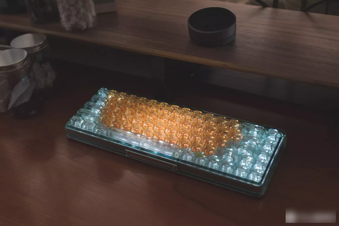
It is said that Lofree has great control over the design, so each keyboard will not blindly pile up useless configurations, and knows where its own settings are. Friends who want to get more with the same budget may be disappointed. The 1% Vitality Orange transparent keyboard does not have RGB lighting effects. The four-level brightness adjustment can well highlight the transparent property. Perhaps the designer has also tried other colors, and the bright light effect will definitely destroy the theme style of Vitality Orange.

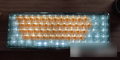

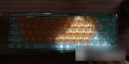
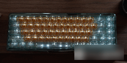

The lighting effect is basically sufficient, and the 7 styles can give users a mood match in different usage environments. Of course, the transparent and high light transmission characteristics, you can take it easy in the dark environment, don't blind your eyes.

As mentioned at the beginning, Lofree did not engage in price wars, nor did it engage in niche customization. The public accepts it, and the appearance is the first to bear the brunt, and the details are not lost at all, which is the core idea of every time it launches a hot style. The 1% Vitality Orange transparent keyboard is not a beautiful vase at all. It has full keys without punching, dual-mode connection, and the shaft keycap is used properly, which is very suitable for the product positioning of light office entertainment.
Compared with the original transparent color scheme, the 1% Vitality Orange transparent keyboard, which focuses on summer vigor attributes, is indeed a little less popular. It is indeed understandable as a limited edition, but it is not clear whether this wave will be limited. At least I think this kind of product design caters to the cool attributes of summer or even autumn, and it is a very good choice whether it is for personal use or as a gift.
Factory Adress: No.11,FengpingRoad